
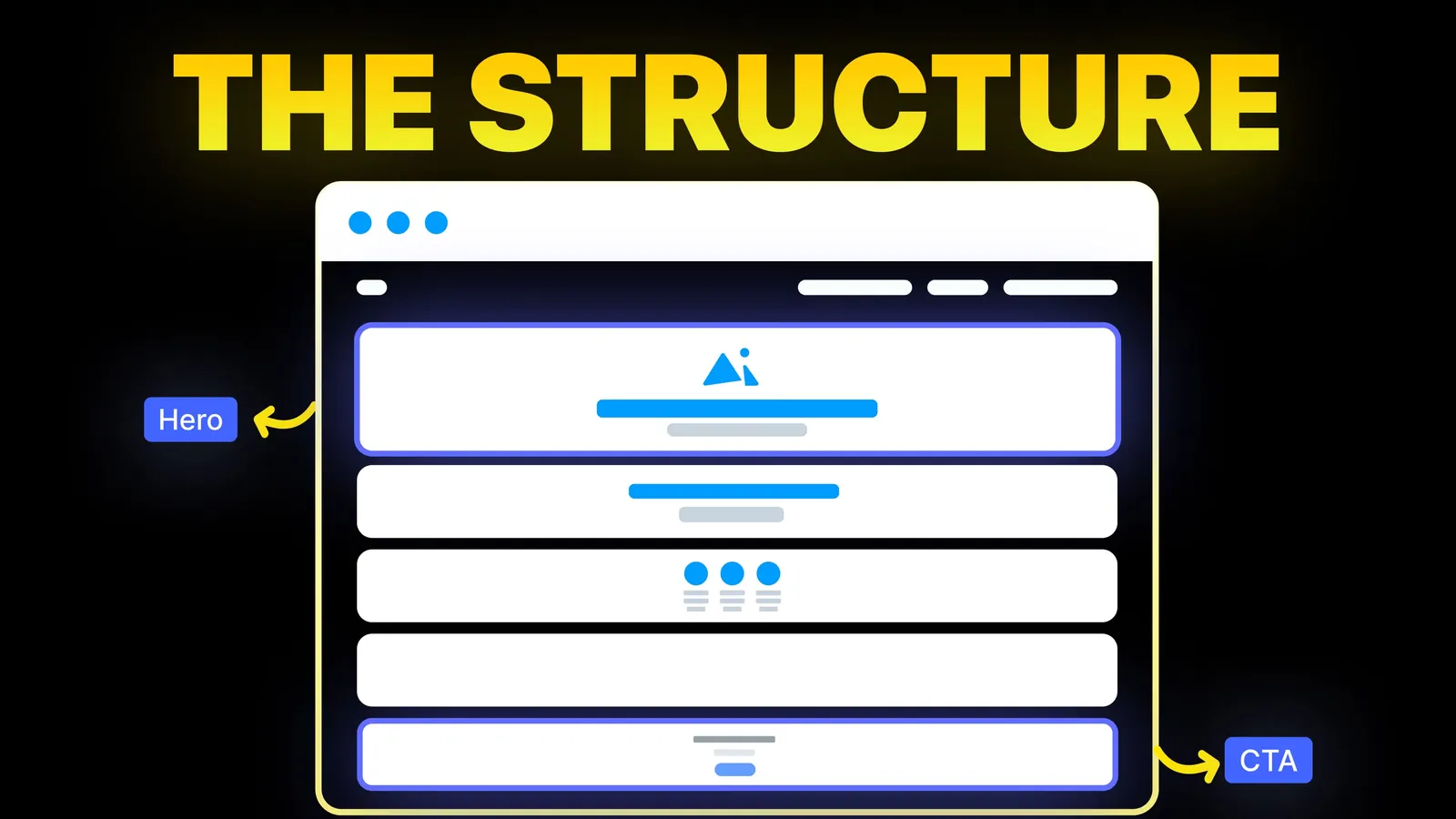
How to Turn Your Website Into a High-Converting Sales Tool
The structure behind a website that sells: the five decisions that carry conversion, the homepage section order, and how to rebuild without losing traffic.
Web Design
Most lists of web design principles are taste: balance, harmony, white space. They are fine, but you cannot check them. This guide keeps the principles and adds a test for each one, using numbers from the W3C, Google and the Nielsen Norman Group, so you can tell whether your site follows them.

For a small business site, follow seven principles: say what the site is for, put the most important thing first, make text readable, keep navigation short, stay consistent, load fast, and make it work for everyone. Each one below comes with a test you can run in a few minutes. The numbers come from the W3C's Web Content Accessibility Guidelines (WCAG) 2.2, Google's Core Web Vitals page and the Nielsen Norman Group's usability heuristics, all read on 12 November 2026.
About this guide: it comes from Amariq, a web design studio. The rules and tests are the standards' own; where something is our own habit rather than a standard, we say so.
On 12 November 2026, Google (US, English) showed lists such as Webflow's 10 principles (updated 26 February 2025), Canva's 20, UX Pilot's 19, Tilda's 10 and the U.S. Web Design System's principles. Webflow's covers purpose, content, visuals, harmony, typography, organisation, colour, white space, hierarchy and authenticity. The U.S. Web Design System's are about process: start with real user needs, earn trust, embrace accessibility, promote continuity and listen.
Both are sound. What an owner still lacks is a way to check them. "Choose colours that make content easy to read" is advice; a contrast ratio is a result. The rest of this page turns each principle into something you can measure.
| Principle | What it means | A test you can run |
|---|---|---|
| 1. Clear purpose | The page says who it is for and what to do | Show it to someone for five seconds. Can they say what you sell and what to click? |
| 2. Visual hierarchy | The most important thing is the most noticeable | Squint at it. Does one headline and one button stand out? |
| 3. Readable text | Size, contrast and line length suit reading | Contrast of at least 4.5 to 1; lines under 80 characters |
| 4. Easy navigation | People find things in a few steps | Can a stranger reach your price or contact page in two clicks? |
| 5. Consistency | Same patterns everywhere | Do buttons, headings and spacing look the same on every page? |
| 6. Speed | The page appears quickly and stays steady | Largest Contentful Paint 2.5 seconds or less, layout shift 0.1 or less |
| 7. Access for everyone | Works by keyboard, screen reader and on a phone | Targets 24 pixels or more each way; every link reachable with Tab |
Webflow's list starts here, and so does the U.S. Web Design System's first principle, which is to start with real user needs. A site that tries to say everything says nothing.
How to apply it. Write the purpose in one sentence ("We repair boilers in Leeds and you can book online") and make the top of the home page say the same thing. One main action per page: call, book, buy or ask for a quote.
Test. The five-second test. Show the home page to someone who does not know your business, take it away after five seconds and ask two questions: what does this company do, and what would you click? If they cannot answer, the purpose is not clear. Our homepage design ideas show what to put in that first screen.
Hierarchy is the order in which the eye moves: biggest and boldest first, small print last. It is how a page tells people what matters. The arrangement underneath it is the layout, and our website layout examples show which arrangement suits which kind of business.
How to apply it. Use three or four text sizes, not ten. Make the main headline clearly larger than everything else. Give the main button the strongest colour on the page, and do not use that colour for anything else.
Test. Squint, or blur the page in your design tool. If you can still tell where the headline and the main button are, the hierarchy works. If five things compete, remove or shrink four.
This is where published numbers help most.
| Rule | Number | Source, read 12 Nov 2026 |
|---|---|---|
| Contrast, normal text | At least 4.5 to 1 | WCAG 2.2, success criterion 1.4.3 (Level AA) |
| Contrast, large text | At least 3 to 1 | Same criterion |
| What counts as large | 18 point (about 24 pixels), or 14 point bold (about 18.5 pixels) | Same criterion |
| Line length | No more than 80 characters | WCAG 1.4.8 (Level AAA, the strictest tier) |
| Line spacing | At least 1.5 within paragraphs | WCAG 1.4.8 |
| Alignment | Not justified to both margins | WCAG 1.4.8 |
The W3C notes that contrast results are thresholds, not rounded: 4.499 to 1 fails the 4.5 to 1 rule. Logos and purely decorative text are exempt from the contrast rule.
Test. Paste your text and background colours into a free contrast checker. Check the pale grey captions and the text on photos, which fail most often. Then count characters on one line of body text. Our website colour schemes guide covers palettes that pass.
The Nielsen Norman Group's heuristics, first published in 1994 and last reviewed on 30 January 2024, include "match between the system and the real world", which means using words your visitors use, and "recognition rather than recall", which means showing options instead of making people remember them.
How to apply it. Five to seven top-level menu items, named in plain words ("Pricing", not "Investment"). Put the contact action in the header. Keep the footer for the extras; see our footer design guide.
Test. Ask someone to find your prices, then your phone number. If either takes more than two clicks, or they hesitate, shorten the menu. The same test works on a phone, where the menu is often hidden.
The Nielsen Norman Group's fourth heuristic is "consistency and standards": the same word, action or pattern means the same thing everywhere. The U.S. Web Design System calls this continuity.
How to apply it. Define one button style, one heading scale, one spacing scale and one set of icons, and reuse them. Write a short style sheet, even a single page.
Test. Open four pages side by side. Do the headings, buttons and spacing match? A button that looks different on each page makes visitors wonder whether it does the same thing. The same test sorts this year's styles; our review of the 2026 web design trends marks which to keep, test or skip.
Google's Core Web Vitals page (last updated 31 October 2024) lists three measures and the score Google calls "good", judged at the 75th percentile of page loads, for mobile and desktop separately.
| Measure | What it shows | "Good" |
|---|---|---|
| Largest Contentful Paint (LCP) | How fast the main content appears | 2.5 seconds or less |
| Interaction to Next Paint (INP) | How fast the page reacts to a tap or click | 200 milliseconds or less |
| Cumulative Layout Shift (CLS) | How much the page jumps while loading | 0.1 or less |
How to apply it. Size images to the space they fill, use modern image formats, load only the fonts you use, and keep scripts to what the page needs.
Test. Run the page through a speed tool and read the three scores. Our guide to testing website speed shows how, and the speed optimisation guide lists the fixes.
Accessibility is a principle in its own right in the U.S. Web Design System, which asks whether users can navigate with only a keyboard and whether a screen reader can reach all content. WCAG 2.2 adds a size rule for things people tap.
| Rule | Number | Source, read 12 Nov 2026 |
|---|---|---|
| Minimum size of a tap or click target | 24 CSS pixels wide and tall at minimum (Level AA) | WCAG 2.2, success criterion 2.5.8 |
| Spacing exception | A smaller target can still pass when the 24 pixel circle drawn around it stays clear of its neighbours | Same criterion |
| Exceptions | Targets inside a sentence, controls set by the browser, and cases where a different size is essential | Same criterion |
Test. Put the mouse away and press Tab through the page. Can you reach every link and button, see where you are, and press Enter to use it? Then use a phone with one thumb: are the links in your footer and menu easy to hit without opening the wrong one? Our accessibility checklist has the full list, and our mobile design guide covers phones.
These are typical patterns, not named sites. Each change can be tested against the numbers above.
| Before | After | Why it passes |
|---|---|---|
| Pale grey text on white, 13 pixel captions | Dark grey on white, at least 16 pixel body text | Contrast reaches 4.5 to 1 or more |
| Text runs across the full width of a wide screen | Column of about 65 to 75 characters | Under the 80 character limit |
| Menu with ten items, including "Solutions" and "Resources" | Five items: Services, Pricing, Work, About, Contact | Shorter, plain words, contact in reach |
| Three buttons in three colours, all the same size | One main button, one plain text link | One clear action |
| Hero image is a 4 MB photo | Resized, compressed image that fills only the space it needs | Main content appears faster |
| Footer links 12 pixels apart and 14 pixels tall | Links at least 24 pixels tall or spaced apart | Meets the target size rule |
Balance, white space, typography and image style are the parts the tests do not settle. Two sites can pass every check and still feel very different. That is where the brand lives. A good order of work is: get the tested rules right first, then spend your time on how it feels. White space helps both, since it makes text easier to read and a page easier to scan.
| Check | Done? |
|---|---|
| Home page says what you do and what to do next within five seconds | |
| One main action per page | |
| Three or four text sizes; one clear headline | |
| Body text contrast at least 4.5 to 1 | |
| Lines under 80 characters, line height at least 1.5 | |
| Five to seven menu items in plain words | |
| Contact reachable in one click from any page | |
| Buttons, headings and spacing match across pages | |
| LCP 2.5 seconds or less, INP 200 ms or less, CLS 0.1 or less | |
| Every link reachable with the Tab key | |
| Tap targets 24 pixels or more in both directions |
Before a site goes live we run it through the seven checks above, whichever platform it is built on: Webflow, Framer, WordPress, Shopify, Wix, Squarespace or custom code. Pricing follows the scope of the project and is never charged by the hour. Payment is 40% to start, 30% when you approve the design and 30% before launch. After the final payment the design, copy and code are yours, and the domain, hosting and analytics accounts are held in your name. See our web design service or read more on this blog.
Common lists include purpose, hierarchy, balance, contrast, white space, consistency and navigation. This guide groups them into seven you can test: purpose, hierarchy, readable text, navigation, consistency, speed and access for everyone.
There is no fixed number. Webflow lists 10, Canva 20 and UX Pilot 19, and the Nielsen Norman Group has 10 usability heuristics. The count changes because writers group the same ideas differently.
For a business site, a clear purpose: visitors should know within seconds what you offer and what to do next. Everything else supports that.
At least 4.5 to 1 for normal text and 3 to 1 for large text, under WCAG 2.2 success criterion 1.4.3 at Level AA. Large text means 18 point, or 14 point bold.
Criterion 2.5.8 in WCAG 2.2 sets a floor of 24 CSS pixels in each direction, and lets a smaller target pass if enough space separates it from the next one. Bigger is kinder to thumbs.
You are not required to, except where accessibility law applies to you, which depends on your country and sector. The principles are still worth following because they make a site easier for customers to use and trust.

The structure behind a website that sells: the five decisions that carry conversion, the homepage section order, and how to rebuild without losing traffic.
What a good 404 page says, where to set it on Webflow, WordPress, Shopify, Wix, Squarespace or a static host, and the status code test. Checked 10 Nov 2026.
What a small business website footer needs, what to leave out, and a plain checklist built from Nielsen Norman Group and W3C guidance.