
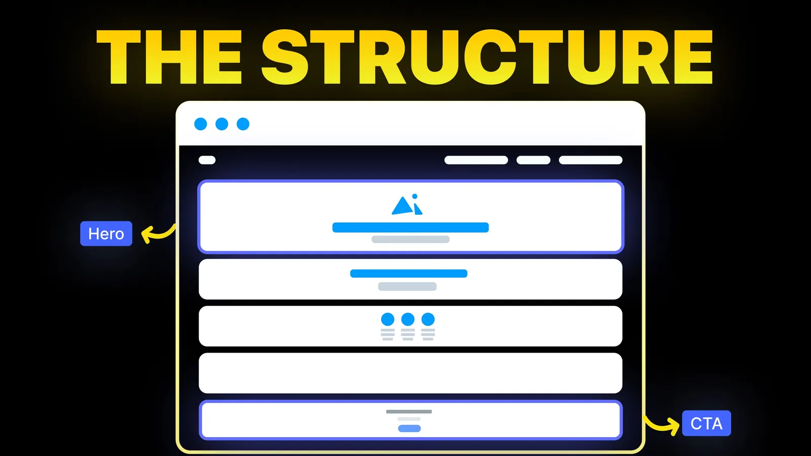
How to Turn Your Website Into a High-Converting Sales Tool
The structure behind a website that sells: the five decisions that carry conversion, the homepage section order, and how to rebuild without losing traffic.
Web Design
Most lists of 2026 trends were written in late 2025 as forecasts. It is now November 2026, so we can do something they could not: look back. We read the lists that rank, sorted every trend they named into keep, test or skip for a business website, and checked the browser support behind each one on MDN on 14 November 2026.
animation-timeline) as Baseline 2026, newly available in all major browsers. Cross-document page transitions (@view-transition) are still limited availability.From the 2026 trend lists, a business site should take five things: larger, more confident type; shorter copy; content grouped into clear blocks; real photos of your people and work; and small, purposeful motion. Test 3D, video and scroll-linked effects only where they show the product. Skip experimental navigation and the deliberately messy styles. Whatever you pick, check it against the page's job: helping a visitor understand the offer and get in touch.
About us: Amariq is a web design studio. We designed and built sites for clients and our own portfolio through 2026, so the verdicts below mix the published lists, MDN's browser data read on 14 November 2026 and what we chose to keep or drop in our own work. We have not run controlled tests of these trends.
We searched Google (US, English) on 14 November 2026. Google's AI summary named bento grids, tactile and neo-brutalist styles, type-first layouts, nostalgic and "cute" styles, nature palettes, AI as a creative partner, lightweight WebGL and CSS, and frosted glass. The ranking pages broke down like this:
| Source | Published | Trends it named |
|---|---|---|
| Webflow blog | 23 Dec 2025 | Proprietary effects, art meets UI, minimal copy, the "TL;DR experience", explosion of colour, dynamic text, guided scrolling, the infinite canvas |
| Figma resource library | Not dated on the result | 3D and immersive elements, experimental navigation, vibrant colour palettes and more (from Google's result summary) |
| Vistaprint | 3 Nov 2025 | Cute-alism, Dial-Up Delight, Resonant Stark, Frosted Touch, light skeuomorphism and more (from Google's result summary) |
| Behance gallery | 15 Dec 2025 | Node-based AI design tools, retro and brutalist styles, immersive 3D, humanised and imperfect styles (from Google's result summary) |
| Elementor | 21 Jan 2026 | Organic shapes and anti-grid layouts, agentic web experiences, AI as partner, design tokens (from Google's result summary) |
| Sayenko Design | Not dated on the page | AI features, bento grids, bold type, human-crafted visuals, dark mode, micro-animation, 3D, mobile-first, accessibility, clean navigation |
The Sayenko article was the only one that asked which trends are worth using on a business site, and it is a useful read. It also quotes several statistics without links to their sources, so we have not repeated them here. None of the six checked whether browsers support the effects they describe, and none was written after the year had run.
| Trend | Our call for a business site | Why |
|---|---|---|
| Bold, expressive type | Keep | A large, clear headline helps every visitor and costs almost nothing in speed |
| Shorter copy, the "TL;DR" page | Keep | Visitors skim; say the offer in one line and back it with proof |
| Content in clear blocks (bento grids) | Keep, with care | Good for features and services; poor for long reading or a single message |
| Real, human photos and craft | Keep | Generic stock and AI images look alike; your own people and work do not |
| Small, purposeful motion | Keep | Feedback on buttons and forms helps; motion for its own sake does not |
| Dark mode and colour-scheme support | Test | Worth it for tech and creative brands; check contrast in both versions |
| Explosion of colour | Test | Strong colour can carry a brand, but text contrast still has to pass |
| Frosted glass panels | Test | Looks good over photos; text on blurred backgrounds often fails contrast |
| Scroll-linked effects ("guided scrolling") | Test | Now easier to build in CSS, but long scroll sequences can bury the offer |
| 3D and immersive scenes | Test only where the product is visual | Furniture, architecture, physical products; elsewhere it slows the page |
| AI chat and agents on the site | Test | Useful where enquiries are many and repetitive; a clear form still matters |
| Experimental navigation, the infinite canvas | Skip | Visitors expect a menu they recognise; novelty costs them time |
| Brutalist, "imperfect", anti-grid layouts | Skip for most | Fine for a studio or a campaign, risky for a page that must earn trust |
| Nostalgic styles (dial-up, cute-alism) | Skip for most | Fun for a youth brand or a launch, dated quickly elsewhere |
A trend you cannot build reliably is a trend you should not plan around. MDN labels each web feature by how widely it works. "Widely available" means a consistent history of support in Chrome, Edge, Firefox and Safari on desktop and mobile for at least 2.5 years. "Newly available" means it works in the latest version of each of them but may fail on older devices. "Limited availability" means at least one major browser still lacks it. Here is what MDN showed on 14 November 2026 for the features behind this year's trends:
| Feature | Trend it serves | MDN status, 14 Nov 2026 |
|---|---|---|
animation-timeline (scroll-driven animation) | Guided scrolling, scroll reveals | Baseline 2026, newly available |
@view-transition (animated page changes between pages) | Smooth page transitions | Limited availability |
backdrop-filter (blur behind an element) | Frosted glass | Baseline 2024, newly available |
light-dark() (one value for light and dark themes) | Dark mode support | Baseline 2024, newly available |
container-type (container queries) | Bento grids and cards that adapt to their box | Widely available |
text-wrap (balanced headline lines) | Bold, type-first headlines | Widely available |
Two practical points follow. Scroll-driven effects no longer need a script library for simple cases, but anything older than this year's browsers will not run them, so the page must make sense without the effect. And page transitions between separate pages should stay a nice extra: build the site so it works the ordinary way, and let supporting browsers add the animation. MDN's own note is worth repeating: Baseline is a summary of browser support, not a substitute for accessibility, performance or usability testing.
Some items on the lists are not trends at all. Mobile-first design, fast loading and accessibility appear every year because they are the standard a site is judged by. Google scores page experience with three Core Web Vitals; this plain-English explainer covers them. Accessibility follows WCAG, and our accessibility checklist turns it into steps. Motion has its own rule too: WCAG 2.2 (success criterion 2.2.2) says self-starting movement lasting over five seconds beside other content must come with a pause. If a trend breaks one of these, the trend loses.
On our own site we removed a bento-style "why us" section from the home page in November 2026, when we reorganised it around two actions: book a call or request a free website audit. The grid looked fine; the page simply had a clearer job without it. Several of our portfolio designs this year shipped in both a light and a dark version, built from the same source so neither falls behind. Our case study videos play only while on screen and stay still for visitors who prefer reduced motion; our video background guide shows how.
None of that is a trend. It is the same filter applied each time: does this help a visitor understand the offer and act on it?
Our web design principles set the tests behind these steps, and our website animations guide sets a motion budget. If you are deciding whether your site needs a new look at all, start with the signs your website needs a redesign.
Want a site that looks current without chasing every list? We start from what your visitors need and add the parts of this year's style that serve them. Send us your current site and we will tell you which changes would help and which would only cost speed. Webflow, Framer, WordPress, Shopify, Wix, Squarespace and hand-coded builds are all options. Quotes follow the scope, never the hours, and payment comes in three parts: 40% to begin, 30% once you approve the design, 30% before the site goes live. Once you have paid in full, you own the design, copy and code, and the domain, hosting and analytics are registered to you. Our web design and brand design service pages explain more.
Across the lists we read, the common thread was a move away from the uniform, template look: bold type, more colour, human photos and craft, and proprietary effects. For business sites, the most useful of these is bold, clear type.
Yes, and they work well for features, services and case study previews. They suit pages where visitors scan, not pages that tell one story or need long reading. Container queries, which MDN lists as widely available, make them easier to build well.
It depends on the audience. For tech, creative and premium brands it can fit; for warmer services it is optional. If you add it, check text contrast in both themes. The light-dark() CSS function, Baseline 2024 on MDN, makes the two themes simpler to maintain.
For simple effects, yes. MDN marks animation-timeline, the property behind CSS scroll-driven animation, as Baseline 2026, newly available. Older browsers will ignore it, so the page must read correctly without the animation.
Only when the product is visual and the page still loads quickly. For most service businesses, real photos and clear structure do more than a 3D scene.
For a business site: experimental navigation, deliberately rough layouts, nostalgic gimmicks, and any effect that hides the offer or slows the first screen. They suit portfolios and campaigns better.
Rarely on purpose. Update when the site is slow, unclear, hard to use on phones or no longer matches the business. A trend can shape how the new version looks, but it should not be the reason to rebuild.
We would rather not forecast. Watch which features MDN moves to widely available, because those are the effects that become practical for everyone, and keep testing against your own visitors.

The structure behind a website that sells: the five decisions that carry conversion, the homepage section order, and how to rebuild without losing traffic.
Scroll animation ideas for a business website, four ways to build them, a short CSS example and the motion rules to follow. Sources checked 9 Nov 2026.
Should your website have a sticky header? What Nielsen Norman Group and WCAG say, when to skip it, and a short CSS build. Sources checked 9 Nov 2026.