
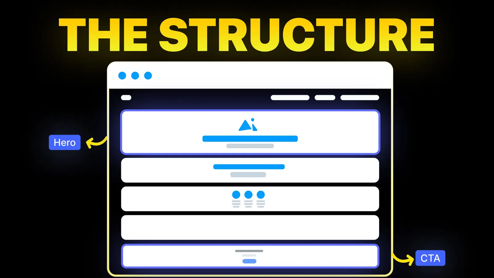
How to Turn Your Website Into a High-Converting Sales Machine
The structure behind a website that sells: the five decisions that carry conversion, the homepage section order, and how to rebuild without losing traffic.
Web Design
Search "sticky header" and you get code tutorials and plugin pages. Few ask whether your site should have one. This guide covers when a sticky header helps, what it costs, the accessibility rule that catches people out, and a short, plain CSS build, with sources read on 9 November 2026.

Use a sticky header if your pages are long, your menu is short and your visitors move between sections. Skip it, or make it hide on scroll down, if your pages are short or your header is tall. If you add one, keep it small and opaque, avoid fancy animation, and make sure it never covers the item a keyboard user has tabbed to or a section a link jumps to. In CSS it takes position: sticky and top: 0 on the header, plus scroll-padding-top on the page.
Who is writing: Amariq designs and builds websites. We have not run our own test of sticky headers for this post. The advice comes from the sources linked in the text, and the checklist is our own summary of them.
On 9 November 2026 the first page of Google (US, English) for "sticky header" was mostly how-to pages and tools. It showed a code library page, an OceanWP premium add-on, a Dribbble tag page, W3Schools on CSS sticky positioning, a WordPress.com video, Astra's documentation, a Twentig tutorial dated 26 January 2026 for block themes, a FlutterFlow doc dated 5 October 2026, a CSS-only video and a Reddit thread on r/web_design with a comment that sticky headers can cause accessibility problems, especially when zooming. We saw that thread only as a snippet.
Most of these answer "how do I make one" for a particular tool. What the results we could see do not do is help a website owner decide whether to have one, or warn about the accessibility rule that applies. That is the gap this guide fills. Keyword data shows why the topic is crowded with code: of the related searches we saw, many are about app development, tables and spreadsheets, not websites.
A sticky header is a header that stays on screen as the visitor scrolls. There are three common versions:
| Version | What it does | Good for |
|---|---|---|
| Always visible | The header stays at the top at all times | Long pages with a short menu |
| Shrinks on scroll | A tall header becomes a slim bar | Sites with a big logo area at the top |
| Hides on scroll down, shows on scroll up | Out of the way when reading, back when needed | Phones and long articles |
Developers also use the words "fixed" and "sticky" for different CSS behaviours. MDN describes a sticky element as laid out in normal flow and then offset from its nearest scrolling ancestor, behaving like a relatively positioned element until it reaches the threshold you set, and then staying stuck until its containing block ends. A fixed element is taken out of the flow completely. For a site header, sticky is usually the simpler tool.
These are reasons, not measurements. NN/G's article gives no user test results, only design guidelines and examples, and we are not aware of a figure that proves a sticky header raises sales. Treat it as a convenience for visitors, not a conversion trick.
Nielsen Norman Group's article "Sticky Headers: 5 Ways to Make Them Better" (Page Laubheimer, 4 April 2021, read in full on 9 November 2026) gives five rules.
| Rule | What it says | What to do on a small business site |
|---|---|---|
| Keep it small | Maximise the content-to-chrome ratio. Touch targets about 1 cm by 1 cm, text about 16pt | A single slim row: logo, four or five links, one button |
| Ensure contrast | Use an opaque colour that stands apart from the content everywhere | A solid background, not glass |
| Minimise motion | Ideally do not animate. If a tall header must shrink, make it quick and smooth | Skip shrink effects unless the header is very tall |
| Consider partial persistence | Hide on scroll down, reappear on scroll up. Trigger after a few pixels of upward scroll and slide in over roughly 300 to 400 ms | A good choice for phones |
| Question whether it is needed | A sticky header takes space on every page. Weigh its contents against how often users need them | Short page? You may not need it |
The article compares the content-to-chrome ratio of two sites, 13 to 1 for The New Yorker and 2 to 1 for Lollar Pickups, to show how much a header can take from the screen. Those are examples of specific sites, not a benchmark.
WCAG 2.2 success criterion 2.4.11, Focus Not Obscured (Minimum), is Level AA. The W3C's explanation page, read on 9 November 2026, gives the criterion text: when a user interface component receives keyboard focus, the component is not entirely hidden due to author-created content. It names sticky headers, sticky footers and non-modal dialogs as typical content that can overlap focused items. At this level a focused item may be partly covered but must not be fully hidden.
Here is how it goes wrong. A keyboard user tabs down the page. The browser scrolls the focused link into view, but only to the edge of the screen, so it ends up directly under your sticky header and the user cannot see where focus is. The W3C lists this as failure F110, "a sticky footer or header completely hiding focused elements".
The sufficient technique the W3C names is C43, using CSS scroll-padding to un-obscure content. It tells the browser to leave room at the top when it scrolls something into view.
This is a minimal version. We show it as an illustration of the technique described by MDN and the W3C, and we have not tested this exact snippet across browsers for this post.
```css .site-header { position: sticky; top: 0; z-index: 100; background: #fff; / opaque, as NN/G advises / }
html { scroll-padding-top: 5rem; / set to the header's height / } ```
Notes:
top must be set. MDN says at least one inset property must be non-auto, or the element behaves like a relative one.overflow: hidden is the usual reason a sticky header does not stick.Most builders have a switch. Astra and OceanWP appeared in the search results with sticky header features, Twentig's tutorial for block themes uses a Position setting of Sticky in the editor, and WordPress.com has a block editor method. We did not test these. Whatever the builder, check three things afterwards: tab through the page and watch whether focus is ever hidden, click an in-page link and see where the heading lands, and look at it on a phone. Our guides to mobile website design and the website accessibility checklist cover the rest.
A sticky bar at the bottom, such as a call button on a phone, takes space from the thumb zone and has the same focus problem, because the W3C names sticky footers alongside headers. A cookie banner is the same case. The W3C page says a sticky notification can fail if it completely covers the focused item, and it can pass by becoming modal, using scroll padding or closing when it loses focus. See our website footer design guide for what belongs in the footer instead.
scroll-padding-top matches its height.If your header covers content or you are not sure whether to keep it sticky, send us the link and we will tell you what we would change. For a new build we work on Webflow, Framer, WordPress, Shopify, Wix, Squarespace or a custom stack, and we set the header, the scroll padding and the focus checks as part of the design. Each project is priced from its scope, never by the hour, with 40% to start, 30% at design approval and 30% before launch. Once the final payment is made, the design, copy and code belong to you, and your domain, hosting and analytics accounts sit in your name. See our web design service.
A header that stays visible at the top of the screen as the visitor scrolls. In CSS it is usually made with position: sticky and a top value.
They can be, when they are small, opaque and not animated. NN/G says a persistent header should be questioned, because it takes space on every page.
We found no source for a ranking effect either way, so we do not claim one. The risk is usability: a header that covers content or focus is a poor experience.
MDN describes sticky as staying in the normal flow until it reaches the threshold you set, then sticking. A fixed element is removed from the flow and stays put. Sticky is usually simpler for a header.
MDN says an inset value such as top must be set, and that an ancestor with overflow set to hidden, scroll, auto or overlay changes what the element sticks to. Check both.
It can be. WCAG 2.2 criterion 2.4.11 (Level AA) says a focused item must not be entirely hidden by content you created. The W3C technique C43 uses scroll-padding to prevent it.
NN/G suggests it for phones: hide on scroll down, show on scroll up after a few pixels of upward scrolling, with a slide of roughly 300 to 400 ms.

The structure behind a website that sells: the five decisions that carry conversion, the homepage section order, and how to rebuild without losing traffic.
What a small business website footer needs, what to leave out, and a plain checklist built from Nielsen Norman Group and W3C guidance. Sources checked 8 Nov 2026.
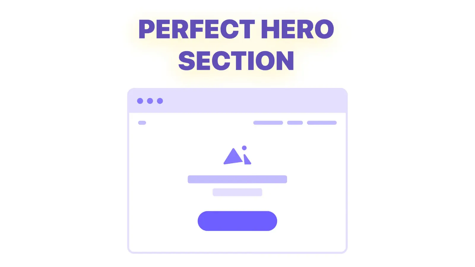
The five jobs of a hero section, before and after headline examples, hero patterns by business type, and how to design the first screen for a phone.