
How to Turn Your Website Into a High-Converting Sales Machine
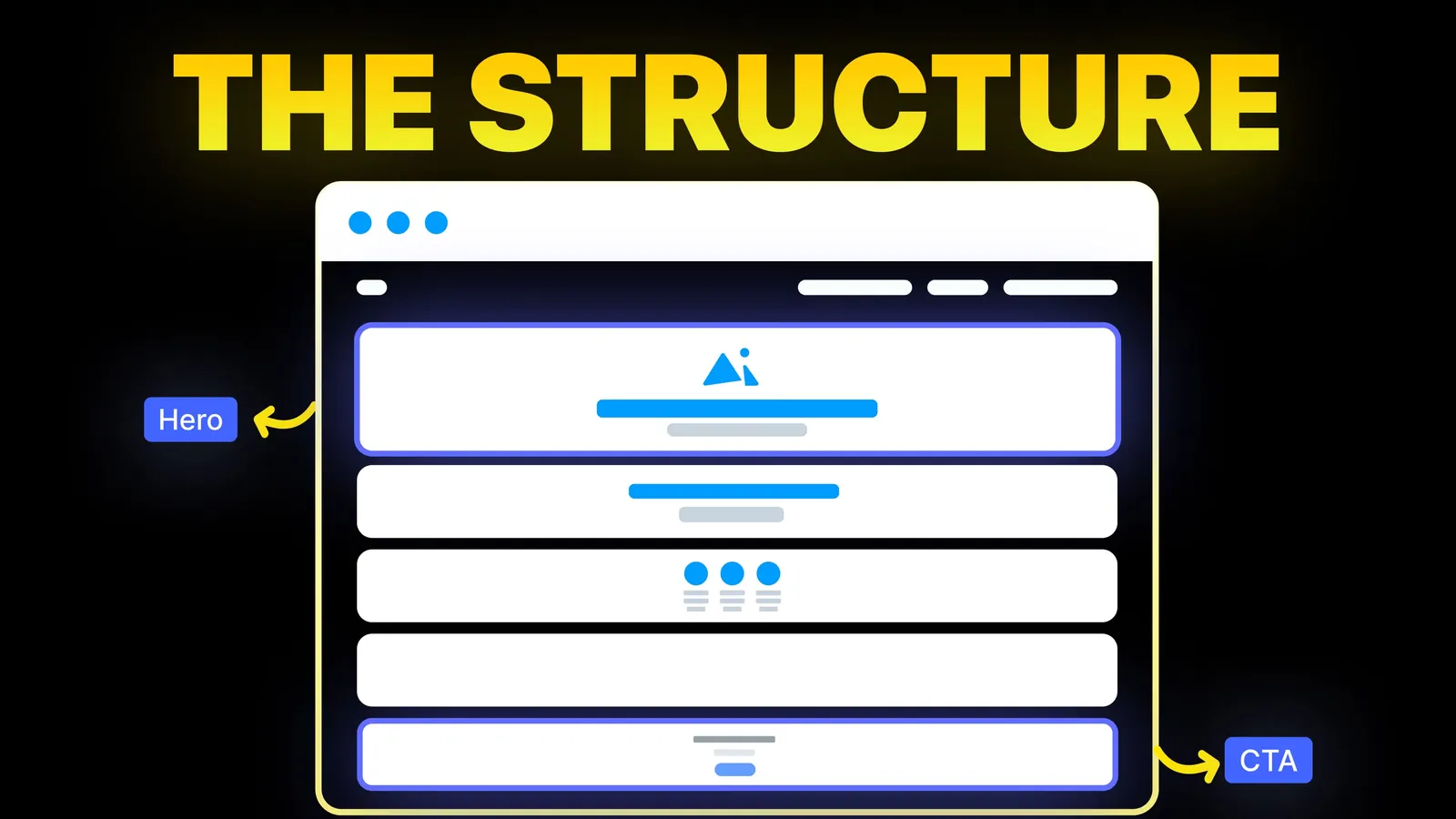
The structure behind a website that sells: the five decisions that carry conversion, the homepage section order, and how to rebuild without losing traffic.
Web Design
Most guides to mobile website design show pretty examples and repeat the same tips. This one ranks the fixes by what they change for a visitor, sorts out the three different tap target numbers you will see quoted, and shows how to test a site now that Google has retired its mobile test. Sources checked 2 November 2026.

Good mobile website design means a visitor can read, tap and finish their task with one thumb, on a slow connection, without zooming. Build one responsive site, since Google recommends that as the easiest pattern to implement and maintain. Then work through the list below from the top. If your budget or your afternoon runs out halfway, you will still have fixed the parts that lose enquiries.
The order is our judgement, based on how much of a visitor's task each problem blocks. Nothing here is a ranking factor list.
| # | Fix | What goes wrong without it | Effort |
|---|---|---|---|
| 1 | Main action works in one or two taps | The visitor wanted to call or book, and could not | Low |
| 2 | No sideways scrolling, no zooming to read | The page looks broken in the first second | Low to medium |
| 3 | Forms suit a phone keyboard | Enquiries are abandoned halfway | Low |
| 4 | Pop-ups do not cover the content | The visitor leaves before seeing anything | Low |
| 5 | Tap targets are big enough and spaced apart | Wrong link, back button, frustration | Medium |
| 6 | The first screen says what you do | Visitors cannot tell if they are in the right place | Medium |
| 7 | Images and scripts are light | Slow pages, which hurt most on weak signals | Medium to high |
| 8 | Menu is short and readable | People get lost or give up | Medium |
| 9 | Same content as desktop | Google and visitors miss what you hid | Medium |
Decide the one thing a phone visitor most wants. For a plumber, it is calling. For a studio, it may be a short enquiry. Make that action visible without hunting, and make your number a real tel: link so a tap starts the call. Then try it on your own phone. It sounds obvious, and it is the first check in our website audit checklist for that reason. Our guide to call to action examples covers the wording.
If a page moves left and right under a thumb, something is wider than the screen. The usual causes are a fixed-width image, a table, a long unbroken word or an embedded widget. Wide comparison tables should scroll inside their own box and not push the whole page sideways. Set body text large enough to read without zooming. Lighthouse used to fail pages where 40% or more of the text was under 12px, and Chrome's docs say that audit was removed in Lighthouse 13, so nothing automatic may warn you now. Your eyes have to do this one.
Forms are where mobile costs the most money, because the person has already decided to contact you.
inputmode values such as tel for a phone keypad, email for a keyboard with @, and numeric for digits.Google's guidance is to avoid covering the entire page, and to use banners that take up a small fraction of the screen. Its only stated exception is an interstitial that is legally required, such as an age gate, and even then it suggests overlaying the content. So a full-screen newsletter box on arrival is a poor trade on a small screen. Show an offer as a small banner, or after someone has read a while.
This is where guides disagree, and they rarely say why. They quote different standards in different units:
| Source | Figure | Status | Read on |
|---|---|---|---|
| WCAG 2.2, 2.5.8 Target Size (Minimum) | 24 by 24 CSS pixels | Level AA, with exceptions for spacing, equivalents, inline links and more | 2 Nov 2026 |
| WCAG 2.2, Target Size (Enhanced) | 44 by 44 CSS pixels | Level AAA, the stricter level | 2 Nov 2026 |
| Apple Human Interface Guidelines | 44 by 44 points on iOS and iPadOS | Default control size, with 28 by 28 as the minimum | 2 Nov 2026 |
| Google Material Design 3 | 48 by 48dp, about 9mm | "Consider" this for most platforms | 2 Nov 2026 |
So when one guide says 44 and another says 48, neither is wrong. They are quoting different makers. WCAG's 24 is the accessibility floor at AA. Apple and Google give platform guidance for designers. Here is the rule we would use on a marketing site:
The tappable area can be larger than what you see. Material's example is a 24dp icon whose padding makes a 48dp target. So a small icon does not have to mean a small target, and you can keep a design delicate without making it hard to use.
On a phone, a desktop hero often becomes a large photo, a long headline, and a button below the fold. Cut until the visitor can see what you do, for whom, and what to do next, within the first screen or close to it. Our hero section guide goes deeper, and homepage design ideas covers what follows it.
Google's Core Web Vitals give clear targets, measured at the 75th percentile of visits, split by mobile and desktop: LCP within 2.5 seconds, INP of 200 milliseconds or less, and CLS of 0.1 or less. Because mobile is reported separately, a site can pass on desktop and fail on phones. Our website speed guide has the fixes, so we will not repeat them here.
Motion deserves its own mention. An effect that feels smooth on a laptop can drag on an older phone, so simplify or turn off heavy scroll effects at the phone breakpoint. If you build on Webflow, our Webflow Interactions guide shows how to do this per breakpoint.
A long desktop menu rarely survives on a phone. Put the few pages that matter most at the top level, and make the phone number or main action reachable from the menu as well. A hamburger icon is fine, as long as the items inside are well spaced and easy to read. A dropdown tree three levels deep is not much use to a thumb.
Google says to make sure your mobile site contains the same content as your desktop site, and warns that it will not load content that needs a tap, swipe or typing to appear. So do not delete text on phones to make a page look shorter, and do not lazy load main content behind a button. Reorder, restyle and collapse with care instead. Check this before any redesign goes live.
Plenty of pages still point to Google's Mobile-Friendly Test. Google's own blog notes that the test and the Mobile Usability report were retired on 1 December 2023. Use this routine instead:
| Step | Tool | What it tells you |
|---|---|---|
| 1 | Your own phone, on mobile data, with Wi-Fi off | Whether the site feels slow, and whether a thumb can use it |
| 2 | A second phone, ideally an older one, and another brand | Problems your own device hides |
| 3 | Browser device mode, such as Chrome DevTools | Sideways scrolling and layout at several widths |
| 4 | PageSpeed Insights | Lab scores, and real visit data if your site has enough traffic |
| 5 | Search Console's Core Web Vitals report | Which groups of pages have problems for real visitors |
Device mode is a good first pass, not a final test. It cannot tell you how a button feels under a thumb, or whether you can read the page in daylight.
We ran a small check on four live amariq.com pages on 2 November 2026: the home page, the contact page, a service page and a blog post. Each loaded in a frame 390 pixels wide, and a script measured the page width and every button, form field and standalone link. Links inside sentences were left out, since WCAG treats those separately.
| Page | Controls measured | Under 24 by 24 | Sideways scrolling | Form field text |
|---|---|---|---|---|
| Home | 19 | 0 | None | 16px and 17px |
| Contact | 21 | 0 | None | 16px |
| Webflow development | 22 | 0 | None | 16px |
| Blog post | 11 | 0 | None | No form |
This is one simple script at one width. It does not replace a real phone. You can run the same idea on your site, or ask a developer to, in a few minutes, and the output gives you a list of controls to look at.
Usually not. Figma, Wix and others still answer the old "mobile URL vs desktop URL" question, because separate m. sites used to be common. Google recommends responsive design, and one set of URLs is simpler to keep correct. A web page also opens without an install, which suits a business people find through search. An app is a separate product, worth the cost only if people return often enough to keep it on their phone.
Webflow, Framer, Wix, Squarespace, Shopify and WordPress can all produce good phone pages. The platform matters less than whether someone checked each page at phone width. Our website builder comparisons cover the wider decision, and we would not move platforms purely for mobile reasons.
We design and test every page at phone width as part of the build, on whichever platform suits you. If an existing site loses enquiries on phones, we can review it and give you a ranked list of fixes, or carry out the fixes as part of a conversion-focused redesign. Work is priced from scope, never by the hour. See also web design and UI/UX.
It is planning a website so people can read it and use it comfortably on a phone. In practice that usually means one responsive site, a clear main action, forms that suit a thumb, and fast loading.
Aim for 44 pixels or more on main controls. W3C's AA floor is 24 by 24 CSS pixels and its AAA level is 44. Apple's iOS default is 44 by 44 points, and Material Design suggests 48 by 48dp.
Responsive describes the result: one site whose layout adapts to the screen. Mobile-first describes the working order: you start with the phone layout and add to it for larger screens. You can have both.
No. Google retired it, along with the Mobile Usability report, on 1 December 2023. Test on real phones, use browser device mode, then check PageSpeed Insights and the Core Web Vitals report.
Yes. Google says it uses the mobile version of a site's content for indexing and ranking. If a section exists only on desktop, assume Google may not count it. Mobile and desktop Core Web Vitals are also measured separately.
There is no single best width, as phones vary. Check a narrow phone, around 360 to 390 pixels wide, then a larger one and a tablet. Let the layout flow between them and do not design for one device.
Not on a phone, where space is short. The risk is hiding your main action inside one. Keep the call or enquiry button outside the menu wherever you can.
Set the field text to 16px or larger and test on an iPhone. Avoid viewport settings that block zoom for everyone, since people with low vision rely on it.

The structure behind a website that sells: the five decisions that carry conversion, the homepage section order, and how to rebuild without losing traffic.

How to make a product demo video: where it goes on a SaaS site, how to record it on a Mac, which recorder to pick and how to add it without slowing the page.

Call to action examples for small business websites by business type, with the real buttons on amariq.com, wording rules and the W3C size rule for tap targets.