
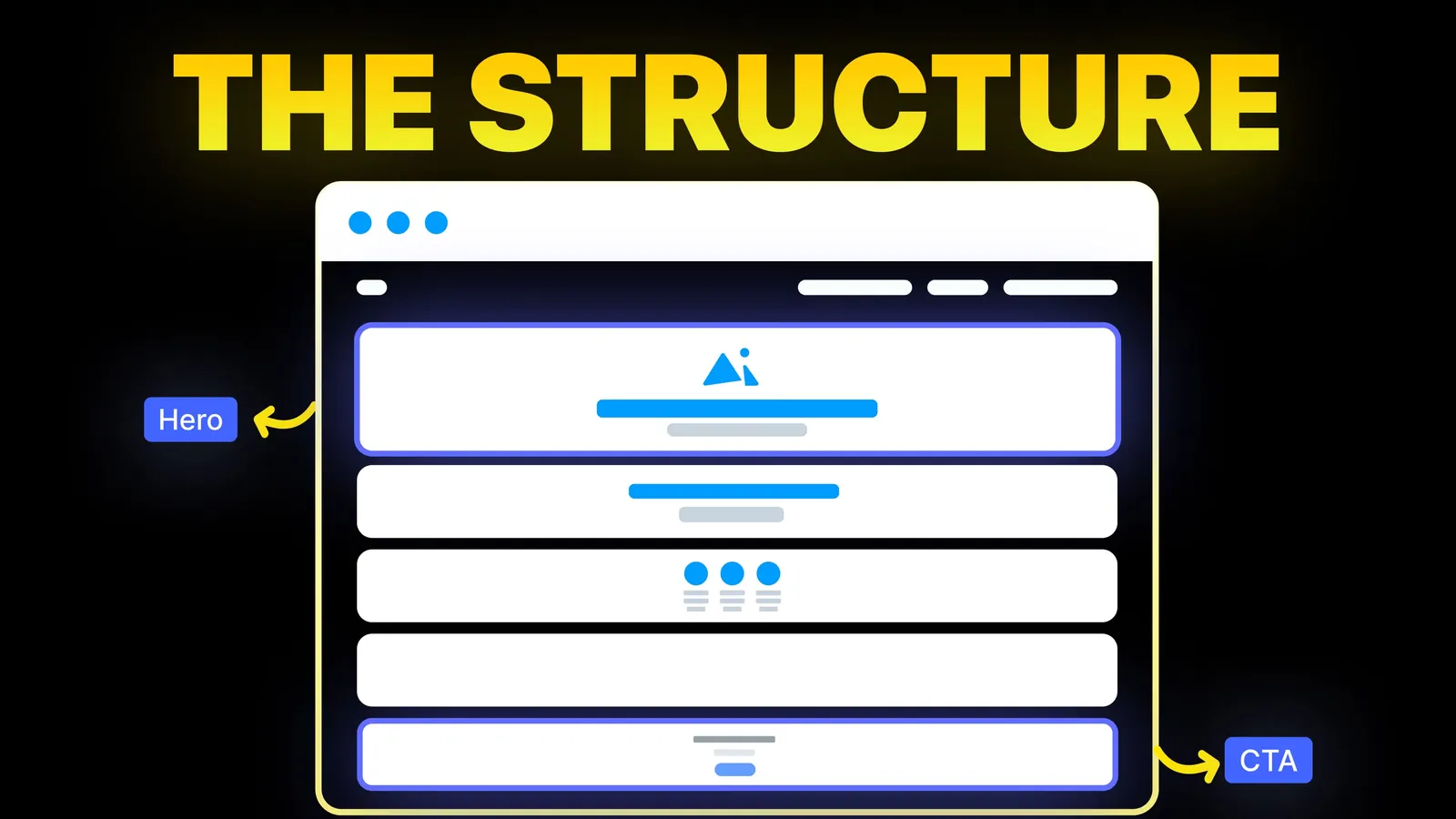
How to Turn Your Website Into a High-Converting Sales Tool
The structure behind a website that sells: the five decisions that carry conversion, the homepage section order, and how to rebuild without losing traffic.
Web Design
Search for website layout examples and you get the same dozen names in every list: grid, split screen, zig-zag, F-pattern, magazine, cards. The lists rarely say which one a plumber, a shop or a consultant should pick, and several teach the F-pattern as a layout to copy when the people who found it call it a warning sign. This guide sorts the layouts by business type and by page, and uses the Nielsen Norman Group's eye-tracking figures, read on 16 November 2026.
A website layout is the arrangement of blocks on a page: where the headline, pictures, text and buttons sit. For a service business, use a full-width opening section with one headline and one button, then zig-zag rows that pair each service with a picture. For a shop or a portfolio, use a card grid. For articles and legal pages, use a single column. For a business with one offer, a one-page layout is enough. Put the thing the visitor came for in the first screen, lean important items to the left, and break long text with headings so people do not skim past it.
Who is writing: Amariq is a web design studio that builds on Webflow, Framer, WordPress, Shopify and static hosting. The figures on this page are from Nielsen Norman Group articles, read on 16 November 2026. Nothing here was measured by us.
On 16 November 2026, Google (US, English) returned these for "website layout examples": Figma's 12 layout ideas, the Awwwards layout collection, Dribbble, the Made in Webflow layout gallery, ColibriWP's 19 layouts (its title still says "update 2021"), a Pinterest board, Namecheap's 10 layout examples (9 April 2026) and Eleken's 50 website design examples.
The written guides agree on the names. Figma lists grid, split screen, asymmetrical, full screen, side scrolling, card, magazine, gallery, zig-zag, F-pattern, interactive and animated. Namecheap lists single column, content focused, grid, asymmetrical, split screen, Z-pattern, F-pattern, full-screen image, magazine and card based, each with one site as an example.
Two things are missing. None of them starts from the reader's business and says "you run a clinic, use this". And the F-pattern is presented as a design to follow. Namecheap calls it "another great design for a blog". The research it comes from says the opposite, which we cover below.
| Layout | What it looks like | Works for | Watch out for |
|---|---|---|---|
| Single column | One stack of content down the middle of the page | Articles, legal pages, simple landing pages | Long text with no headings gets skimmed |
| Split screen | Two halves side by side, often text and picture | Opening sections, sign-up pages, two audiences | Halves must stack sensibly on a phone |
| Zig-zag rows | Rows that alternate picture left, text right, then the reverse | Service and feature sections | More than five or six rows feels endless |
| Card grid | Equal boxes in rows, each a link | Products, projects, blog lists, team pages | Cards with uneven text look ragged |
| Sidebar | Main column plus a narrow column | Blogs, documentation, filters in a shop | The side column drops below on phones and is often never seen |
| Full-screen hero | One picture or video fills the first screen with a headline over it | Hotels, restaurants, photographers, events | A visitor may not realise there is more below |
| Magazine | Mixed sizes: one large story, several small | News, large blogs, publishers | Needs a steady supply of new content |
| One-page | The whole site as sections of one long page | One service, an event, a new business | Hard to rank for many different searches |
Asymmetrical, interactive and animated layouts, which appear in most lists, are styles laid over one of these eight. They change the feel, not the structure.
This is the table the other lists do not have. Each row is a page order we would start from, written as a plain list of sections from top to bottom.
| Business | Home page layout | Why |
|---|---|---|
| Local trade (plumber, electrician, cleaner) | Opening section with headline, phone button and service area; three or four service cards; zig-zag rows of proof (reviews, licences, photos of real jobs); enquiry form | The visitor wants to know "do you do this, near me, and can I call now". Everything else is support |
| Professional firm (lawyer, accountant, consultant) | Split screen opening with headline and one button; card grid of practice areas; zig-zag rows about how you work; people; contact | Buyers compare several firms, so the services and the people must be easy to find |
| Restaurant or cafe | Full-screen hero with a photo, opening hours and a booking button; menu as a single column of text; location and map | Food sells by photo, but hours, menu and booking must be readable text in the first screen or just below |
| Online shop | Short opening banner; card grid of categories; card grid of best sellers; reviews | People came to browse. A grid lets them scan many items quickly |
| Photographer, designer, architect | Card or gallery grid of projects straight away; a short line about who you are; contact | The work is the pitch. Text before the pictures only delays it |
| Software or app | Split screen opening with product screenshot; zig-zag rows, one per feature; pricing cards; sign-up | Each row answers one question and shows the screen that proves it |
| Coach, therapist, solo consultant | One-page layout: who it is for, how it works, about you, prices or next step, booking | One offer and one action do not need five pages |
| Blog or publisher | Magazine layout on the home page, single column for each article | The home page helps people choose; the article page helps them read |
Our own guides go deeper on several of these: plumber website design, lawyer website design, restaurant website design, ecommerce website design, photographer website and the five-page structure for a software site.
The home page is one decision. The inner pages each have their own best fit.
| Page | Layout that usually fits | Reason |
|---|---|---|
| Home | Opening section, then zig-zag rows or cards | It routes people to the right inner page |
| Service page | Single column with headings, a price or process table, a form at the end | People read this page more carefully than any other |
| Product list | Card grid with filters in a sidebar | Scanning and narrowing down |
| Product page | Split screen: pictures left, price and button right | The buying details stay beside the picture |
| About | Zig-zag rows of story and photos | Breaks a long story into short steps |
| Blog post | Single column, lines kept short | Reading comfort |
| Contact | Split screen: form on one side, phone, address and hours on the other | Both ways of getting in touch are visible at once |
| Landing page for an ad | Single column or one-page, no menu | One message and one action |
For page-level detail, see our guides to services page design, contact page design and landing page structure.
Three NN/g findings should shape any layout.
Most attention goes to the top. In "Scrolling and Attention" (15 April 2018), NN/g analysed more than 130,000 eye fixations from 120 participants. Users spent about 57% of their page-viewing time above the fold and 74% in the first two screenfuls. In its 2010 study the first screen took 80%. People scroll more than they used to, but attention still drops sharply after the first screen. NN/g's advice is to reserve the top of the page for high-priority content and keep major calls to action above the fold.
The left half gets more than the right. In "Horizontal Attention Leans Left" (22 October 2017), NN/g reported that 80% of viewing time fell on the left half of the page and 20% on the right. That figure is for languages read left to right. It is a good reason to put the headline and the main button on the left of a split screen and the picture on the right.
Full-screen sections can hide the rest of the page. NN/g warns about "false floors": a first screen that looks complete, so the visitor does not scroll. Its fix is a visible hint, such as the top of the next section showing at the bottom of the screen.
These are averages across many sites and tasks, not a promise about your page. They tell you where to put the important thing, not what the important thing is.
Several layout lists include an "F-pattern layout" and suggest arranging a page along an F shape. The pattern comes from NN/g's eye-tracking work in 2006, and NN/g revisited it in "F-Shaped Pattern of Reading on the Web: Misunderstood, But Still Relevant" (12 November 2017, last reviewed 19 August 2026).
That article says three things plainly. Scanning does not always take the shape of an F. People fall into the F when a page has text with little or no formatting and they want to finish quickly. And the F-shape is "bad for users and businesses", because readers skip content simply because of where it happens to sit in a column.
So the F is what happens when a layout gives the eye no help. NN/g's remedies are layout and writing choices: put the most important points in the first two paragraphs, use headings that look different from body text, start headings with the words that carry the meaning, group related content with a border or background, use bullets and numbers, and cut what is not needed. NN/g names a healthier pattern too, the "layer cake", in which the eye moves from heading to heading and reads only the sections it wants. A page with clear headings invites that.
Our homepage design ideas and web design principles guides cover the tests to run once the layout is in place, and mobile website design covers the phone check.
We plan the layout before any visual design: the action each page should lead to, the sections that support it, and the order they appear on a phone. Then we design and build it on the platform that suits you. Projects are quoted from the agreed scope and not billed by the hour, with payment split 40% to begin, 30% when you approve the design and 30% ahead of launch. After the final payment the design, copy and code are your property, and the domain, hosting and analytics accounts are registered to you. See our web design service or tell us about your site.
It is the arrangement of the blocks on a page: where the headline, text, pictures, menu and buttons sit, and in what order they appear as you scroll. The layout is the structure. Colours, fonts and photos are laid over it.
For most service businesses: an opening section with one headline and one button, service cards, zig-zag rows of proof and a contact form. It answers what you do, where, and how to reach you within the first two screens, which is where NN/g found 74% of viewing time goes.
A full-width opening section followed by stacked rows, some as cards and some as picture-and-text pairs. It is common because it turns into a single column on phones without extra work.
No. NN/g, which identified the pattern, says it appears when text has little formatting and that it is bad for users and businesses. Use headings, short paragraphs and lists so readers find what they need instead of skimming down the left edge.
It can be, if you have one service and one action. If you offer several services or want to be found for several different searches, separate pages work better. Our guide to choosing between a website and a landing page covers the decision.
On a desktop, one column for long text, two for a picture beside text, and three or four for cards. On a phone, almost everything should become one column.
This is not legal advice. Using a common arrangement, such as a grid of cards, is normal practice across the web. Copying another site's text, images, logo or code is a different matter and can infringe copyright or trade marks. If you are unsure, ask a lawyer.

The structure behind a website that sells: the five decisions that carry conversion, the homepage section order, and how to rebuild without losing traffic.
Eight homepage design ideas for businesses that sell by enquiry, with when to use each, plus the section order of amariq.com's own homepage.
We measured 18 homepages from two popular best-of lists: headline length, first-screen action, page length and words. What they share, and what to copy.