
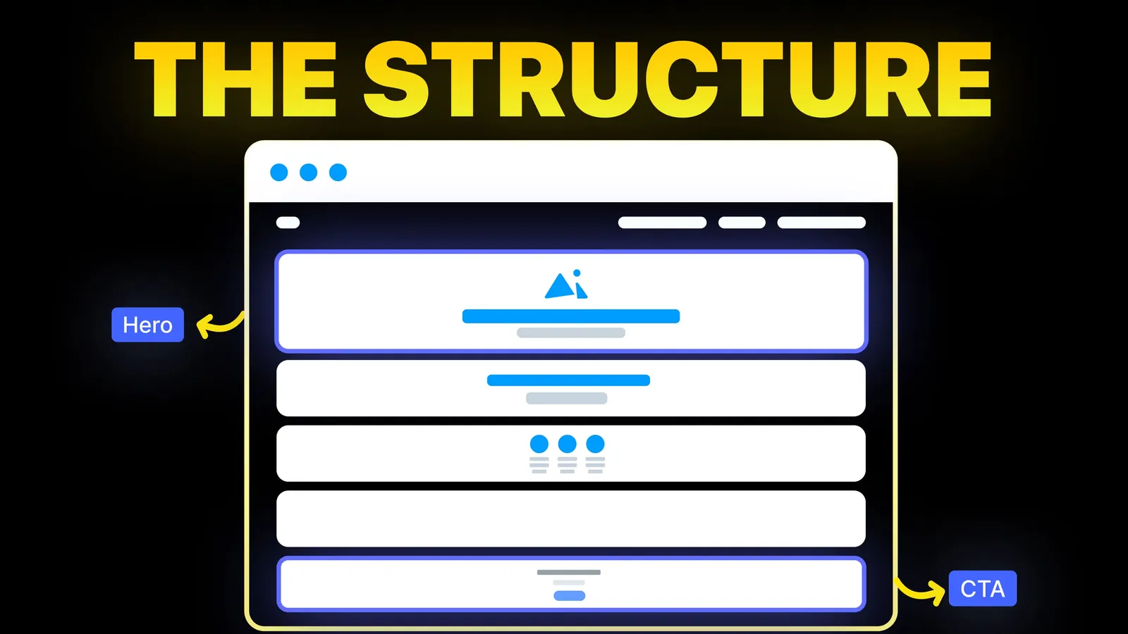
How to Turn Your Website Into a High-Converting Sales Machine
The structure behind a website that sells: the five decisions that carry conversion, the homepage section order, and how to rebuild without losing traffic.
Web Design
Lists of the best homepage designs show you screenshots and tell you to keep it simple. We wanted numbers, so on 2 November 2026 we opened the first ten homepages on two popular lists and measured them: how long the headline is, what the first button says, and how far the page runs.
The best homepage design tells a stranger what you do in under ten words, gives them one obvious next step in the first screen, then earns the scroll with proof and detail. That is the common ground across the pages we measured. Almost everything else, including length, word count and visual style, differs widely. So look for what matches your own business and pay less attention to what is fashionable.
Best-of pages rarely explain how they chose or give any figures. Eleken's list of 35 examples (updated 1 May 2026) judges on things like value proposition and social proof, and cites no research. Wix's list of 15 global brands and 5 small businesses (updated 20 October) says its selection is the author's judgement, and it reports no metrics. Both are useful for ideas, and we are not criticising them for being what they are. Awwwards, Dribbble and Webflow's gallery, which also rank for this search, are galleries.
So we ran a small test of our own:
Be careful with this data. It is a small sample, and it mixes consumer brands with software companies. We loaded pages from outside the US, so some may differ by country. Word counts include menus and footers. A button styled as an image or gradient may have been missed. Airbnb uses an inner scrolling area, so we could not read its page length. These are snapshots of one day.
| Homepage | H1 | Words in H1 | First-screen action | Screens | Words on page |
|---|---|---|---|---|---|
| Slack | All your people and AI agents working together | 8 | Get started | 12.5 | 1,192 |
| Starbucks | No visible H1 | n/a | Start an order | 2.6 | 277 |
| Uber | Go anywhere | 2 | See prices | 6.7 | 443 |
| Lyft | No visible H1 | n/a | Apply to drive | 5.7 | 479 |
| Lemonade | Forget everything you know about insurance | 6 | Check our prices | 7.6 | 1,330 |
| Airbnb | No visible H1 | n/a | None detected (search bar) | Not read | 2,252 |
| Dropbox | Get to work, with a lot less work | 8 | Try Dropbox free | 11 | 794 |
| Four Seasons | Discover Four Seasons | 3 | Check rates, among others | 5.6 | 1,962 |
| NYC Ballet | Experience the magic Nutcracker opens Nov 27 | 7 | None detected | 9.3 | 636 |
| Postscript | Retention, Rebuilt | 2 | Book a demo | 7.8 | 455 |
| Gaiia | grow better with gaiia. | 4 | Book a demo | 10.2 | 1,444 |
| Lago | Billing for AI products, from usage to invoice | 8 | Book demo | 14.9 | 498 |
| Exa | The world's data for AI agents | 6 | Try API for free | 9.4 | 1,913 |
| Doppler | One platform. Every secret. Human or AI. | 7 | Start for free | 7.6 | 555 |
| FlutterFlow | Build Better. Launch Faster. | 4 | None detected | 14.1 | 1,091 |
| AssemblyAI | Industry leading voice models. Infrastructure built to run them. | 9 | Get started | 14 | 933 |
| Nash | Autonomic Logistics. | 2 | Talk to Nash | 14 | 1,196 |
| Ashby | What an ATS should be. | 5 | Get in touch | 6.9 | 587 |
The medians are our own arithmetic. For H1 words, we used the 15 pages with a visible H1. For screens, we used the 17 pages we could read. For words, we used all 18.
Not one measured headline ran past nine words. Four had three words or fewer. Short does not automatically mean clear, though, and the sample shows this well. Look at the two kinds:
If people already know your name, a slogan can be enough. If they arrived from a search and have never heard of you, name what you do. Our hero section guide has patterns and a test for this.
15 of 18 pages had a clear button in the first screen. Here is what those buttons ask for:
| What the button asks | Count | Examples |
|---|---|---|
| Talk to us or book a demo | 5 | Book a demo, Get in touch, Talk to Nash |
| Try or start now | 5 | Get started, Try Dropbox free, Start for free |
| Buy, order or see a price | 4 | Start an order, See prices, Check rates |
| Join in another way | 1 | Apply to drive |
Notice how closely the action follows the sale. Software people can try gets a "try" button. Expensive software with a sales team gets "book a demo". A hotel gets "check rates". So your first question is not what colour the button should be. It is what a visitor could reasonably do next. Our call to action examples cover the wording by business type.
The three exceptions tell you something too. Airbnb's first screen is its search, so the page itself is the action. A ballet company leads with a show, and its tickets may sit in links our script did not read. FlutterFlow's button may simply be styled in a way our script missed. A lack of a button is not automatically a flaw if the visitor still knows what to do.
Sixteen of the 17 pages we could read ran past five screens. Only Starbucks was shorter, at 2.6, perhaps because so many of its visitors simply want to order. Long pages are normal in this sample, as long as each part earns its place. Wix and Eleken both name social proof as a common element, though we did not measure it in this test.
Length. The longest page is nearly six times the shortest. In this sample, B2B software pages tend to be longest: Lago, FlutterFlow, AssemblyAI and Nash all reach 14 screens or more. They have complicated products to explain and buyers who read closely. Consumer pages with an obvious next step are often shorter.
Words. Lago uses 498 words across 14.9 screens, leaning on visuals. Four Seasons uses 1,962 across 5.6. A count on its own tells you very little, so stop trying to hit a word target.
Style. We did not score looks, because that would be our taste and not a measure. Scroll Awwwards and Dribbble and you will see every style win praise. That should reassure you: visual trends do not decide whether a homepage does its job.
Copy these:
Leave these:
Most businesses reading this are not Slack. They are studios, clinics, trades and consultancies, where the sale begins with a conversation. Our guide to homepage design ideas that get enquiries is written for that case, with eight patterns and a five-minute check. Use this post to set your expectations, and that one to plan your page. For a landing page that has a single goal, see our landing page structure guide instead.
Run the same checks we ran, by eye:
| Check | How to do it | What you want |
|---|---|---|
| Headline length | Count the words | Under 10, and clear to a stranger |
| First-screen action | Load the page, do not scroll | One obvious next step, starting with a verb |
| Screens | Scroll and count | Whatever your buyer needs, with no filler |
| Stranger test | Show it to someone for five seconds | They can say what you sell and what to do next |
| Phone check | Repeat on your own phone | The same answers |
If your page fails the first two, you can fix those in an afternoon, and without a redesign. If it fails more broadly, read our signs your website needs a redesign.
We design homepages around what a visitor needs to do next, and we start from your sale and not from a trend. If yours looks fine but brings in few enquiries, we can review it against the checks above and rebuild what needs it, on Webflow, WordPress, Shopify or Framer. See web design and UI/UX and conversion-focused redesign.
A stranger can tell within seconds what you do and what to do next. In our sample, that came from a headline of nine words or fewer and, on 15 of 18 pages, a clear action button in the first screen.
There is no set length. The pages we measured ran from 2.6 to 14.9 screens, with a median of 9.3. Include what your buyer needs in order to decide, and stop there.
There is no target either. We counted 277 to 2,252 words, with a median of about 860, including menus and footers. Complex products usually need more than simple ones.
Start with a clear headline, one main action, proof such as reviews or logos, what you offer, how it works, and the same action again at the close. Order them by what your visitor asks first.
Awwwards, Dribbble and Webflow's gallery are good for visual ideas. Eleken and Wix explain their picks. Treat all of them as ideas, as none of them shows sales results.
We do not know. Neither the lists nor we have access to their sales data, and a page can be praised while performing badly. Only your own analytics can tell you how yours does.
One main action works best in the first screen, and a second, softer option can sit beside it. Lago and Ashby both pair a main button with a way to see more.
There is no fixed schedule. Change it when your offer or audience changes, or when your numbers show visitors are not taking the next step. Small changes to the headline and action often come first.

The structure behind a website that sells: the five decisions that carry conversion, the homepage section order, and how to rebuild without losing traffic.
How to design a services page and each single service page, section by section, with the buyer question every part answers. Checked 26 Oct 2026.
Traffic but no enquiries? Here is how to find where visitors drop off, the eight reasons a site stops converting, and a two-week plan to fix it.