
How to Turn Your Website Into a High-Converting Sales Machine
The structure behind a website that sells: the five decisions that carry conversion, the homepage section order, and how to rebuild without losing traffic.
Conversion
Traffic but no enquiries is a structure problem far more often than a traffic problem. Here is how to find the drop-off, and what to change first.
A website converts when a visitor does the one thing that page was built for. Booking a call. Sending an enquiry. Starting a trial. Adding to cart. If people arrive, scroll, and leave without doing any of it, the traffic is not the problem. The page is not helping anyone make a decision.
That distinction matters, because the usual reaction is to buy more traffic. More visitors on a page that does not convert simply costs more per lost visitor.
Most conversion advice tells you what to fix. Almost none of it tells you where to look first, so people redesign the section they dislike rather than the section that is losing them money.
Three readings, in this order, will tell you more than any opinion:
We run this on every conversion focused website redesign before touching a single layout, because the page people complain about and the page doing the damage are rarely the same page.
A visitor gives you a few seconds to answer three questions: what is this, is it for me, and what happens next. A headline like "innovative digital solutions" answers none of them. Name the outcome and name the audience. Our full breakdown of that first screen is in hero section design.
Pages that offer a call, a newsletter, a brochure and a chat widget all at once feel helpful and convert badly. Every extra option is another decision. Choose one primary action for the page, repeat it, and demote everything else to a plain text link.
Logos, reviews and results usually sit near the bottom, which is where the people who already believed you get to see them. The visitors who needed convincing left long before. Put one piece of proof within the first screen and keep proof beside each claim.
"Built on a modern stack" is a fact about you. "Your team can publish a new page without a developer" is a change in the reader's week. Features belong in the detail sections, after the reader knows why they should care. There is a step by step method in our guide to writing website copy that converts.
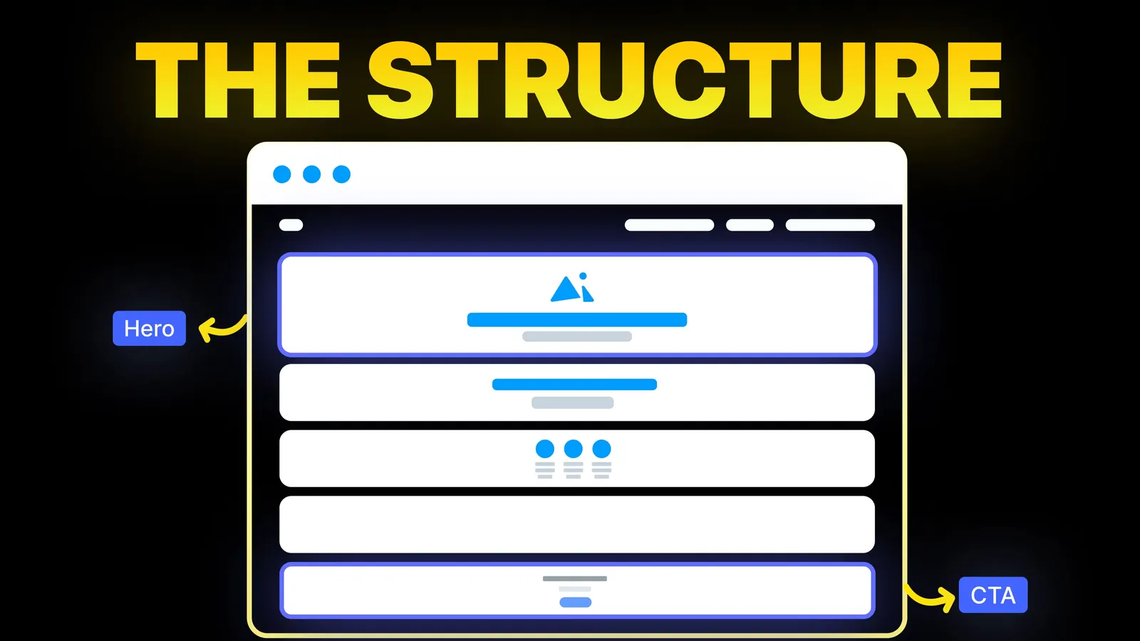
A page that jumps from a headline straight to pricing asks people to judge cost before they understand value. The order that works follows the way people actually decide: problem, promise, proof, how it works, objections, then the ask. That sequence, with real examples, is in landing page structure that actually converts.
A first enquiry does not need a company size, a budget range and a phone number. Every field is a reason to stop. Ask for what you need to reply, and collect the rest in the conversation that follows. For made-to-order trades the balance tips the other way, because specifics qualify the lead: see how a custom furniture maker's form was rebuilt.
Price, timeline, switching cost, "will this work for a business like mine". People carry these questions the whole way down the page. If your site never names them, the visitor resolves them alone, and the safe answer for them is to do nothing. A short FAQ close to the call to action removes more friction than another round of visual polish.
Speed is a conversion issue long before it is a ranking issue. So is a tap target too small for a thumb, a sticky bar that covers the button, or a form that zooms the page when a field is focused. Test the whole journey on a real phone, on a normal connection, not on a desktop window made narrow.
You do not need a rebuild to see movement. This order front-loads the cheap changes.
| Days | What to change | Why it goes here |
|---|---|---|
| 1 to 2 | Rewrite the headline and subheading to name the outcome and the audience | Highest reach on the page, and it costs nothing |
| 3 to 4 | Cut to one primary action and repeat it down the page | Removes the decision that stalls people |
| 5 to 7 | Move one piece of proof above the fold and pair proof with claims | Answers doubt at the point it appears |
| 8 to 10 | Reduce the form to the fields you need to reply | Usually the single biggest measurable lift |
| 11 to 12 | Add a short objection FAQ beside the call to action | Catches the questions that end a visit quietly |
| 13 to 14 | Fix the phone experience and the slowest images | Protects everything above on the device most people use |
Change one thing at a time and give each change enough traffic to mean something. Two changes shipped together will teach you nothing about which one worked.
Patching stops working when the problem is structural: the site says something the business has outgrown, the page order cannot be fixed without moving sections, or the content management setup makes every edit a developer ticket. At that point a redesign is cheaper than another year of patches. Our own approach to that rebuild is in how to turn your website into a high converting sales machine, and the website optimization service covers the smaller, faster version of the same work.
Start with scroll depth and the pages people see right before they leave. Fix the earliest point where people drop, because everything below it is currently unread.
A headline or form change on a page with steady traffic usually reads within two to three weeks. Low traffic pages take longer, so judge those on enquiry quality rather than percentages.
Ship one at a time on your main page. Bundling changes makes it impossible to know what helped, and the instinct afterwards is to keep all of it, including the part that hurt.
No. Mismatched traffic looks identical from the inside. If an ad promises a price the page never mentions, the page is not the thing that broke the promise.
Usually not. Most sites have more to gain from clarity, proof and a shorter form than from new visuals. A redesign earns its cost when the structure itself is the limit, and the tests for each sign of a redesign show how to tell.

The structure behind a website that sells: the five decisions that carry conversion, the homepage section order, and how to rebuild without losing traffic.
Conversion optimization from zero: what to measure, how to set up tracking, how to choose what to fix first, and how to run a change without fooling yourself.
The anatomy of a landing page, section by section: what each block has to prove, the order that matches how people decide, and how to know a section is failing.