
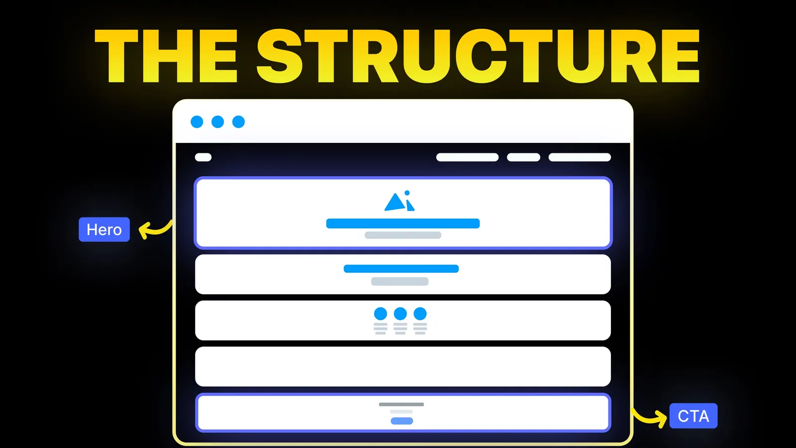
How to Turn Your Website Into a High-Converting Sales Tool
The structure behind a website that sells: the five decisions that carry conversion, the homepage section order, and how to rebuild without losing traffic.
Web Design
Most advice on thank you pages is about the second ask: a discount, a download, a follow button. That comes after the part that matters more, telling someone their form or order worked and what happens next. This guide puts the confirmation first, then one next step, then the build rules nobody lists: keeping the page out of search, counting each conversion once and announcing the message to every visitor. Sources were read on 13 November 2026.
A good thank you page tells the visitor what just happened, what they will get and when, who to contact if it does not arrive, and then gives one useful next step. Behind the page it is kept out of search, counted once for analytics and readable by a screen reader. Whether it is a separate page or a message on the same page matters less than getting those parts right.
Who is writing: we are Amariq, a web design studio. The rules quoted come from Unbounce, Google Search Central, Google Analytics and the W3C, read on 13 November 2026.
For "thank you page design", Google (US, English) showed on 13 November 2026 galleries (Dribbble, Mobbin, Webflow's showcase, SaaSFrame, Behance), template pages (OptimizePress, Envato, AidaForm, SeedProd), and example lists from FluentCRM (30 July 2026), Unbounce (updated 1 February 2024), HawkSEM (updated 8 January 2025) and others. Unbounce's guide, which we read in full, is the most useful. It argues the page is not the end of the transaction, and suggests telling people what to do next, inviting them to follow or subscribe, offering an event invite or a promo code, and putting a download link on the page rather than relying on email alone.
What the lists mostly leave out is the build side: where the page should not appear, how to stop double counting, what a visitor sees if they land on it directly, and how it is announced to people who cannot see it. They also lean towards the extra ask. For a small business taking quote requests, the extra ask should be the smallest part of the page.
Here is sample wording for a quote request. It is an example, not a template to paste:
Thanks, your quote request is in. We will reply from the address on your confirmation email within one working day with questions or a price. If it is urgent, call the number below. If you do not see our email, check your spam folder.
| Form | Sensible next step | Skip |
|---|---|---|
| Contact or quote request | Read one relevant case study or prepare a short brief | Newsletter pop-up |
| Booking or call | Add to calendar, what to prepare, how to reschedule | A discount code |
| Newsletter signup | Link to the best three posts, with the confirmation email note | Asking for a second form |
| Download | A download link on the page, as Unbounce suggests, plus the email copy | Hiding the file behind another step |
| Purchase | Order number, delivery information, how to reach you | Upsell before they have read the receipt |
| Donation | Receipt timing, what the gift does | A second ask on the same screen |
Unbounce's examples show bigger asks: an invitation to an executive briefing, a loyalty programme sign-up, and a follow-up question that routes people to more content. Those come from companies with an established funnel and traffic to test against. For a small site, one clear link is plenty. For the form itself, see contact page design and for the donation case nonprofit website design.
Nobody should find a thank you page from Google. Google's documentation says the rule is set with a robots meta tag or an X-Robots-Tag header, and that when Googlebot crawls the page and sees it, Google drops the page from results. It also says the rule only works if the page is not blocked by robots.txt, because a crawler that cannot fetch the page never sees the rule. So do not block thank you pages in robots.txt as a shortcut. See our robots.txt guide. Google also says it can take months for Googlebot to revisit a page, and that the URL Inspection tool shows the HTML it received.
A page you do not want in search should not be in the file that lists pages for search. Check your sitemap after you add the page.
If your analytics counts a visit to the page as a conversion, a reload or a returning visit counts again. Google Analytics' reference for the purchase event says the transaction_id parameter is required and helps you avoid duplicate events for a purchase. Use the same idea for any conversion that has an ID, such as an order number, and test it by reloading the page and checking you get one count.
Someone will open the address without submitting anything, from a bookmark or an old email. Show a short, polite page with a link to the form instead of a "your order is confirmed" message that is not true.
WCAG 2.2 success criterion 4.1.3 (Status Messages, level AA) says status messages should be programmatically determinable through role or properties so assistive technology can present them without receiving focus. If your confirmation appears on the same page after a submit, announce it that way. If you send people to a new page, put the message as the first thing in the page and set the page title to say what happened. See our accessibility checklist.
If the form fails to send, the visitor must see an error, with their entries kept, not a thank you. Test a failed send, as well as a good one.
| Separate page | Message on the same page | |
|---|---|---|
| Good for | Tracking by address, longer next steps, tools that count page views | Short forms, keeping people in context |
| Watch for | No-index, sitemap, direct visits, double counting | Announcing the change to assistive technology, keeping the message visible |
| A sensible default | Orders, bookings, downloads | Short contact forms |
Neither is wrong. Pick the one your analytics and platform handle cleanly, then test both the success and failure paths. For Webflow forms specifically, see Webflow forms. For a tour request, as on a daycare website, say when you will call to confirm the time.
Add it to your website audit checklist and to the redesign checklist so it survives the next rebuild.
We plan the confirmation step with each form, test the success and failure paths before launch and set the page up so it is counted once and kept out of search. Quotes come from the scope, never the clock, with payment of 40% to start, 30% at design approval and 30% before launch. Once the final payment is made the design, copy and code belong to you, and the domain, hosting and analytics accounts sit in your name. See our web design service.
What happened, what the visitor gets and when, who to contact if it does not arrive, and one next step. Put the confirmation first.
Either works. A separate page helps with tracking by address and longer next steps. A message on the same page suits short forms, as long as it is announced to screen readers.
A small, relevant next step is fine. A big upsell before the visitor has read their confirmation tends to feel pushy. Unbounce suggests promo codes and sign-ups, but start with the confirmation.
No. Use a robots meta tag or header that blocks indexing, and do not block the page in robots.txt, or Google cannot see the rule.
Send a unique ID with the conversion where you can, as Google Analytics' purchase event does with transaction_id, and test by reloading the page.
A short confirmation that tells people to check their inbox, with a note about the spam folder and one link to your best content.
Short. A few lines of confirmation and one next step is enough for most business sites.
You need a confirmation. It can be a separate page or a message on the same page. It must say the message was sent and when to expect a reply.

The structure behind a website that sells: the five decisions that carry conversion, the homepage section order, and how to rebuild without losing traffic.
FAQ page design that works: where questions come from, when to use accordions, accessible markup, and FAQ schema after 2026. Checked 15 Nov 2026.
Website layout examples by business type and page: which layout fits a service firm, shop, restaurant or portfolio, with eye-tracking data. Checked 16 Nov 2026.