
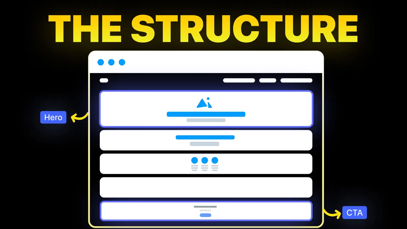
How to Turn Your Website Into a High-Converting Sales Machine
The structure behind a website that sells: the five decisions that carry conversion, the homepage section order, and how to rebuild without losing traffic.
Web Design
Most about page guides show screenshots and say "tell your story". A screenshot shows a look, not the order of the sections or the job each one does. This guide describes three real about pages by their structure, as they appeared on 1 November 2026, adds what research says visitors want from the page, and ends with a section order you can adapt to your own business.
A good about page does six jobs in this order: say in two sentences who you are and who you help, show the people, give the reason you exist, back it up with proof, answer the practical doubts, and offer one next step. A solo consultant needs a face and a story. A store needs materials, sourcing and returns. A company with a team needs people and values.
Disclosure: Amariq is a web design studio, and our own about page is one of the examples below. We have not measured how any about page performs, so everything here is design reasoning with sources named.
On 1 November 2026 we searched Google (United States, English) for "about page examples". The first page was mostly written guides from Printful, DreamHost, HubSpot, Shopify, Search Engine Land, Wix, Liquid Web and Fiverr. We read Shopify's guide, two Nielsen Norman Group articles and Google's helpful content page. We make no claims about the others.
Shopify's guide (published 8 September 2026) lists eight elements:
It then goes through ten store pages, each with one lesson. That list is sensible. What it does not give is the order of the parts, how the answer changes with the kind of business, or a look at what is on a live page today. This guide covers those three.
We opened each page on 1 November 2026 and wrote down what was visibly there. We describe the structure and tone, not the quality. Treat this as a snapshot.
| Basecamp, /about | Buffer, /about | Allbirds, Our Story | |
|---|---|---|---|
| Spine | One long first-person letter from the founder | Team, values and story on one page | Brand story with a timeline |
| Opening | Heading "Where we came from" | "About us" heading and a short intro with a team photo | Headline over a full-width image, then a short brand statement |
| Middle | Origin, the problem, building the tool, the change of direction, the ongoing promise | A filterable grid of team members, six named values, a multi-paragraph story | A timeline carousel, two split sections on materials and sustainability, two pull quotes with portraits |
| Proof | The story itself, plus a figure inside the letter | Four company numbers shown with links to open dashboards | Founding and launch years, a certification, a third-party check on a carbon method |
| Ending | Thank you, a contact email, a signature, a newsletter box, then a try-it button | Footer links | Newsroom cards, an email signup, footer |
| Tone | Personal, candid, humble | Warm, friendly, optimistic | Brand voice, mission led |
What the three share is a clear spine. What they do not share is a template. A founder letter suits a founder-led brand, a team grid suits a business where people are the product, and a timeline suits a history that explains the product. Pick the spine that matches what your buyers doubt.
The core NN/G article on About Us information was published on 26 May 2019 by Anna Kaley and Jakob Nielsen. It draws on more than 70 users and 100 websites tested. We read it on 1 November 2026. The points that matter for a small business:
NN/G also describes four levels of detail: a tagline on the homepage, a short summary at the top of the About page, optional subpages for things like leadership or history, and a link in the footer. Small sites can keep everything on one page. And it advises plain link labels. A link called "About us" is understood. A jargon label is not.
A second NN/G article, from 21 June 2015, adds that the top About page should carry the key facts and that concrete facts beat hollow claims. It is old, so we treat it as support only.
Google's page on helpful content (read 1 November 2026) adds a reason beyond conversion. It asks site owners to make clear who is behind the content, and it names made-up names, generated headshots and false credentials as signs of low quality.
Use this as a start and cut what does not apply.
| Order | Section | The question it answers | Typical form |
|---|---|---|---|
| 1 | Summary | Who are you and who do you help? | Heading plus two short paragraphs |
| 2 | People | Who will I deal with? | Real photos, names, one line each |
| 3 | Reason | Why do you do this? | A short story, in first person if it is a small business |
| 4 | Method | How do you work? | Three to five steps or principles |
| 5 | Proof | Can I trust you? | Named testimonials, a short list of past work, accreditations that are real |
| 6 | Practical answers | What are the terms? | Short FAQ on timelines, payment, returns, ownership |
| 7 | Next step | What do I do now? | One button and one contact option |
For a store, move method up and make it specific, as the Shopify guide suggests: where things are made, from what, and what happens if the customer is unhappy. For a professional practice, such as the kind covered in our lawyer website guide and therapist website guide, put credentials and licensing facts where a visitor can find them, and check your profession's advertising rules before you publish claims.
Not every business needs a long about page. Keep it to a single screen or two when:
A long story is no fix for a weak offer. If visitors leave early, look at the services page first.
We checked our own page, amariq.com/about-us, on 1 November 2026. Top to bottom it has: a headline that says senior design and development sit under one roof, three principles, three recent builds with a line on the problem each solved, four steps from first call to launch, a block of client quotes, a set of questions on scope, timelines and fit with the founder's name and a prompt to book a call, and a closing contact section. It puts method before proof, the same order as the table above. We have not tested whether this order wins more enquiries, and a different business could reasonably choose another.
Pair it with a good contact page.
We plan an about page as part of the whole site: first what your buyers doubt, then which spine answers it, then the layout. We build it on Webflow, Framer, WordPress or Shopify, or on Wix, Squarespace or a custom build if that suits you better, with real photo slots, a proof block and a single call to action. Pricing comes from scope, not hours, with 40% to start, 30% at design approval and 30% before launch. See web design and UI/UX or website conversion improvements.
A short summary of who you are and who you help, the people behind the business, the reason you started, how you work, proof, answers to practical questions and one next step.
Long enough to answer the visitor's doubts and no longer. NN/G recommends a short summary of one or two paragraphs at the top, with more detail below or on subpages for those who want it. A small business can do well with one or two screens.
First person suits a small business or a founder-led brand, because it sounds like a person. Third person suits a larger organisation, but name real people even then.
If people buy from your people, yes, with real photos and names. A solo operator needs one good photo and a short bio. Avoid stock photos, which NN/G says hurt trust, and made-up staff, which Google calls a sign of low quality.
Only real ones you can show. Name the body that gave them and link to proof where you can. A claim that cannot be checked can cost trust.
From the main navigation, with the plain label "About" or "About us", and from the footer. NN/G notes that visitors scroll to the footer when they cannot find the information elsewhere.
Indirectly. It gives people and search engines a clear page on who runs the site, which fits Google's advice to make authorship easy to find. It is not a ranking trick.
Whenever the facts change: new people, new services, new proof. Check it once a year, and keep your profiles on other sites consistent with it.

The structure behind a website that sells: the five decisions that carry conversion, the homepage section order, and how to rebuild without losing traffic.

Pricing page layouts for service businesses: packages, from-prices, ranges with cost drivers, sample jobs and quote forms, plus when to keep quote only.
A website audit checklist for small business owners: 30 checks in eight areas, pass lines from Google and W3C pages, and a score sheet. Checked 1 November 2026.