
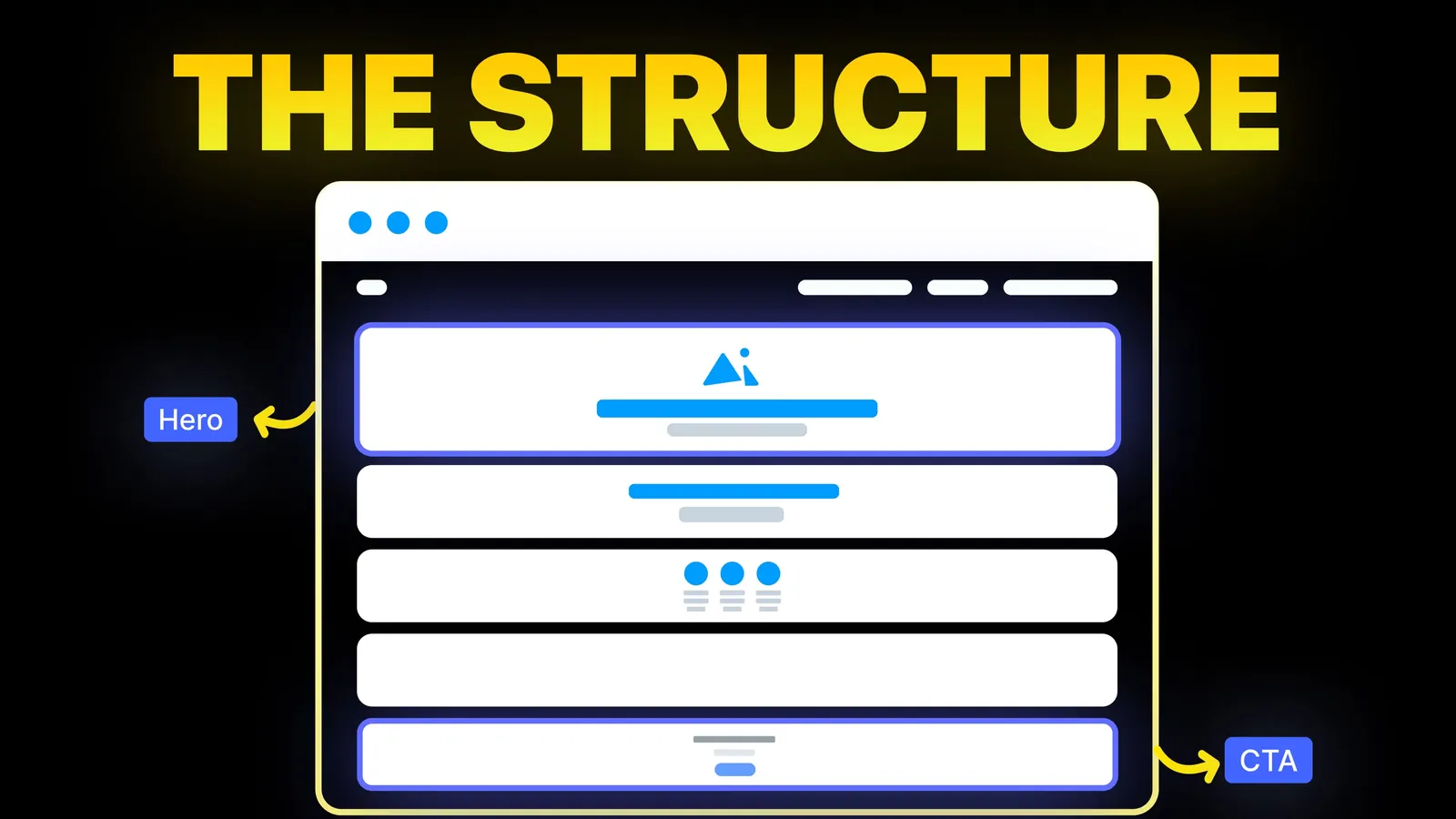
How to Turn Your Website Into a High-Converting Sales Tool
The structure behind a website that sells: the five decisions that carry conversion, the homepage section order, and how to rebuild without losing traffic.
Conversion
Search for button design and you get galleries: Pinterest boards, award-site picks and pretty variants. They show what buttons can look like. They rarely say why one button gets pressed and another is missed, or what the accessibility rules require. This guide sets out the rules for website buttons, with the numbers from WCAG 2.2 and Nielsen Norman Group's research, read on 19 November 2026.
A good website button looks pressable, says exactly what happens next, is big enough to hit with a thumb, and is clearly stronger or weaker than the buttons around it depending on its importance. In practice: a solid, high-contrast primary button for the one main action, an outlined or lighter secondary button for the alternative, plain text links for everything else; a label that starts with a verb; at least 44 by 44 CSS pixels for main buttons on phones; a visible focus outline; and distinct hover, pressed and disabled looks. Then test it on a real phone.
About us: Amariq is a studio that designs and builds websites. The rules below come from the W3C's Understanding documents for WCAG 2.2 and from Nielsen Norman Group's article on button states (April 2025), read on 19 November 2026. Our call to action examples cover the wording side in more depth.
We searched Google (US, English) for "good button design" on 19 November 2026. The results were Pinterest boards (one dated June 2011), Orpetron's list of ten award-site buttons from February 2024, a designer's Instagram post, a glossary entry, and a YouTube video on building a button component in a design tool.
The galleries show attractive buttons. None explains hierarchy on a real page, gives the size and contrast numbers from the accessibility standard, covers the five states, or tells you when a button should be a link. That is the gap this guide fills.
A page with five equally loud buttons has no main action. Decide which single action matters most in each view and style the rest down.
| Level | Typical style | Use for |
|---|---|---|
| Primary | Solid fill in the strongest colour, high-contrast label | The one main action: "Book a call", "Get a quote", "Add to cart" |
| Secondary | Outline, or a lighter fill | The alternative: "See pricing", "View our work" |
| Tertiary | Text link, sometimes with an arrow | Minor actions: "Read more", "Learn how it works" |
Two primaries side by side force the visitor to choose between equals and often lead to neither being pressed. If you need two actions, make one clearly secondary. Our hero section guide shows how this works in the first screen.
WCAG 2.2 has two rules on target size, read on the W3C's Understanding pages on 19 November 2026:
| Criterion | Level | Requirement |
|---|---|---|
| 2.5.8 Target Size (Minimum) | AA | A target 24 CSS pixels square or larger, or spaced so a 24 pixel circle centred on each small target does not touch another target or its circle |
| 2.5.5 Target Size (Enhanced) | AAA | At least 44 by 44 CSS pixels |
Both have exceptions, such as links inside a sentence and controls whose size is set by the browser. The W3C's note on 2.5.8 says it is possible to meet the minimum with very small targets that are well spaced, but encourages authors to meet the minimum size anyway, and to consider the stricter 44 pixel rule for important controls.
Our practice for business websites: treat 24 pixels as a legal-style floor for small controls such as icons and close buttons, and make main buttons at least 44 pixels tall on phones, with the full button area clickable, not only the text.
Two WCAG level AA rules apply:
The second rule is the one most "ghost button" designs break. A thin pale outline on a photo, or a pale grey fill on a white page, may pass for the label but not for the shape. If the only thing that marks the button is its outline or fill, that outline or fill needs 3:1 against what is next to it. You can test both pairs of colours in the contrast tool on our site.
Nielsen Norman Group's article "Button States: Communicate Interaction" by Kelley Gordon (25 April 2025) names five common states:
| State | What it tells the visitor | Typical treatment |
|---|---|---|
| Enabled | This can be pressed | Full colour, high contrast, legible label |
| Disabled | This cannot be pressed now | Muted or greyed, lower contrast but still readable |
| Hover | Your pointer is on something clickable | Slight darkening; NN/g suggests a delay of about 150 to 200 ms so passing pointers do not trigger it |
| Focus | This has keyboard focus | A clear outline or ring |
| Pressed | Your press registered | A darker or inset look |
Focus is not optional. WCAG 2.4.7 Focus Visible (AA) requires a mode of operation where the keyboard focus indicator is visible. Removing the browser's focus outline without replacing it is one of the most common button faults we see.
Hover does not exist on touch screens, as NN/g also points out, so never hide information or the button's purpose behind a hover effect.
A greyed-out "Submit" button that stays disabled until every field is filled leaves people guessing which field they missed. NN/g notes that disabled labels need lower contrast than enabled ones, but must still be readable, and that the aria-disabled="true" attribute lets the button keep keyboard focus while screen readers announce it as unavailable.
In forms, the better pattern is usually to leave the button enabled and show clear messages next to the fields that need fixing when it is pressed. Our contact page guide covers form design.
| Weak label | Stronger label | Why |
|---|---|---|
| Submit | Send my enquiry | Says what happens |
| Click here | Download the price list | Makes sense out of context, which screen reader users rely on |
| Learn more | See how a project works | Specific |
| Go | Search | Names the action |
| Buy | Add to cart, or Pay $49 | Matches the step |
Start with a verb, keep it short, use sentence case, and keep the same label for the same action across the site. Our call to action examples have labels by business type.
Visitors do not care about code, but the difference changes how a page behaves with a keyboard and a screen reader.
| Use a link when | Use a button when |
|---|---|
| It takes the visitor to another page or another place on the page | It does something on this page: sends a form, opens a menu, adds to cart, plays a video |
| It should open in a new tab with a middle click | Opening in a new tab makes no sense |
A link can be styled to look like a button, which is fine and common for "Book a call" style calls to action that lead to another page. What breaks things is the opposite: a clickable div or image with no button or link underneath, which keyboards and screen readers cannot use.
Put the primary button where the visitor has enough information to act: in the first screen for people who arrive ready, and a second time once the reviews and examples have done their work, for people who need convincing. On long pages, repeat it at the end. On phones, a fixed bottom bar with one button works for urgent services. Our sticky header guide covers fixed elements and the WCAG rule on not hiding the focused item.
Rounded or square corners, shadows or flat: these are brand choices, and none of them makes a button work on its own. What matters is consistency (every primary button looks the same everywhere) and that the shape still reads as pressable. Icons help when they add meaning, such as an arrow for "next" or a phone icon on a call button, but an icon alone without a text label is a guessing game for many visitors.
We design button systems as part of every site: one primary style, a secondary and a text style, all five states, and checks against the WCAG size and contrast rules before launch. Projects are priced from scope, never by the hour, and paid 40% to start, 30% at design approval and 30% before launch. Once the final payment is made, the design, words and code belong to you, and the domain, hosting and analytics accounts sit in your name. To talk it through, book a call or see our website optimization service.
It looks pressable, says what happens when pressed, is large enough to tap, contrasts clearly with its surroundings, and is styled by importance: one strong primary action, weaker secondary ones. It also has visible hover, focus, pressed and disabled states.
Under WCAG 2.2, the level AA floor is a target 24 CSS pixels square (or enough spacing around a smaller one), and level AAA asks for 44 pixels square. For main buttons on phones, aim for at least 44 pixels tall.
The colour that stands out most against your page while fitting your brand, used only for primary actions. No single colour wins everywhere. What matters is contrast: 4.5:1 for the label text and 3:1 for the button's shape against its surroundings.
Not always, but they often fail WCAG's 3:1 non-text contrast rule when the outline is thin and pale, and they look weaker than a filled button. Use them for secondary actions and check the outline's contrast.
It should look clearly unavailable but stay readable. In forms, it is usually better to keep the button enabled and explain what needs fixing after it is pressed, so people are not left guessing.
What happens next, starting with a verb: "Get a quote", "Send my enquiry", "Download the price list". Avoid "Submit" and "Click here".
Nielsen Norman Group lists five common ones: enabled, disabled, hover, focus and pressed. The focus state is required for keyboard users under WCAG 2.4.7.

The structure behind a website that sells: the five decisions that carry conversion, the homepage section order, and how to rebuild without losing traffic.
Eight homepage design ideas for businesses that sell by enquiry, with when to use each, plus the section order of amariq.com's own homepage.
We measured 18 homepages from two popular best-of lists: headline length, first-screen action, page length and words. What they share, and what to copy.