
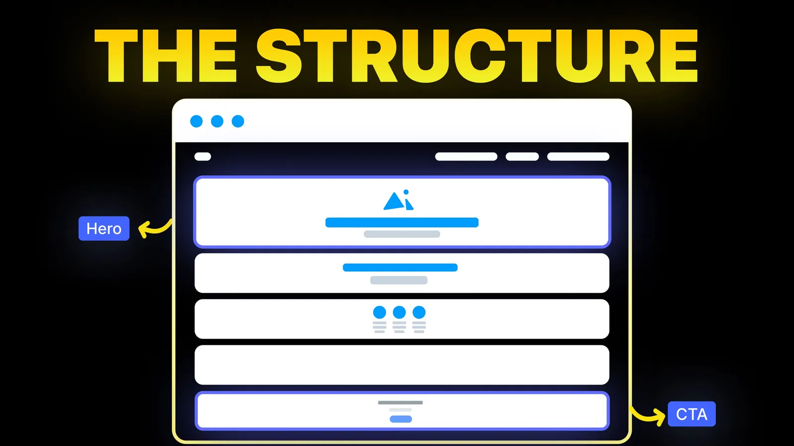
How to Turn Your Website Into a High-Converting Sales Tool
The structure behind a website that sells: the five decisions that carry conversion, the homepage section order, and how to rebuild without losing traffic.
Web Design
The results for "blog page design" are galleries: Dribbble shots, template stores and lists of attractive SaaS blogs. They show what blogs look like. They do not give the numbers behind a readable post or the rules that decide how Google reads your dates and page two. This guide does, using the W3C's and Google's own pages read on 11 November 2026, plus the measured layout of the page you are reading.
Design the blog index for finding and the post for reading. The index needs a featured post, topic filters, clear cards with title, date and a one-line summary, and real page links at the bottom. The post needs a narrow text column, generous line spacing, a visible labelled date, a short summary at the top, headings that work as a table of contents, and one relevant next step at the end.
Who is writing: Amariq designs and builds websites, and this blog is one of them. Where we give numbers for our own layout, we measured them on this page on 11 November 2026. Rules come from the W3C's and Google's own pages read the same day.
On 11 November 2026, Google (US, English) showed mostly inspiration for "blog page design": Dribbble, Webflow's blog templates, Figma's free blog templates, Land-book, an Awwwards collection, a SaaS Landing Page list of 40 blog pages, Pinterest, Unsection, and an OptimizePress list of 18 blog designs (17 June 2026). Google's AI answer mentioned a narrow reading column of 60 to 70 characters, line height of 1.5 to 1.6, tables of contents, author boxes and calls to action, credited mostly to YouTube videos.
The galleries are useful for taste. What a site owner still needs: which numbers come from a standard rather than habit, how the index and post differ, and what Google says about dates and page two of a blog. Those are below.
| Blog index (the list) | Blog post (the article) | |
|---|---|---|
| Main job | Help a visitor find something worth reading | Help them read it and take a next step |
| Above the fold | Title, one line on what the blog covers, featured post | Title, date, summary or key points |
| Main content | Cards or a list, topic filters | One narrow text column |
| Navigation | Topics, pagination | Headings, table of contents, related posts |
| Next step | Open a post | One call to action that fits the topic |
Mixing them causes most blog problems: an index that tries to sell, or a post page cluttered with sidebars and banners that pull attention from the text.
Start with a short intro. One sentence on who the blog is for and what it covers. It helps readers and gives the page words of its own beyond titles.
Feature one post. The newest, or the one that matters most to your business. Larger image, title and summary.
Let people filter by topic. Five to eight topics that match your services. Each topic can have its own page, which also helps search engines understand your site's structure.
Design cards for scanning. Each card needs:
Use a list or a grid. Grids suit visual posts and short titles. A list with summaries suits long titles and text-led blogs. Either way, keep six to twelve posts per page, so the first page loads quickly.
Google's pagination guide, read on 11 November 2026, sets out what page two and beyond need:
| Google's guidance | What it means for your blog |
|---|---|
| Link pages in order with normal links | "Next" and page numbers are real links, not buttons that only run a script |
| Give each page a unique URL | /blog/page/2 or ?page=2, not the same address for every page |
| Give each page its own canonical | Do not point page 2 and 3 back to page 1 |
| Do not use # fragments for page numbers | Google ignores what follows a # |
| rel="next" and rel="prev" are no longer used by Google | They do no harm, but they are not what Google reads |
Google also says pages in a paginated sequence do not need distinct titles, and suggests linking every page back to the first page of the collection. A "load more" button is fine for people, as long as there are also crawlable links to the same posts.
The W3C's success criterion 1.4.8, Visual Presentation, is a Level AAA criterion, the strictest tier. For blocks of text it lists:
The W3C notes that content does not have to use these values; a way for users to get them must exist, and the browser can provide it. Still, they make a sound default for anyone designing a post template.
How this page measures, at a 1920 pixel wide desktop screen on 11 November 2026: the text column is 672 pixels wide, body text is 19 pixels with a 30.4 pixel line height (1.6), and a typical paragraph runs at about 75 characters per line. It sits inside the W3C's 80 characters.
| Setting | Common starting point | This page |
|---|---|---|
| Column width | Narrow enough for under 80 characters a line | 672 px, about 75 characters |
| Body text size | Large enough to read without zoom | 19 px |
| Line height | At least 1.5 | 1.6 |
| Alignment | Left aligned, not justified | Left aligned |
Readers decide in seconds whether to stay. Give them:
Close with one next step that fits the topic: a related service, a tool, a consultation or the next post in a series. A post about pricing can end with a quote request; a post about a technique can end with the next read. One clear choice beats a row of five buttons. Our call to action examples show wording that works.
Most of the rules hold on phones, with a few changes:
Blog pages carry many images, which makes them slow if left unchecked. Size images to the column width, use modern formats, and lazy-load images below the first screen. Our speed test guide explains how to measure. Check contrast between text and background, keyboard focus on links, and heading order; our accessibility checklist covers each.
| Check | Done? |
|---|---|
| Index has a one-line intro, a featured post and topic filters | |
| Cards show title, date, summary and topic | |
| Pagination uses real links and unique URLs | |
| Each paginated page has its own canonical | |
| Post text column stays under 80 characters a line | |
| Line height at least 1.5, text left aligned | |
| Visible, labelled date that matches structured data | |
| Summary or key points at the top | |
| Descriptive links to related posts and services | |
| One call to action that fits the topic | |
| No sideways scrolling at 390 px except inside tables |
We design and build blogs as part of business websites on Webflow, Framer, WordPress, Shopify, Wix, Squarespace or a custom stack, with an index, post template and topic pages your team can update. Each project is priced from its scope, never by the hour, with 40% to start, 30% at design approval and 30% before launch. Once the final payment is made, the design, copy and code belong to you, and your domain, hosting and analytics accounts sit in your name. See our web design service or browse this blog to see the layout in use.
For the index, a featured post followed by a list or grid of cards with title, date, summary and topic, plus topic filters and real page links. For the post, a single narrow text column with headings, a visible date and one call to action at the end.
Narrow enough that lines stay under 80 characters, the limit in the W3C's Visual Presentation criterion. On this site that is a 672 pixel column with 19 pixel text, about 75 characters a line.
Yes. Google's byline date guide asks for a prominent, labelled, user-visible date that matches any date in structured data. Readers also use it to judge whether advice is current.
Not for readers, but search engines need crawlable links to every post. Google's pagination guide says to give each page its own URL and link pages in order with normal links, so add those alongside any "load more" button.
It is optional. A sidebar can hold topics or a signup, but on most business blogs it competes with the text and disappears on phones anyway. Many sites put related posts and the call to action after the article instead.
Enough to scan without a long load, often between six and twelve. Use pagination or a "load more" button with crawlable links for the rest.

The structure behind a website that sells: the five decisions that carry conversion, the homepage section order, and how to rebuild without losing traffic.

Web design principles you can test: contrast, target size, line length, speed and navigation, with W3C, Google and NN/G numbers. Checked 12 Nov 2026.
What a good 404 page says, where to set it on Webflow, WordPress, Shopify, Wix, Squarespace or a static host, and the status code test. Checked 10 Nov 2026.