

Case study
Three landing pages for three buyers who ask nothing alike
YMH builds manufactured homes for lifestyle developers, caravan parks and commercial projects. We designed one system and argued it three ways, including the part where it tells the wrong enquiry not to bother.
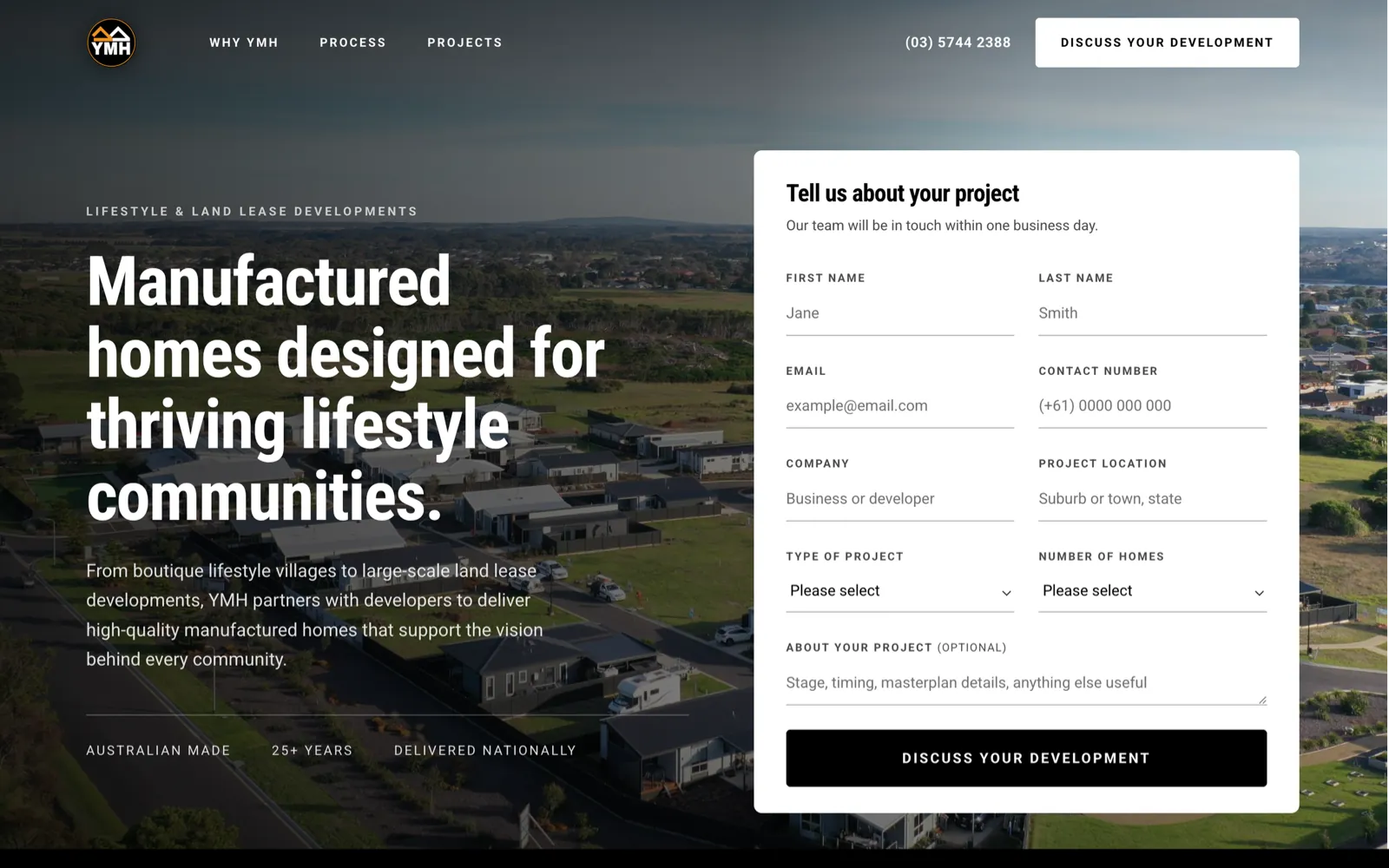
In short
- The problem
- One product, three buyers who share almost no questions: a property developer masterplanning a village, a caravan park operator adding cabins, and an organisation procuring workforce accommodation. A single page would have spoken past all three.
- The idea
- One design system, three arguments. The same section skeleton on every page, re-argued for the buyer in front of it, down to the noun in the headline.
- The design
- The enquiry form sits in the hero on every page, above the fold, and its fields change with the audience: number of homes for developers, number of cabins and project stage for parks, a capability statement download for commercial buyers.
- The unusual part
- The pages are built to turn the wrong lead away. One line under the tourism form, repeated in the FAQ, says YMH does not manufacture individual cabins for private buyers. Fewer enquiries, better ones.
- The build
- WordPress and Elementor. Shared sections were built once and reused, so a fourth audience page starts from parts that already exist.
- Status
- The Lifestyle and Land Lease page is live. The rest of the set follows the same build.
Who YMH is
YMH manufactures homes in a factory at Yarrawonga, Victoria, established in 1998, and delivers them across Australia. The homes are built off site while civil works continue on site, which is the whole commercial argument for the category: the build and the groundwork happen at the same time instead of one after the other.
The complication is who buys them. YMH sells the same manufacturing capability to three markets that have almost nothing in common.
- Property developers masterplanning lifestyle villages, land lease communities and over-50s estates.
- Caravan park and tourism operators adding cabins, villas and amenities to a park that is already trading.
- Organisations and government procuring workforce accommodation, key worker housing, education or health facilities.
A developer wants to know whether these homes will help sell a masterplan. A park operator wants to know whether a cabin will earn its place on a balance sheet. A council wants a capability statement and evidence you can deliver at scale. Put all three on one page and you write something that is true for everyone and persuasive to nobody.
One system, three arguments
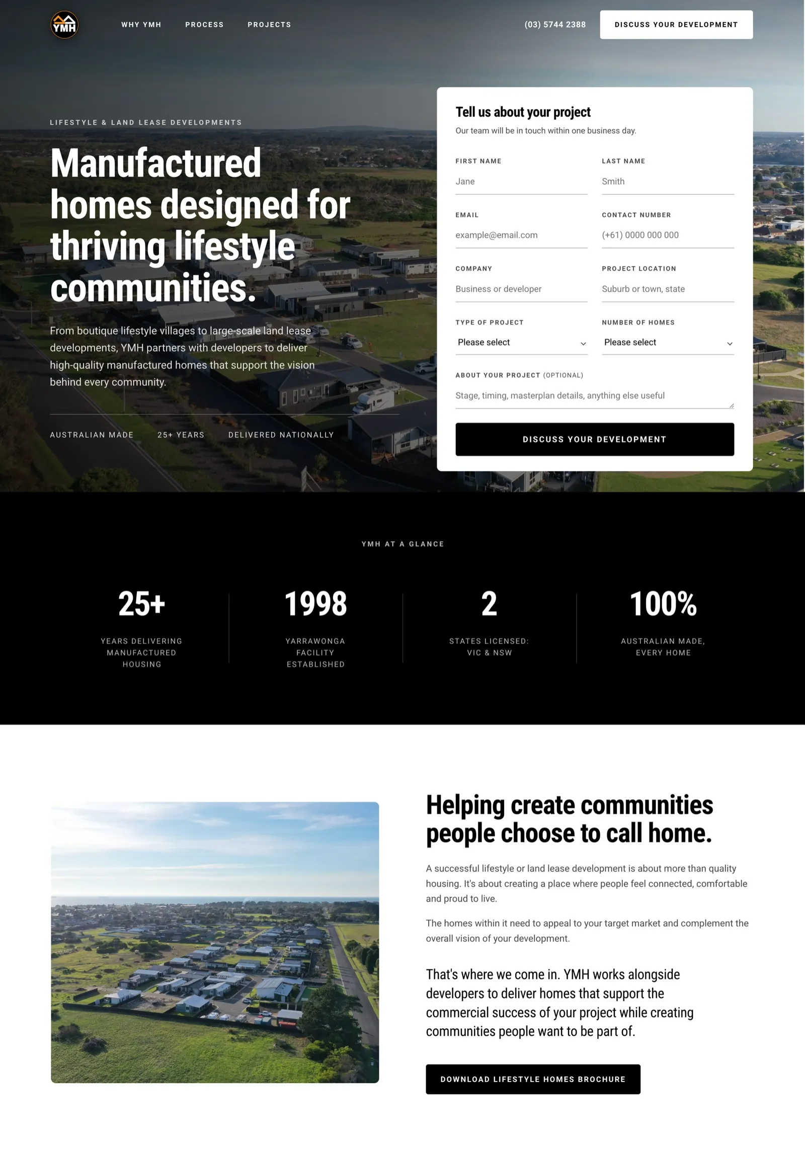
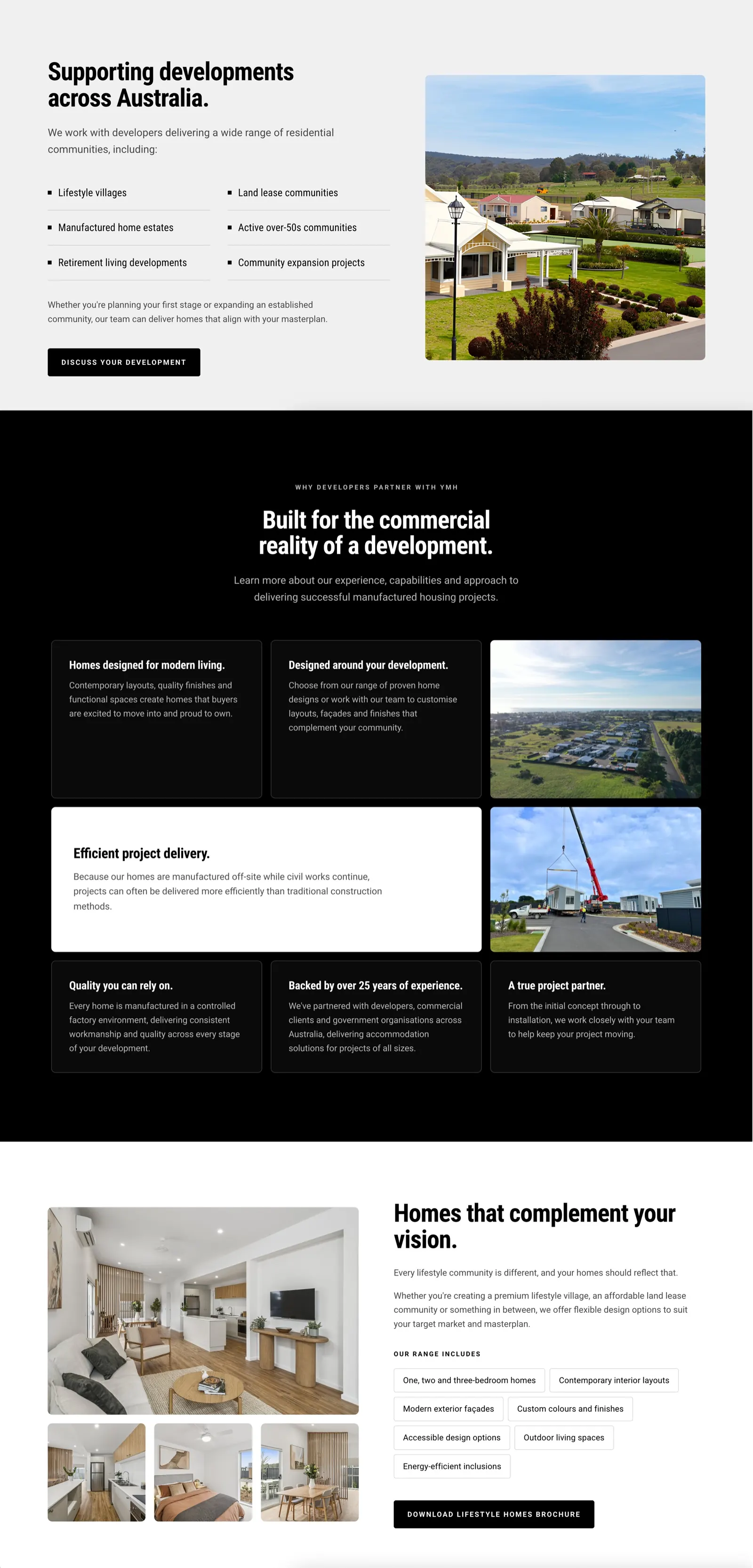
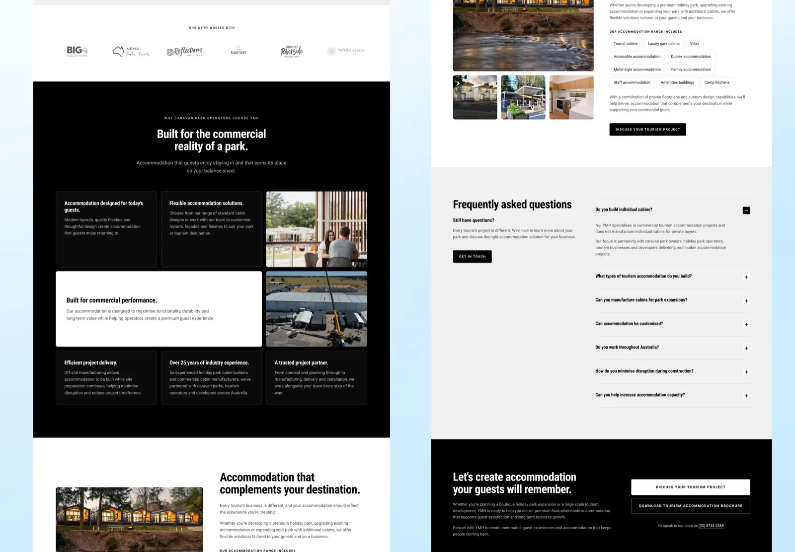
So the answer was not three websites and not one page. It was one design system carrying three arguments, with the same section skeleton underneath each page: hero with an enquiry form, a glance at the company, the case for the category, proof, range, questions, close.
What changes is everything inside the skeleton, down to the noun in the headline. The developer page says built for the commercial reality of a development. The park page says built for the commercial reality of a park. Same promise, aimed at the balance sheet the reader actually manages.
The form is the page
On a site like this the enquiry form is not a footer afterthought, it is the product. So it sits in the hero, beside the headline, above the fold, on every page in the set. Nobody has to scroll to start a conversation.
Its fields change with the buyer, and that is where the design does its quietest, most useful work:
- Developers are asked for the type of project and the number of homes.
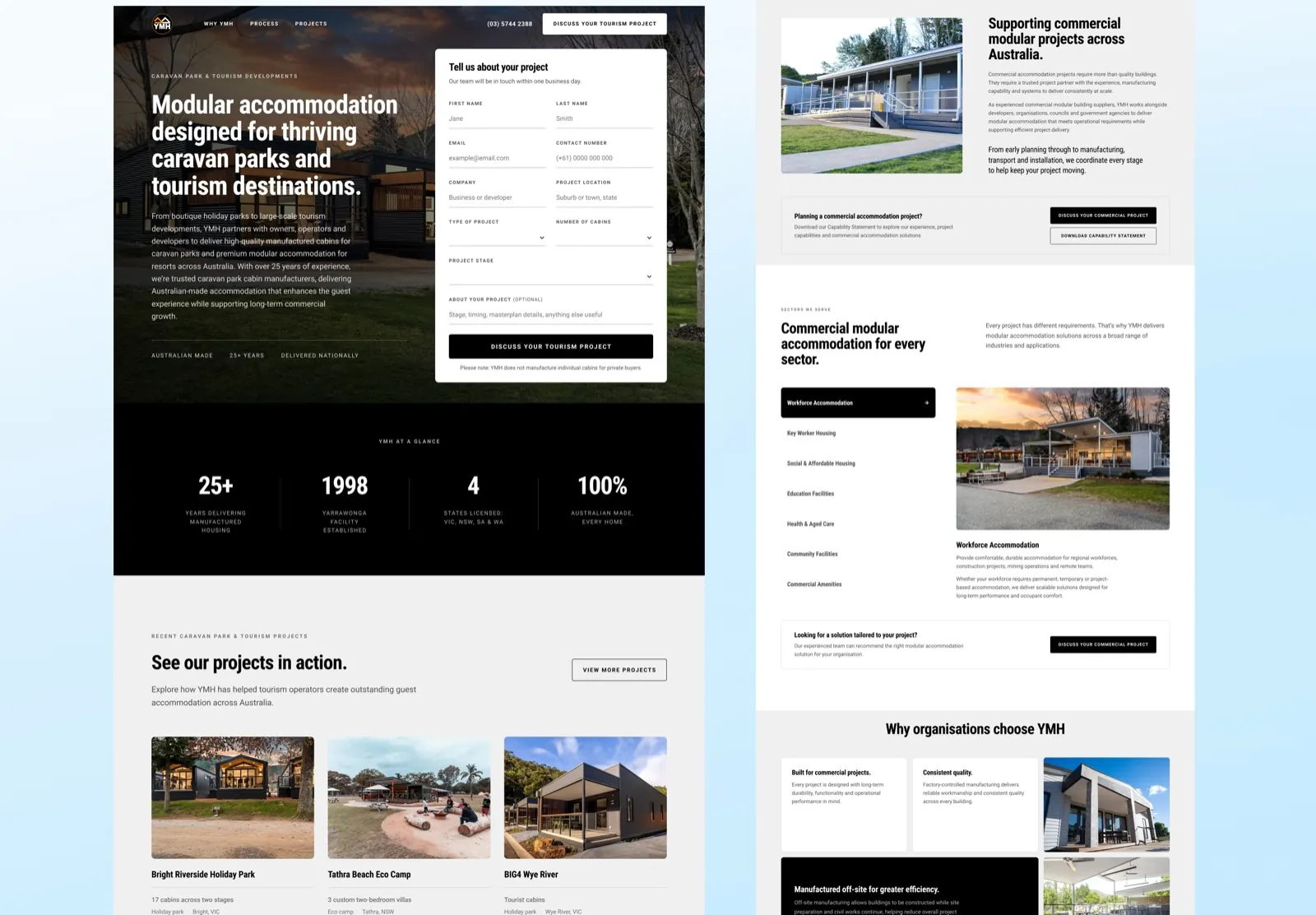
- Park operators are asked for the number of cabins and the project stage, because a park at concept stage and a park with approvals in hand are different conversations.
- Commercial buyers get a second route entirely: a capability statement to download, which is how procurement actually begins in that market.
The button changes too. Discuss your development. Discuss your tourism project. Discuss your commercial project. A visitor never has to translate a generic verb into their own situation.
The part most sites will not do
Under the tourism enquiry form there is one line of small text:
Please note: YMH does not manufacture individual cabins for private buyers.
The same answer appears again, in full, as the first question in the page’s FAQ. It is the only question opened by default.
Most lead generation pages are built to catch everything and sort it out later. This one is built to send a whole category of enquiry away before it becomes a form submission, an email, a phone call and a polite no. For a manufacturer whose smallest real project is several cabins, a page that produces fewer enquiries and better ones is the more valuable page. Saying so plainly also reads as confidence rather than as a limitation.
Proof, in the buyer’s own language
Each page proves itself with the evidence its reader recognises. The tourism page names the operators YMH has worked with, BIG4, NRMA Parks and Resorts, Reflections Holidays, Tasman, Bright Riverside and Tathra Beach, and then shows named projects with their actual scope: seventeen cabins across two stages at Bright Riverside Holiday Park, three custom two-bedroom villas at Tathra Beach Eco Camp, tourist cabins at BIG4 Wye River.
That is a more useful kind of proof than a testimonial. An operator reading “seventeen cabins across two stages” can measure it against their own plan.
The commercial page proves itself differently again, by listing the sectors it serves, from workforce accommodation and key worker housing through to education, health and aged care, because a procurement reader is checking for their own category before they read a word of the pitch.
How it is built
WordPress with Elementor. The shared sections were built once and reused across the set, so the three pages stay consistent without anybody maintaining three copies of the same layout, and a fourth audience page starts from parts that already exist rather than from a blank canvas.
Where it stands
The Lifestyle and Land Lease page is live. The rest of the set follows the same build.
There are no enquiry numbers on this page. We have not been given them, and a lead-quality change is the kind of thing that takes a few months of a sales team’s experience to judge honestly. If YMH shares them later, they go here.
Questions
What people ask about this project.
Why three pages instead of one with tabs?
Because the three buyers do not share a question. A developer is thinking about a masterplan, a park operator about occupancy and a procurement officer about capability and compliance. Tabs would have made one of them do the sorting.
They are three pages on one system, not three websites. The sections are shared, so the set stays consistent and a fourth audience page starts from parts that already exist.
Is a form in the hero not too aggressive?
On a consumer site it often is. On a business-to-business site where the whole point of the page is to start a project conversation, the form is the product, and burying it below three screens of scrolling only costs enquiries.
What makes it work is that the fields ask about the project rather than about the person. Type of project, number of homes, project stage. It reads as the beginning of a conversation, not as a toll gate.
Why put a line on the page that turns customers away?
Because they were never customers. YMH does not manufacture single cabins for private buyers, and every enquiry from someone who wants one costs the sales team a reply and the enquirer a disappointment.
Saying so under the form and again in the FAQ means the page produces fewer enquiries and better ones. It also reads as confidence. A manufacturer who is clear about what they do not do is easier to believe about what they do.
What did Amariq do, and what did YMH provide?
We designed the pages, wrote the structure and built them in WordPress with Elementor. The photography, the project details and the brand are YMH’s own.
The page copy was written against their material rather than invented, which is why the proof names real parks and real cabin counts.
Are there enquiry numbers for this project?
Not on this page. We have not been given them, and lead quality is something a sales team can only judge honestly after a few months of taking the calls.
If YMH shares figures later we will add them here and say what period they cover.
Can you build the same kind of set for another business?
Yes, and it is worth doing whenever one product is sold to audiences who ask different questions. The work is in finding what genuinely differs between them, which is usually the proof and the form, not the visual design.
Next case study