

Case study
Designing a SaaS brand when there is no brand to follow
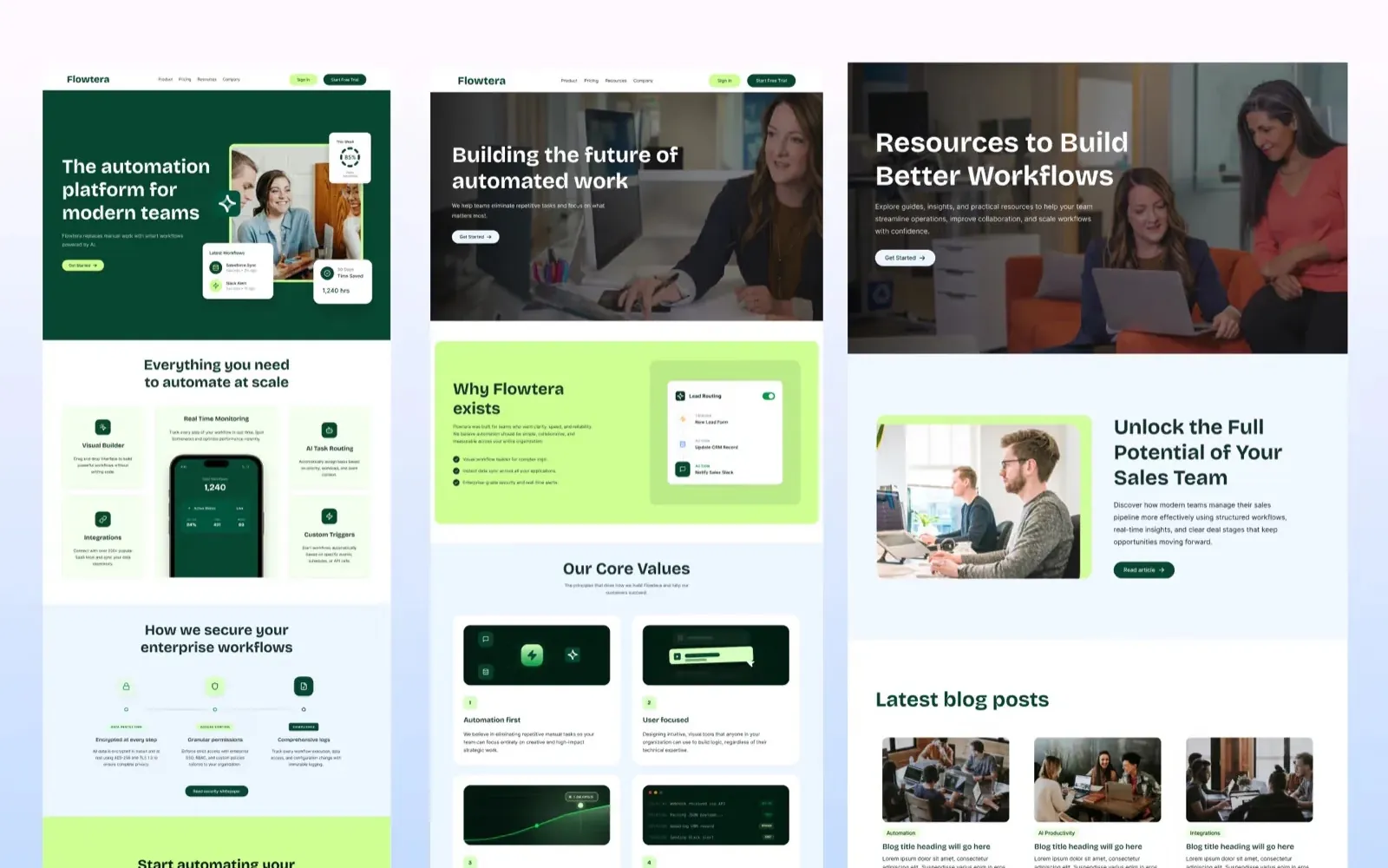
Flowtera is our own concept: an imaginary workflow automation product, taken from a problem statement to a brand, five page designs and a Webflow build. It shows how we handle a SaaS site with nothing to lean on, and we are clear about which parts are invented.
In short
- What it is
- Our own concept project: a brand and a five-page marketing site for an imaginary workflow automation product, designed in Figma and built in Webflow.
- Why we made it
- To show we can handle a product site with no existing brand to lean on. This is the whole job, positioning to build, done in the open.
- The hard part
- Automation tools all sound alike. The site had to make an abstract product feel concrete, and different from the big names, within the first screen.
- The idea
- Show the product working instead of describing it. Every claim sits next to a small piece of interface that proves the point.
- The design
- Deep green and a soft lime on white, one confident sans-serif, card layouts that can be scanned in seconds, and one clear action per section.
- Be clear about
- There is no client. The logos, reviews and numbers inside the design are placeholder product content, not results.
What Flowtera is
Flowtera is not a real company. It is a concept we created to show the full range of SaaS website work in one project: naming the problem, positioning the product, building a brand, designing five pages and building them in Webflow.
The product idea is a workflow automation platform for teams. Most teams run on a patchwork of tools, such as form builders, spreadsheets, a CRM, chat and email, and the same customer ends up as several disconnected records. Work gets copied by hand from one tool to the next. Flowtera promises to connect the tools, the data and the team's workflows in one place, and to automate the repetitive steps between them.
It answers a question every early-stage founder has about an agency: can it design a product site when there is no existing brand to follow? A concept is the most honest way to show that.
The problem the site had to solve
Automation software is a crowded, abstract category. Zapier and Make already own the idea of connecting apps, and most competitors describe themselves in the same words: powerful, seamless, AI-driven. A visitor landing on yet another automation site has no reason to keep reading.
Three things had to happen on the first screen and keep happening afterwards.
- Make the product concrete. Workflows and integrations are invisible. The site had to show them.
- Speak to more than one buyer. Operations leads, marketers, product teams and founders all evaluate tools like this, and each looks for something different.
- Look like a product you could trust with company data. A young SaaS brand is judged on whether it looks finished. Anything that feels like a template loses the enterprise buyer.
Show the product, do not describe it
The rule behind every section was simple: no claim without a piece of interface beside it.
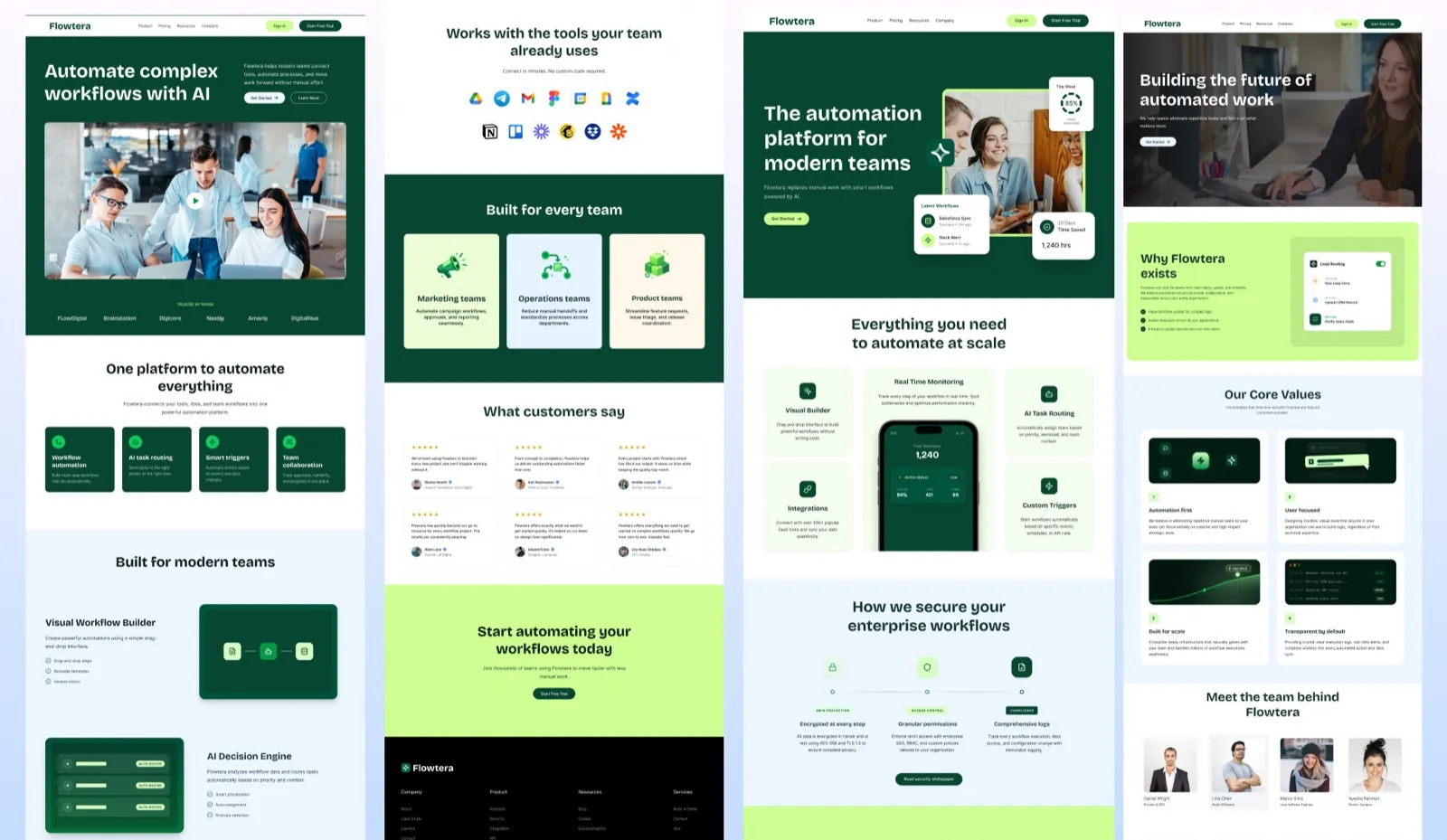
The product page hero is the clearest example. The headline, The automation platform for modern teams, sits beside a photograph of people at work, and around the photograph float three small product cards: a weekly automation score, a list of the latest workflows that ran, and the hours saved this month. A visitor understands what the product does before reading a single feature.
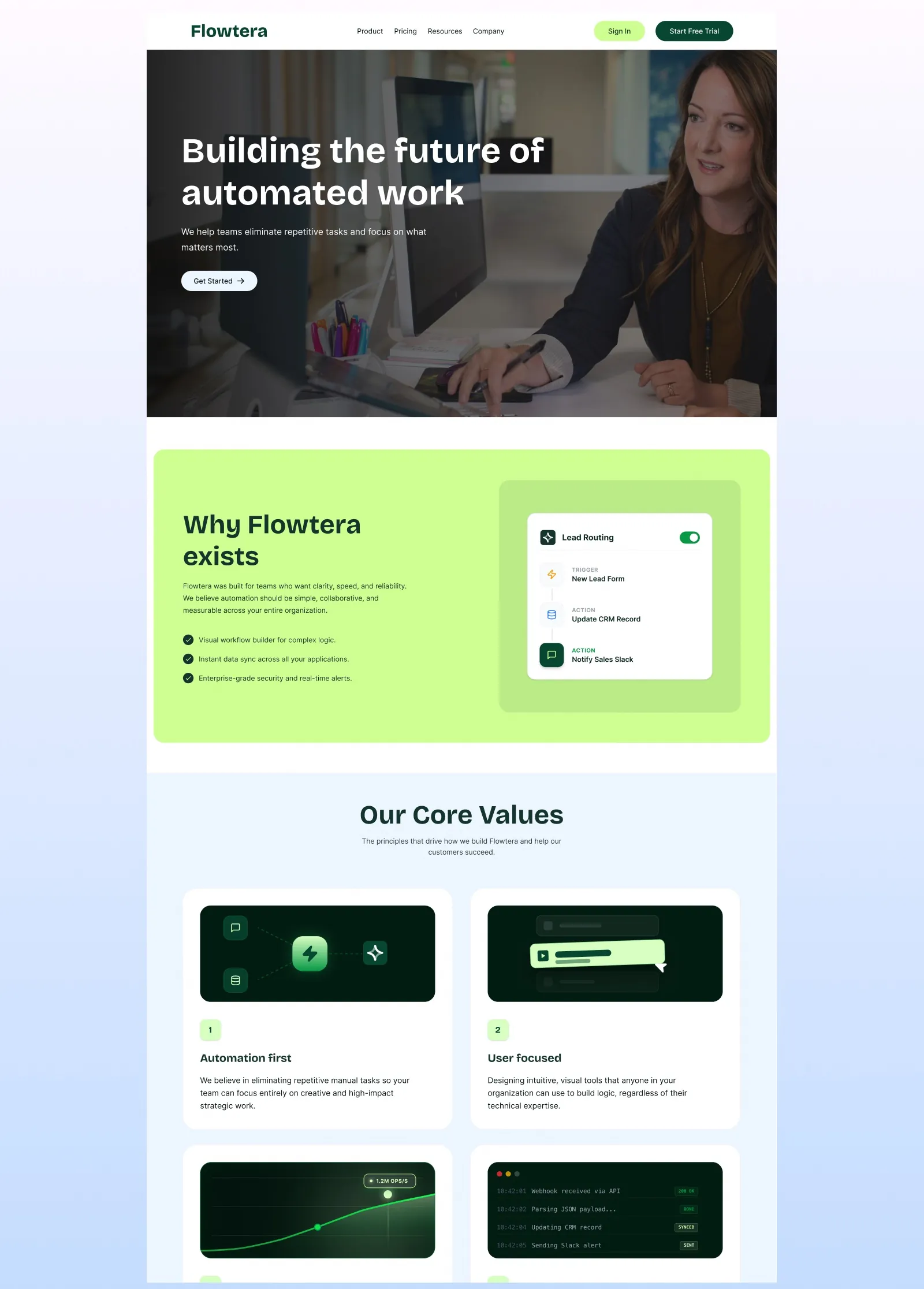
The same idea runs down the page. Real-time monitoring is shown as a phone screen with live figures. Lead routing is shown as a three-step flow, from a new form entry to a CRM update to a message in the sales channel. The integrations section is simply the logos of tools teams already use, with the line Connect in minutes. No custom code required.
Five pages, five jobs
Each page was given one job and one type of visitor.
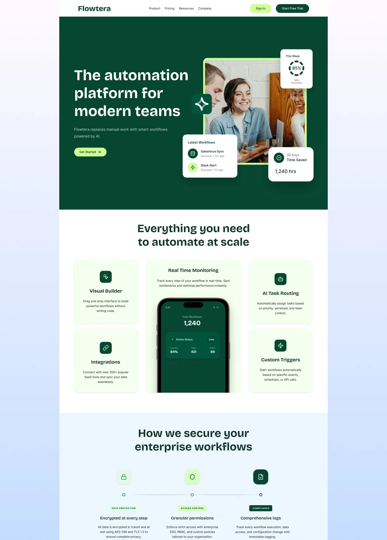
- Home sets the category: Automate complex workflows with AI. It covers the four core features, the tools Flowtera connects to, and a short section for marketing, operations and product teams.
- Product explains the mechanism, feature by feature, and answers the security question directly with encryption, access control and audit logs, because that is where an enterprise buyer stops.
- Company builds trust in the people: why Flowtera exists, four core values and the team behind it.
- Resources is set up for publishing, with a featured article and a blog grid, so the site can grow in search over time.
- Pricing has three tiers and a set of questions that deal with objections before a buyer has to raise them.
The brand
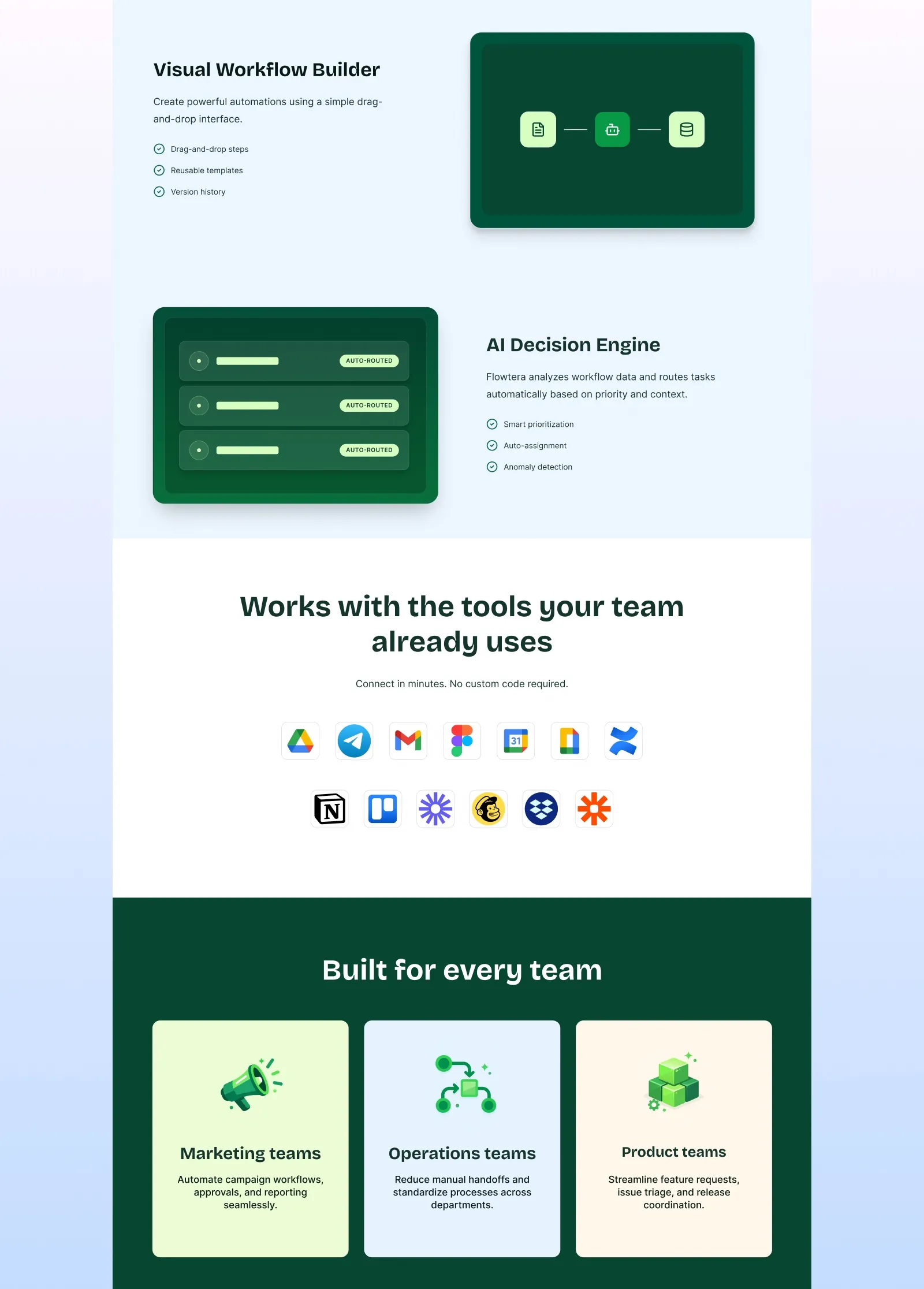
Most automation tools are blue. Flowtera uses a deep bottle green with a soft lime, on white and pale blue-grey. The green is dark enough to carry white text and large sections. The lime is saved for the moments that matter: the main buttons, the closing call to action and the Why Flowtera exists panel. Used sparingly, it gives the eye somewhere to go.
The type is one confident sans-serif family with a clear scale, from 80 pixel display headings down to 22 pixel small headings, with body text kept generous for reading. Spacing follows an 8 pixel grid, so a small button and a full section share the same rhythm.
Cards do most of the layout work. Each feature is a short icon, a heading and one or two lines, so every section can be understood in a few seconds by someone scanning.
How it was built
The design system was set up in Figma first: colours, text styles, spacing and layout guides. It was then carried directly into Webflow as reusable classes and components, so all five pages are built from the same parts. The site is responsive across desktop, tablet and phone.
Being clear about what this is
Because this is a concept, a lot of what appears inside the design is invented to make the product believable. The logo strip of companies, the customer reviews and their names, the figures in the interface cards such as hours saved, the number of integrations and the security standards are all placeholder content. None of it describes a real customer or a real result, and we do not present it that way.
What the project does prove is the process: taking a vague product idea to a positioned brand and a working five-page Webflow site. The project is published on Behance and Dribbble.
Questions
What people ask about this project.
Is Flowtera a real product?
No. It is a concept we created ourselves, with no client, to show how we would design and build a SaaS brand and website from nothing.
Any figures, company logos or reviews that appear inside the designs are placeholder content made to look like a finished product. They are not results.
Why build a concept instead of showing client work?
Client projects usually show only the finished site. A concept can be shown in full, from the first positioning idea to the finished build.
It also shows how we work when there is no existing brand to follow, which is exactly the situation many early-stage founders are in.
How do you make an abstract software product easy to understand?
Show it working. On Flowtera every main claim sits next to a small piece of interface, like a workflow list, a live monitoring screen or a three-step routing flow.
A visitor can see what the product does before reading about it, which matters when most competitors use the same words.
Why green, when most automation tools are blue?
To stand apart in a category where almost every brand looks the same. The deep green carries large sections and white text, and the lime is kept for buttons and key moments, so it always means something.
What did the Webflow build involve?
The design system was set up in Figma first, then rebuilt in Webflow as reusable classes and components. All five pages share those parts, which keeps the site consistent and makes new pages quick to add.
We also build on WordPress, Shopify and Framer, and pick whatever suits the product.
Can you do this for a real SaaS product?
Yes. The process is the same: agree the one thing the product does better than the alternatives, design the site around showing it, and build it so your team can keep publishing.
Next case study