

Case study
A homepage that has to fill a shop and a cart
Man Zone sells man cave supplies, barware and collectibles from a shop in Wodonga and from an online store with more than 2,800 products. We redesigned the homepage so it does both jobs at once instead of choosing between them.
In short
- The problem
- One homepage had to serve two customers: the person buying online and the person deciding whether to drive to the shop. The old page treated them as the same visitor.
- The idea
- Lead with the job the customer is actually doing, which is finding a gift for someone difficult, and prove the shop is real and local before asking for a sale.
- The design
- A gift-led hero over a photograph of the real shop floor, live stock with prices, five interest routes instead of a category menu, a seasonal campaign slot, and a store panel with hours, address and directions.
- The build
- Standard WordPress blocks, so the owner can change products, prices and the seasonal block without a developer.
- Status
- The concept is approved and the WordPress build is under way. No performance numbers yet, and we will not publish any until the site has been live long enough to mean something.
Who Man Zone is
Man Zone is a shop at 41 High Street in Wodonga, Victoria, and an online store with more than 2,800 products. It sells the things people buy for someone else and rarely for themselves: AFL and NRL merchandise, tin signs, barware, model cars, pop culture collectibles, 3D prints and man cave furniture. The range runs across nine top-level categories, and a lot of it is one-off stock that is there one week and gone the next.
That matters for a homepage. A shop with a stable catalogue can build a page around its categories. A shop whose best products change every week cannot, because the page would be out of date within a month of launch.
The problem with the old homepage
The old page showed the range, and that was the whole of it. Categories, the online store and the physical shop all sat on the page with the same weight, competing for the same attention, none of them explaining why a visitor should care.
Underneath that was a harder problem. One homepage had to serve two different people:
- Someone who found the shop on Google, wants a gift, and will buy online tonight if the page makes it easy.
- Someone in the Albury-Wodonga area deciding whether it is worth driving in on Saturday morning.
Most retail homepages quietly pick one of those and lose the other. A pure ecommerce page hides the shop. A shopfront page hides the cart. Man Zone needs both, and the second one is the harder sell, because asking somebody to get in a car is a bigger ask than asking them to click.
The decision: lead with the job, not the range
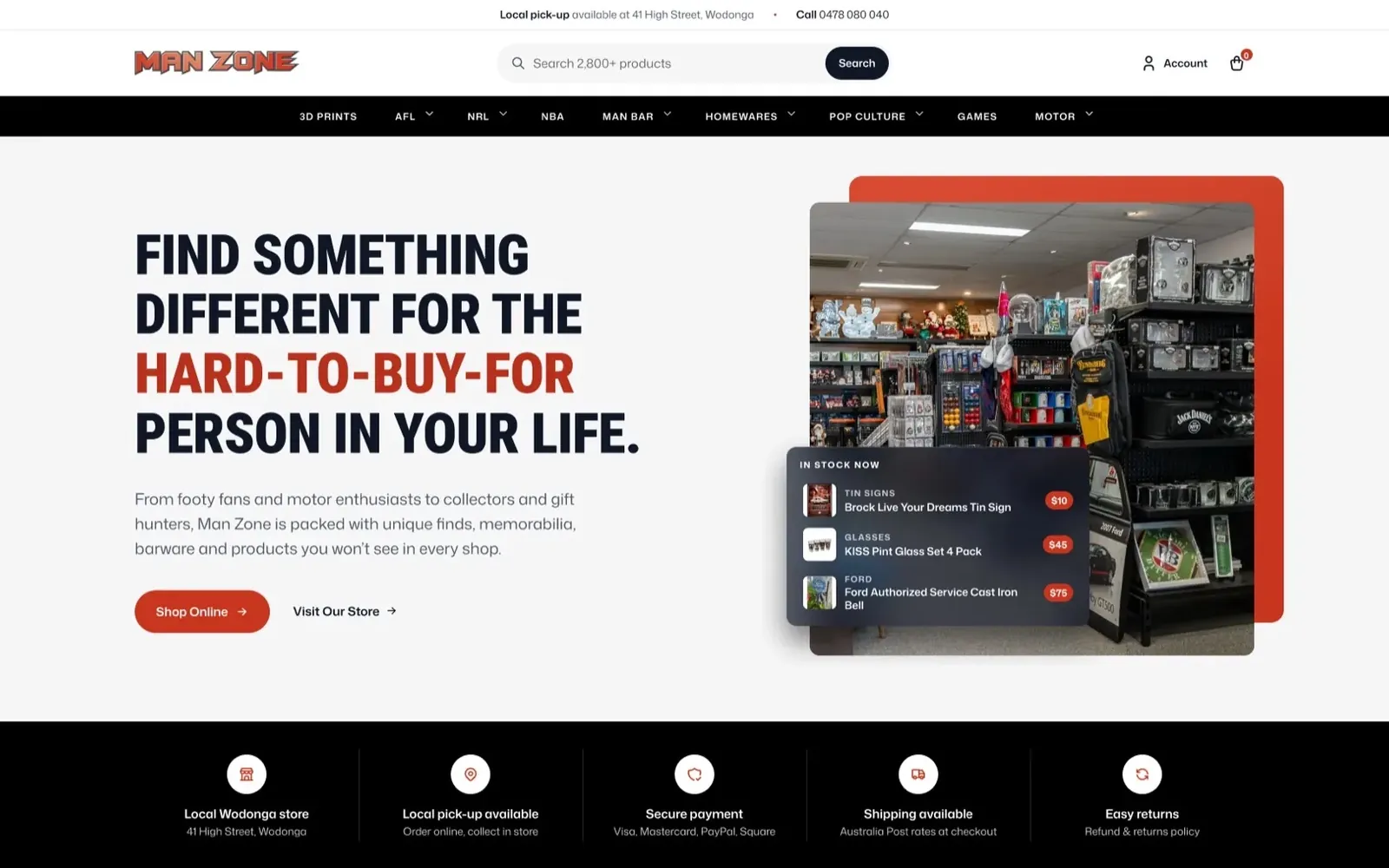
The hero does not say what Man Zone sells. It says what the visitor is trying to do.
Find something different for the hard-to-buy-for person in your life.
Almost everybody arriving at this shop is solving the same problem. They have a father, a brother, a mate or a colleague who already owns everything and likes something specific. That sentence is the reason the shop exists, and it does more work than any list of categories.
Behind the headline sits a photograph of the actual shop floor in Wodonga, not a studio shot and not a stock image. Over it, a small panel lists three products that are in stock now, with real prices. Together those two things answer the question a first-time visitor is really asking, which is whether this is a real shop with real stock or another drop-shipper with a nice logo.
Under the hero, a five-item row states the practical facts before anyone has to go looking for them: local Wodonga store, local pick-up, secure payment, shipping at Australia Post rates, easy returns. Nothing there is a selling point. All of it is the information that decides whether a stranger trusts a small shop with a card number.
Routes in, built around interests rather than categories
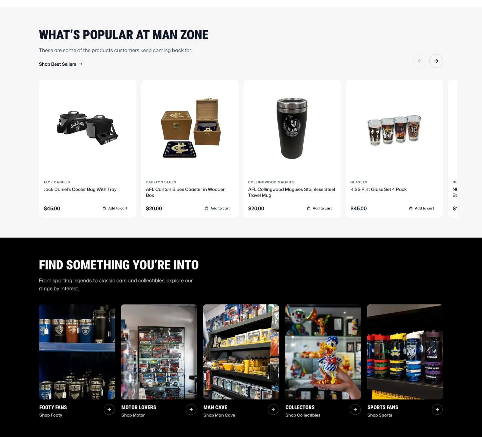
The category menu still exists in the header for people who know what they want. Further down the page, the same range is offered a second way, by interest: footy fans, motor lovers, man cave, collectors, sports fans. Each one is a photograph taken inside the shop rather than an icon.
This is the part of the design that does the most work for the physical shop. A photograph of an actual shelf of model cars tells a car person there is something here for them faster than the word "Motor" in a nav bar, and it shows them the room they would be walking into.
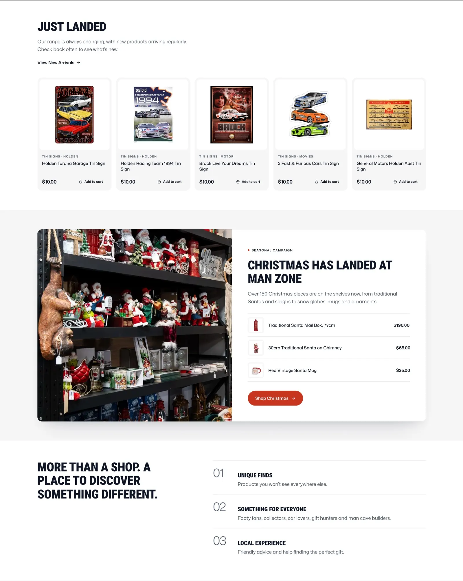
Above that sits a best-seller row with prices and add-to-cart, and below it a new arrivals row. Both are dynamic, so the page stays current without anybody rewriting it. The shop's stock changes constantly, and the homepage now changes with it.
A slot for whatever season it is
Retail runs on seasons, and a gift shop runs on them harder than most. The design carries a campaign block that can hold whichever one is current. In the approved concept it holds Christmas: a photograph of the Christmas shelves, a line saying over 150 pieces are in stock, three products with prices, and one button through to the range.
The same block will hold Father's Day, the start of the footy season, or a clearance. It is one block, edited in place, not a new page built every time the calendar turns.
After it, three short lines say what the shop is for in plain words: unique finds, something for everyone, local experience. It is the closest the page comes to talking about itself, and it is kept to three lines on purpose.
Getting people through the door
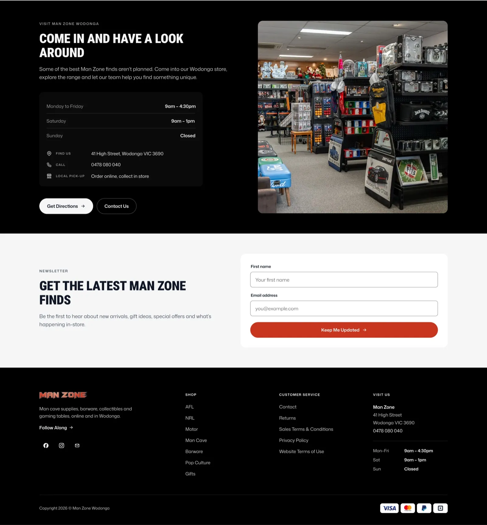
The store section is written for one person: somebody deciding whether to make the trip. It gives them everything that decision needs, in the order they need it.
- Opening hours as a table, including the fact that Sunday is closed, which is the thing people most often find out the hard way.
- The full address, 41 High Street, Wodonga VIC 3690.
- A phone number that works as a tap-to-call on a phone.
- Local pick-up: order online, collect in store.
- A directions button that opens the map, and a contact link for anything else.
The copy above it is honest about why the trip is worth it. Some of the best Man Zone finds are not planned, which is true of any shop with one-off stock, and it is a better argument for visiting than a discount would be.
How it is built
Every section was designed to be built from standard WordPress blocks. That is a design constraint as much as a development one: it ruled out layouts that would have needed custom code to maintain, and it is the reason the page can be edited by the person who runs the shop rather than by us.
In practice that means the owner can swap the campaign block from Christmas to Father's Day, change which products sit in the in-stock panel, update the hours, and add a new interest tile, without a developer and without a support ticket.
Where it stands
The concept is approved. The WordPress build is under way.
There are no performance figures on this page because there is nothing yet to measure. When the site has been live long enough for the numbers to mean something, we will add them here. Anyone quoting a conversion lift for a site that has not launched is quoting a guess.
Questions
What people ask about this project.
What did Amariq actually do on this project?
We designed the homepage: the structure, the copy, the layout and the visual design, from the hero down to the footer.
We are building it in WordPress now. The photography is the client’s own, taken in the Wodonga shop, and we designed the page around it rather than around stock images.
Why are there no conversion numbers on this page?
Because the site is not live yet. The concept is approved and the build is under way.
We would rather publish nothing than publish a figure we cannot stand behind. When it has been live long enough to measure properly, the numbers go here.
Why WordPress for a shop with 2,800 products?
We pick the platform that fits how the team already works, not the one we prefer to build on. Man Zone is a small team running a shop and an online store at the same time, so being able to change the homepage between customers matters more than any technical argument.
Every section was designed to be built from standard blocks, which is what makes that possible. We also build on Webflow, Shopify and Framer, and we say so on the call rather than after the invoice.
Can the Man Zone team update the homepage themselves?
Yes, and the design was constrained so that they can. Products in the in-stock panel, prices, the seasonal campaign block, opening hours and the interest tiles are all editable without a developer.
That is why the layout uses standard blocks. A cleverer layout that needed us every time the season changed would have been a worse design, not a better one.
How long does a homepage redesign like this take?
The design stage runs two to three weeks for a page of this size, including the rounds of changes. The build depends on the platform and on how quickly photography and product data arrive.
The thing that slows a retail project down is almost never the design. It is waiting on product photography, so we plan for that at the start.
Do you work with retailers outside Australia?
Yes. Man Zone is in Victoria, and we work with clients across Australia, the United States, the United Kingdom and Bangladesh. The whole process runs on calls and shared links.
Next case study