

Case study
Turning a loft bed maker's reputation into enquiries
LoftBedNYC builds custom loft beds for New York apartments and had the reputation to prove it. Its website looked fine and was losing people. We repositioned the brand around engineering, rebuilt the site in Webflow and redesigned the form that starts every project.
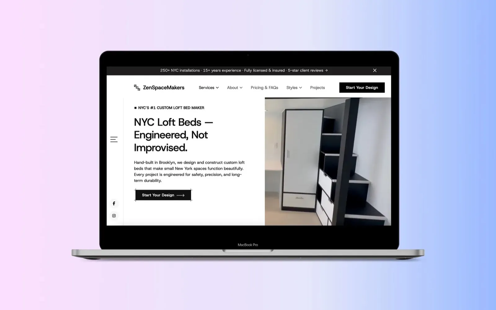
In short
- The business
- A Brooklyn studio that designs, builds and installs custom loft beds for small New York apartments. More than 250 installations and over 15 years of experience.
- The problem
- The old site looked fine and was losing people. Visitors left after a few scrolls, and the founder saw conversions falling by close to half month after month.
- The cause
- The site never explained the engineering, the process or the price range, and the contact form invited vague, low-quality enquiries.
- The approach
- Strategy before design. We started with the founder: pricing, the clients he wanted and did not want, and how people search for a loft bed in New York.
- The design
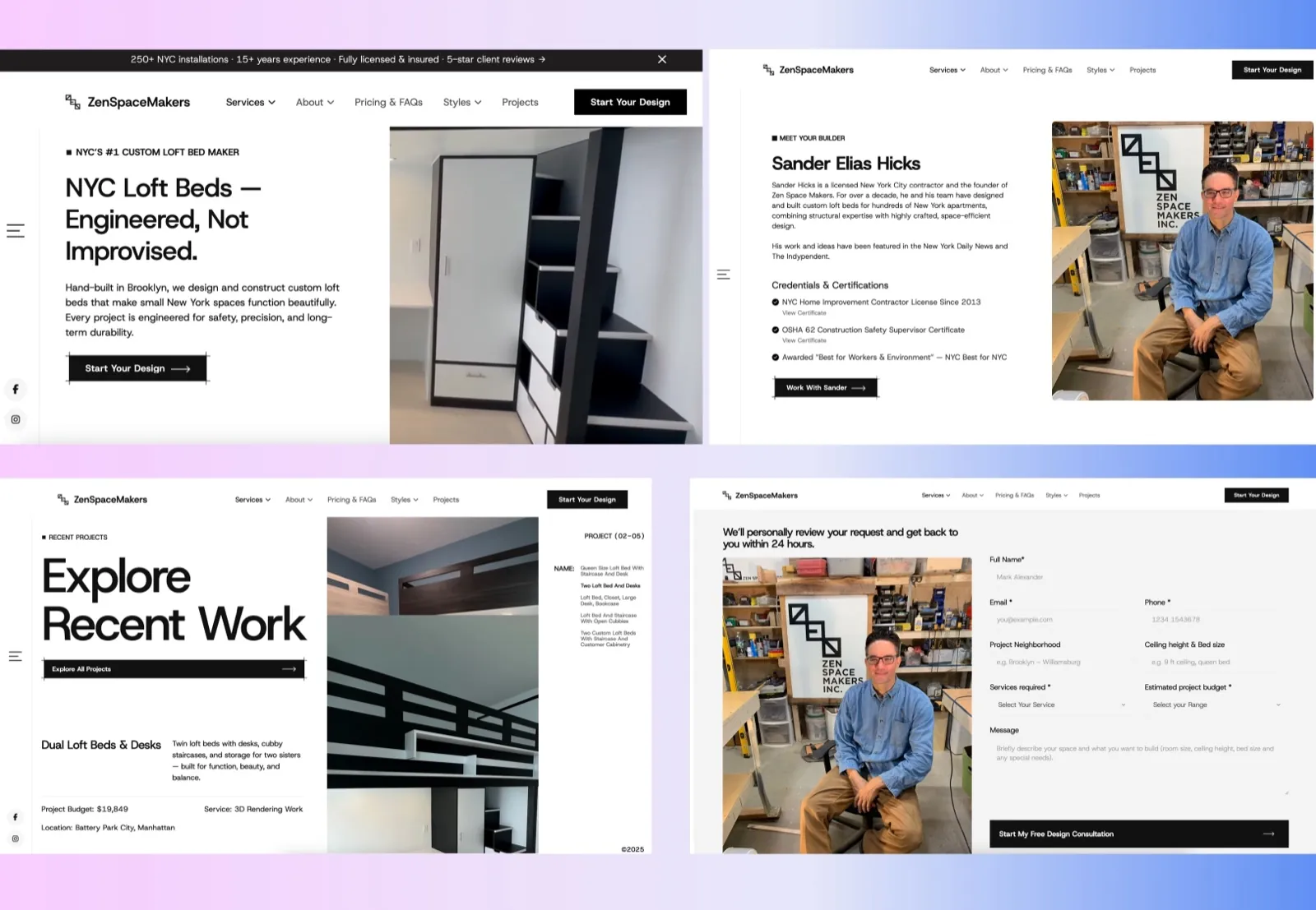
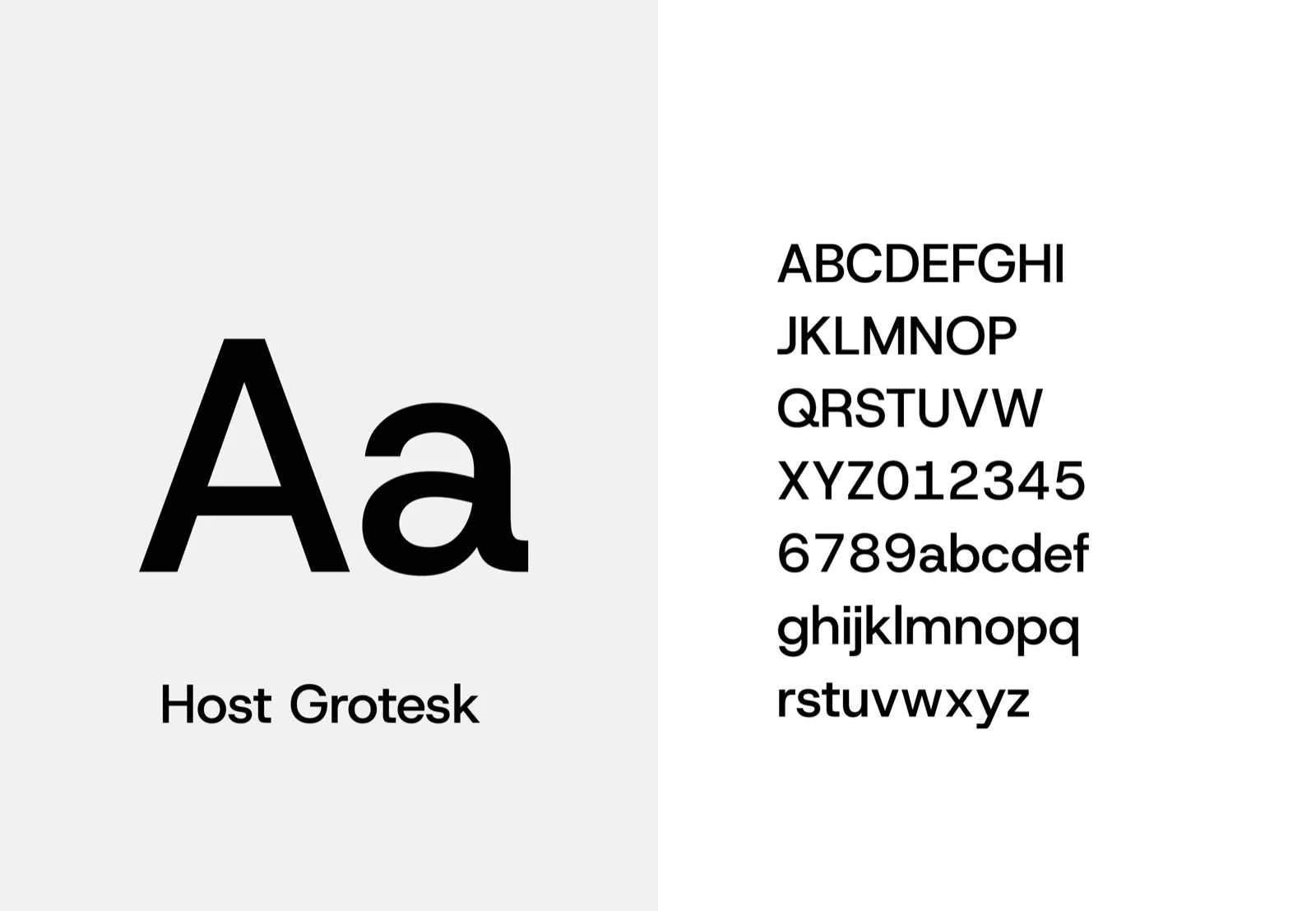
- Black and white with one typeface, Host Grotesk, so the installations carry the colour. A headline that claims engineering, the founder's credentials, and a form that qualifies the enquiry.
- The result
- The founder reported a $15,000 project from a new client in the first week after launch, and far fewer spam or dead-end enquiries.
Who LoftBedNYC is
LoftBedNYC is the loft bed business of Zen Space Makers Inc., a design and fabrication studio in Brooklyn. It designs, builds and installs custom loft beds and space-saving furniture for New York apartments, where a bedroom often has to be a bedroom, an office and a storage room at once. The team has more than 250 installations across the city and over 15 years of experience.
The founder, Sander Elias Hicks, is a licensed New York City home improvement contractor. A loft bed is something people sleep under a ceiling on, often above a child's desk, so the buying decision is about trust as much as style.
The problem
The old website was not ugly, and the business had a strong reputation. That was what made the problem hard to see. Over time the founder noticed conversions falling by close to half month after month, and most visitors leaving after a few scrolls without doing anything.
Looking at the site properly, five things were getting in the way.
- It sounded like furniture, not engineering. Nothing told a visitor that each bed is designed and built for a specific ceiling, floor and room.
- The process was invisible. People could not tell what happens after they get in touch, or how long it takes.
- Price was a mystery. Custom work with no sense of range makes serious buyers hesitate and invites time-wasters.
- The contact form was not built to convert. It asked for too little to be useful, so every enquiry needed a round of back and forth.
- The proof was buried. Years of installations, a licensed founder and happy clients, none of it placed where a decision gets made.
Strategy before design
We treated this as a repositioning, not a redesign. The work began with a long session with the founder, before any layout, on the questions a website usually skips:
- Where the company wants to be in five years.
- The real pricing structure and service model.
- The clients they want to attract, and the ones they would rather not.
- The words people type into Google when they need a loft bed in New York.
- How the business should sit against everyone else selling loft beds in the city.
The answers set the direction. LoftBedNYC would be positioned as the engineered option: custom loft beds designed for safety, precision and long-term durability, rather than furniture you assemble from a box.
A headline that makes a claim
The new hero leads with the positioning in plain words: NYC Loft Beds, Engineered, Not Improvised. A strip above the navigation carries the four facts a nervous buyer wants first: more than 250 New York installations, over 15 years of experience, fully licensed and insured, and five-star client reviews.
Below it, the page follows one order throughout: a headline, a short explanation, proof of the craftsmanship, then a single next step. Start Your Design is the only call to action in the first screen.
A form that qualifies the enquiry
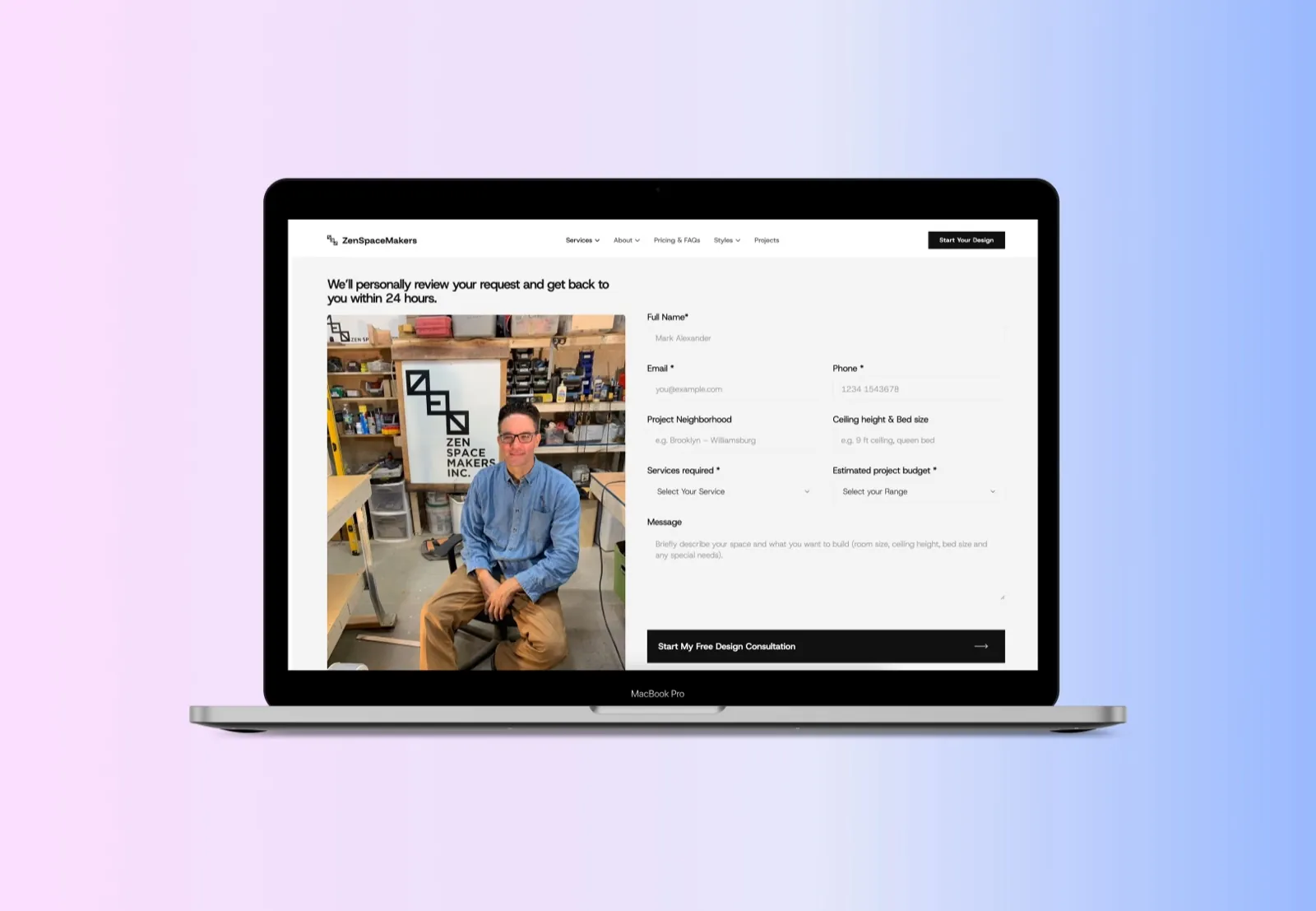
The most valuable change on the site is the least glamorous. The consultation form now asks for what the team needs before the first conversation: the neighbourhood, the ceiling height and bed size, the services needed and an estimated budget, alongside the usual name, email and phone. Above it sits one plain promise: We'll personally review your request and get back to you within 24 hours.
That does two jobs. Serious buyers arrive with clearer expectations, and the team can price and plan before picking up the phone. And the extra fields quietly filter out spam and fake contact details, which were wasting time on the old site.
The founder as proof
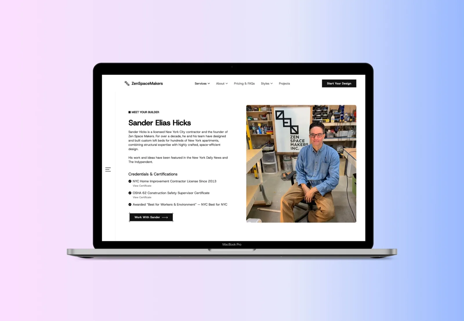
For a custom trade business, the person doing the work is the strongest argument. The founder has his own section, Meet your builder, with a photograph in the workshop and his credentials listed plainly: a New York City home improvement contractor licence held since 2013, an OSHA construction safety supervisor certificate and a Best for NYC award. His work has been featured in the New York Daily News and The Independent.
Recent projects are shown as real jobs, each with the neighbourhood, the budget and the service, so a visitor can see what a project like theirs looks like and roughly what it costs.
The brand system
The visual language was simplified on purpose. The site is white with black type and black buttons, and nothing else competes for attention. The installations are the colour. For buyers of engineered, made-to-measure work rather than mass-market furniture, restraint reads as confidence.
The single typeface is Host Grotesk, a modern grotesk with a technical, architectural feel that suits a brand built on precision. Structured layouts and disciplined spacing do the rest.
Search and build
The site was built in Webflow with a structure the team can keep adding to. It went live with technical SEO in place, content written to answer the questions buyers ask so it can be quoted by AI search tools, Google Search Console for faster indexing and Google Analytics for tracking. We also gave the founder a plan for organic growth: what to publish, how to use social media, and how to build authority over time.
What happened after launch
Within the first week, the founder reported winning a $15,000 project from a new client, with the whole enquiry handled through the new form. Since then the team has seen enquiries arrive with the details needed to quote, much less back and forth, and far fewer spam submissions. The site also loads faster and visitors spend longer on it.
We've worked with Rahat and Amariq across multiple phases of our Webflow site. They understand our marketing goals and execute quickly. It feels less like hiring a freelancer and more like having a dedicated web team.
Sander Hicks, founder of LoftBedNYC and Zen Space Makers.
Questions
What people ask about this project.
What was wrong with the old LoftBedNYC website?
It looked fine but did not sell. It never explained the engineering behind a custom loft bed, hid the process and the price range, and used a contact form that led to vague enquiries.
Visitors left after a few scrolls, and the founder saw conversions falling by close to half month after month.
Why start with strategy rather than design?
Because the problem was positioning, not looks. Until we knew the pricing, the ideal client and how people search for loft beds in New York, any layout would have been a guess.
The strategy session set the one idea the whole site is built on: engineered, not improvised.
How does a longer form get more enquiries, not fewer?
It gets better ones. Asking for the neighbourhood, ceiling height, services and budget lets the team price a job before the first call, and it filters out spam and people who were never going to buy.
A promise of a personal reply within 24 hours makes the extra fields feel worth filling in.
Why black and white?
Because the product is the colour. The installations are photographed in real apartments, and a neutral site lets them stand out. For premium, made-to-measure work, restraint reads as confidence.
What results did the redesign bring?
The founder reported a $15,000 project from a new client in the first week after launch, handled entirely through the new form. Enquiries now arrive with the details needed to quote, with much less spam.
Is LoftBedNYC the same as Zen Space Makers?
Yes. LoftBedNYC is the loft bed business of Zen Space Makers Inc., a design and fabrication studio in Brooklyn. Some screens show the studio's name in the logo.
Next case study