

Case study
Proving community ownership instead of claiming it
Indigo Power is owned by the communities it sells electricity to. That is the whole reason to switch, and the old homepage said it once in a headline and never backed it up. We rebuilt the page around the proof, and around the fear that stops people switching at all.
In short
- The problem
- Community ownership is the only reason to choose Indigo Power over a national retailer, and the old homepage asserted it in a headline without ever proving it.
- The second problem
- Switching electricity retailers carries a real fear: that the power will go off, or that it will be a fortnight of paperwork. Nothing on the old page addressed it.
- The idea
- Turn the claim into numbers, and answer the fear before it stops anybody. Every other decision followed from those two.
- The design
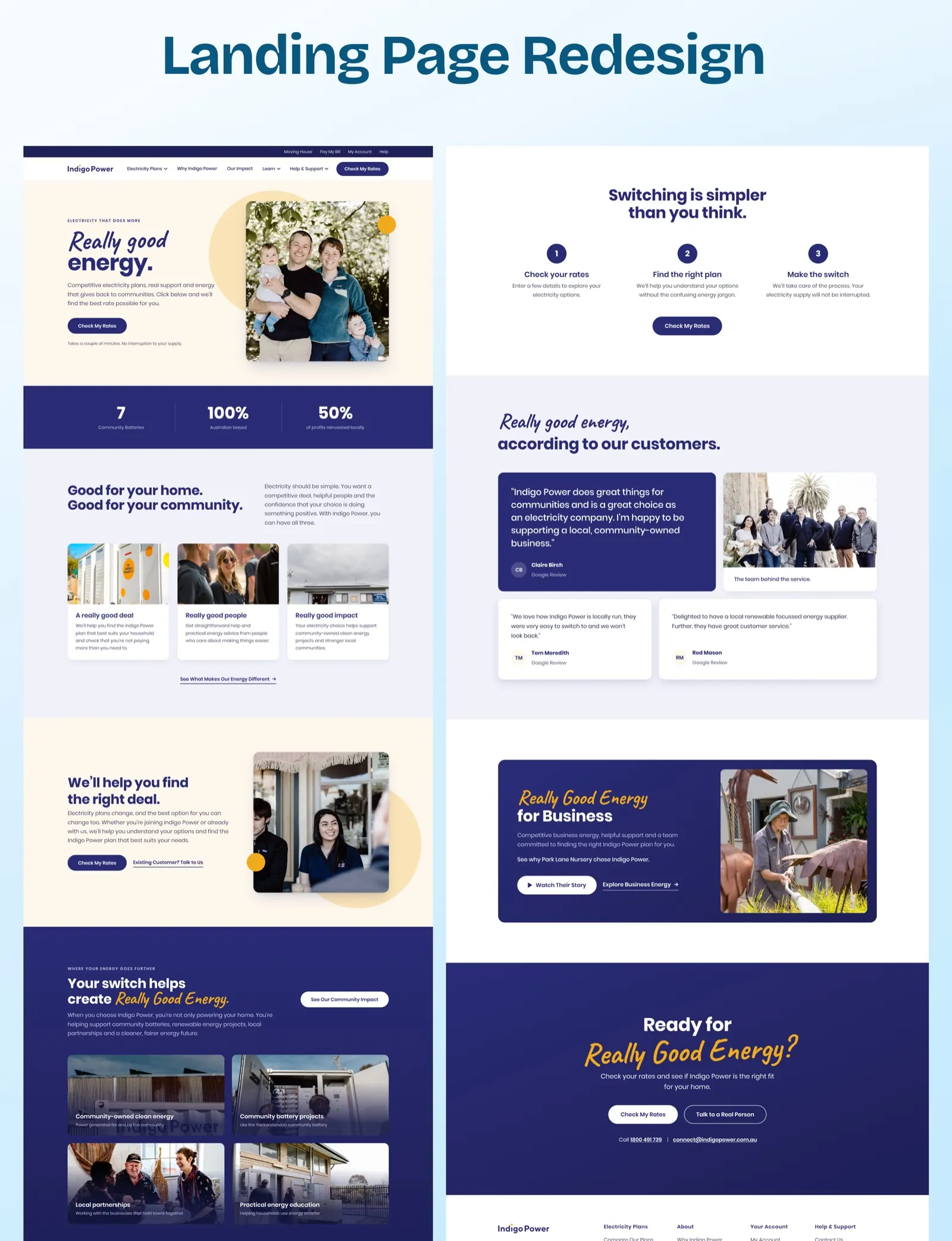
- One call to action instead of two competing ones, a band of figures under the hero, a three-step section on what switching actually involves, and reviews given a proper section with the team behind them.
- The detail worth stealing
- A separate door for existing customers, so they never enter a switch flow they do not need, and Talk to a Real Person as the closing alternative.
- The build
- Divi, on the existing WordPress site and matched to the running theme, so the rest of the site kept working.
Who Indigo Power is
Indigo Power sells electricity in north-east Victoria and is owned by the communities it sells to. Profits go back into local projects rather than to shareholders somewhere else, and the page names them: community batteries, including the one at Yackandandah, local partnerships and practical energy education.
That ownership model is not a nice extra. It is the entire commercial case. Indigo Power cannot win a price war against a national retailer, so the only reason a household switches is that the money stays closer to home. If a homepage fails to make that feel real, there is nothing else for it to sell on.
What the old page did wrong
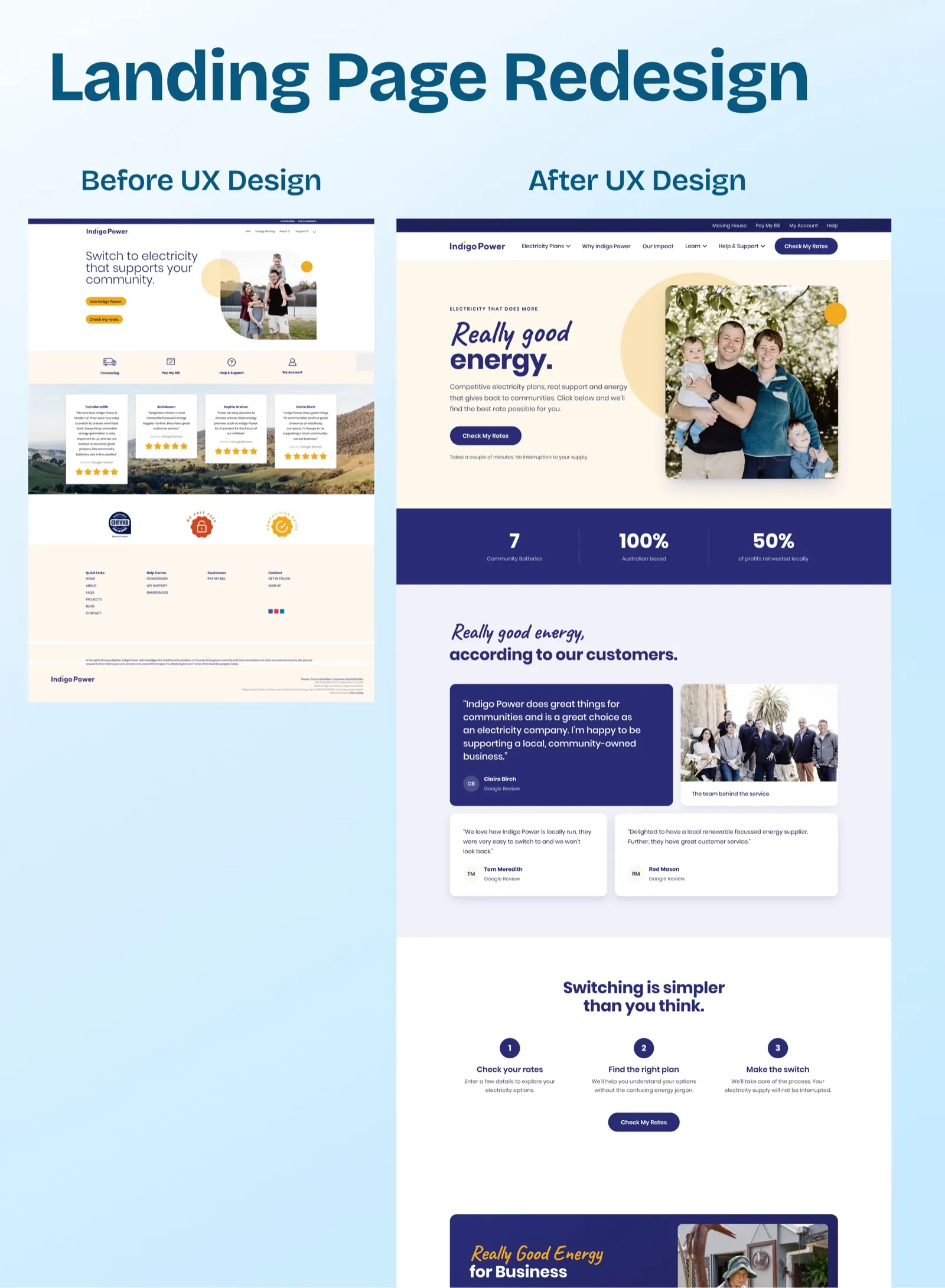
The old homepage said it, once, in the headline: Switch to electricity that supports your community. Then it stopped. Below the fold were four Google reviews floating on a landscape photograph, three trust badges, and the footer.
Two specific problems came out of looking at it properly.
- The claim was never evidenced. Nothing on the page told you how the community benefits, by how much, or where. A visitor had to take the headline on faith, and nobody switches utilities on faith.
- Two calls to action competed. Join Indigo Power and Check my rates sat side by side, the same size, asking for different levels of commitment. The page never decided what it wanted, so the visitor had to.
And underneath both, the thing nobody had written about at all: people are afraid to switch electricity retailers. They think the power will go off, or that it means a fortnight of paperwork. That fear was doing more damage than any missing feature.
Turning the claim into numbers
Directly under the new hero sits a band of three figures: seven community batteries, one hundred per cent Australian based, fifty per cent of profits reinvested locally.
That band is the single most important change on the page. It converts we support your community, which any retailer could write, into three things that can be checked. Further down, a section shows where the money actually goes, with the battery projects, the local partnerships and the education work each given a photograph and a name.
None of this was new information. Indigo Power had been doing all of it. It had simply never been on the homepage in a form a stranger could weigh.
Answering the fear
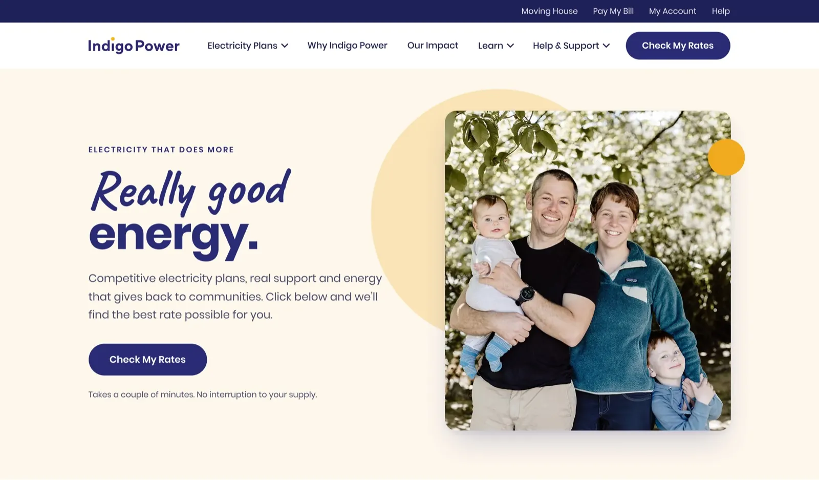
The hero now carries one button, Check My Rates, and one line of small text underneath it:
Takes a couple of minutes. No interruption to your supply.
Eleven words, doing more work than the paragraph above them. Further down, a whole section is given to the same worry: Switching is simpler than you think, in three steps, finishing on the promise that the supply will not be interrupted.
This is the part of the redesign that is easy to undervalue. It adds no features and demos badly. It removes the reason someone closes the tab.
Proof, given a proper place
The reviews were on the old page too, scattered over a photograph. They now have a section of their own, headed in the brand’s own voice, with one quote led large and two supporting it, each attributed and marked as a Google review.
Beside them sits a photograph of the staff, captioned simply the team behind the service. For a retailer whose argument is that it is local and human, a picture of the actual people is proof in a way a five-star rating is not.
Small decisions that matter
- Existing customers get their own door. Next to Check My Rates sits Existing Customer? Talk to Us, so somebody who already pays Indigo Power is not pushed through a switching flow built for strangers.
- The closing call to action offers a person. Check My Rates or Talk to a Real Person, with the phone number and email beside them. For a community-owned retailer that is the differentiator turned into a button.
- The brand line became the page’s spine. A really good deal, really good people, really good impact; your switch helps create Really Good Energy; ready for Really Good Energy. One phrase carries the visitor from the hero to the close.
- Business customers are not ignored. One block, with a named customer story at Park Lane Nursery and a video, rather than a second homepage fighting the first.
How it is built
The concept was approved first, then built in Divi on the existing WordPress site and matched to the theme already running there. That constraint mattered: this was a homepage replacement on a live site, not a rebuild, so every section had to be made from what the rest of the site could keep using.
Where it stands
Built and live at indigopower.com.au.
We have not published switch or conversion figures. We have not been given them, and on a utility site the honest measurement window is months, not weeks. If Indigo Power shares numbers later, they will go here with the period they cover.
Questions
What people ask about this project.
What was actually wrong with the old homepage?
Two things. It claimed community ownership without evidencing it, and it offered two calls to action of equal weight, so the page never decided what it wanted a visitor to do.
There was also something missing rather than wrong. Nothing addressed the fear of switching electricity retailers, which is the real reason people close the tab.
Why put statistics directly under the hero?
Because the claim above them is one any retailer could write. Seven community batteries, one hundred per cent Australian based and fifty per cent of profits reinvested locally are three things a sceptical reader can check.
None of it was new. Indigo Power had been doing all of it for years. It had simply never been on the homepage in a form a stranger could weigh.
Is one line of small text really worth a section of a case study?
"Takes a couple of minutes. No interruption to your supply." is eleven words that remove the single biggest reason a household does not switch.
Work like this is easy to undervalue because it adds no features and demos badly. It is usually the highest-return change on a page.
Why Divi rather than rebuilding the site?
Because this was a homepage replacement on a live site, not a rebuild. The page had to be built from what the rest of the site already used and matched to the running theme, so everything else kept working.
We pick the platform that fits the situation. We also build on Webflow, Shopify, Framer and other WordPress builders.
Are there conversion figures for this redesign?
Not on this page. We have not been given them, and on a utility site an honest measurement window is months rather than weeks, because switching is a considered decision with a long tail.
If Indigo Power shares numbers later we will publish them here with the period they cover.
Can you do the same for another purpose-driven business?
Yes, and the method transfers. The work is finding the claim the business is already living up to and has never evidenced, then building the page around the proof instead of the promise.
Next case study