

Case study
Two directions for a building inspector, and the one that went live
IBRV is an independent building inspector in Wangaratta. We redesigned its site, moved it off Duda and designed two homepage directions on the same content. The client chose the one in its own colours, now live across five pages. Both are shown here, with the reasoning behind each.
In short
- The business
- An independent building inspector in Wangaratta, run by Andrew, a qualified carpenter with more than 25 years in building. Pre-purchase, new home handover and pest inspections across North East Victoria.
- The problem
- The old Duda site was a wall of text in spaced-out capitals. The inspections, the prices and the man doing the work were all there, but none of it led to a booking.
- The idea
- Put the enquiry in the first screen. A buyer with a settlement date should be able to request an inspection without scrolling.
- Two directions
- Two homepages on the same content. Concept 1 in IBRV's own navy and lime, Concept 2 with the design given full control. Both are shown here.
- What went live
- The client chose Concept 1. It is live at ibrv.com.au as five pages: home, two inspection pages, a Wangaratta location page and contact.
- The build
- Webflow, replacing Duda, with every inner page designed from the approved homepage so the site reads as one piece.
Who IBRV is
Independent Building Reports Victoria has inspected homes in and around Wangaratta since 1999. It is Andrew, a qualified carpenter with more than 25 years of building experience, who does the inspection himself, writes the report and talks the buyer through it afterwards. The work covers North East Victoria, from Albury-Wodonga to Bright, Mansfield, Seymour and Shepparton.
People book him at a tense moment. They are about to sign a contract, bid at an auction or accept the keys to a new build, and they have a deadline. The website's job is to turn that worry into a booked inspection as quickly as possible.
What the old site did
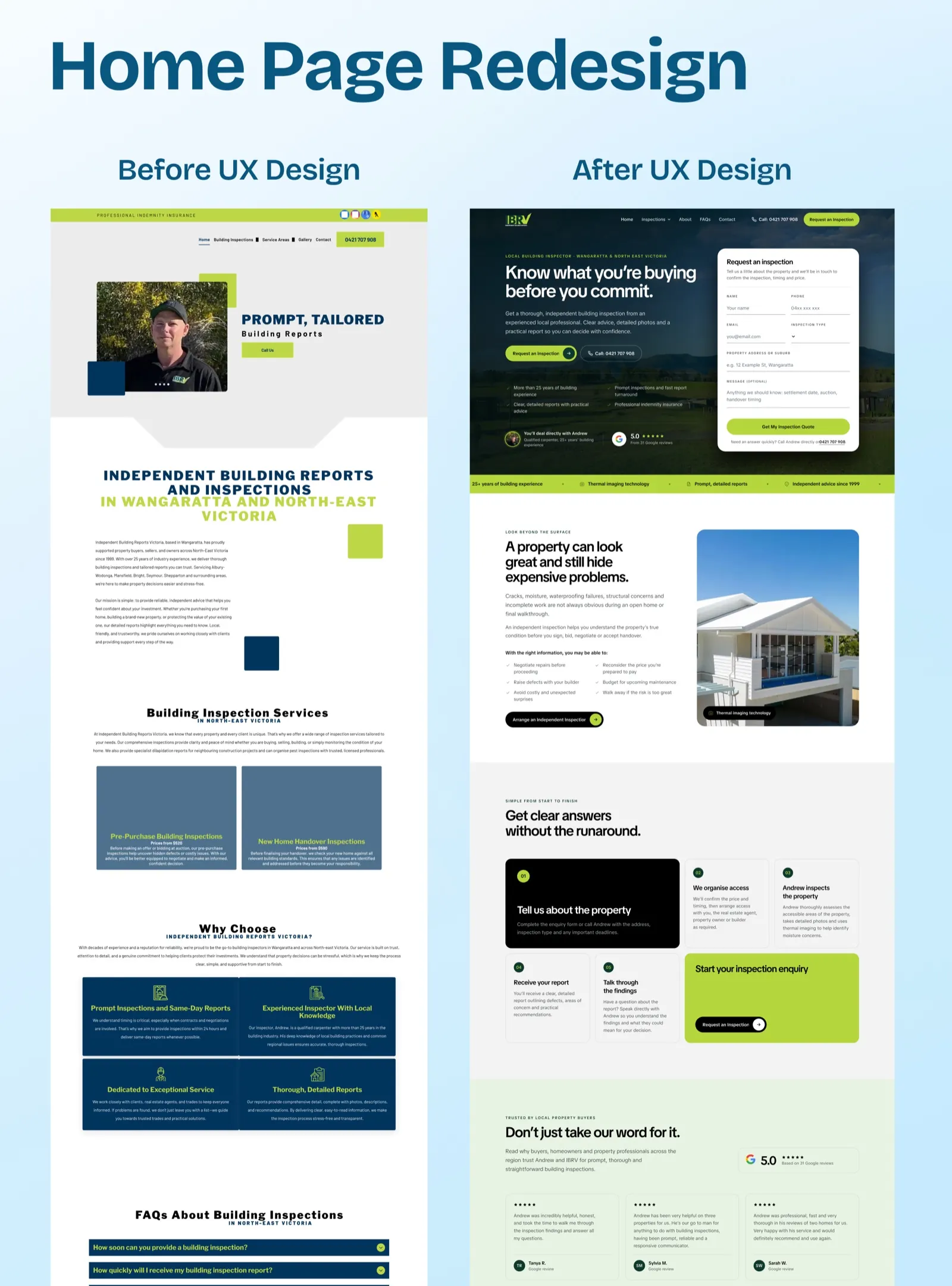
The old site ran on Duda. Everything a buyer needed was technically on it: the inspection types, a starting price for each, a photo of Andrew, a phone number and a set of FAQs. The trouble was the delivery.
- Headings in spaced capitals, body in small grey type. The introduction was two long paragraphs that asked the reader to do the work.
- The services were grey boxes. Pre-purchase and handover inspections sat in two plain blue-grey tiles with the text squeezed along the bottom, easy to scroll straight past.
- No path to a booking. There was a Call Us button and a phone number, but no form, no steps and nothing to say what happens after you call.
- The strongest proof was missing. IBRV has a perfect score across 31 Google reviews. Nothing between the hero and the FAQs mentioned it.
The enquiry goes in the first screen
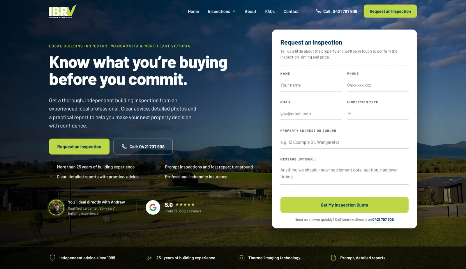
Both directions start the same way. The headline speaks to that tense moment: Know what you're buying before you commit. Beside it, not below it, sits the enquiry form: name, phone, email, inspection type, the property address and an optional message for settlement dates or auction timing. A buyer with a deadline can ask for an inspection without scrolling at all.
Under the headline, four short ticks carry the reasons to trust the business, and below them two proofs sit side by side: You'll deal directly with Andrew, with his photo, and 5.0 from 31 Google reviews. For a one-man local business, the man himself is the selling point, so he is in the first screen too. The form closes with a line for anyone who would rather talk: call Andrew directly, with the number.
Below the hero, the page follows the questions in the order a buyer asks them. Why bother with an inspection. Which inspection do I need, and what does it cost. What happens after I enquire. Is Andrew any good. Do you cover my area. Then the FAQs, and one last way to get in touch.
Two directions, one brief
We designed two homepages with the same content in the same order. Concept 1 stays close to IBRV's own navy and lime. Concept 2 was a deliberate test of how far the same brief could go if the design took full control, so the client could see the range before choosing.
The client chose Concept 1. It was the right call for a local business whose customers already know its colours. One idea still crossed over: Concept 2's lighter tick marks replaced the filled discs in Concept 1 before it was built.
Concept 1, the site that went live
Concept 1 is built on IBRV's navy and lime, with one typeface, Barlow, doing all the work. The hero is a photograph of regional Victoria under a measured dark overlay, with the navigation sitting over the image and the enquiry card clearing the fold. Along the bottom of the photo runs a band of four credentials: independent advice since 1999, 25 years of building experience, thermal imaging and prompt, detailed reports.
The inspection cards show real prices up front. The client's own revision round set them at $560 for a pre-purchase inspection and $660 for a new home handover, both including GST, and turned the third card into a pest inspection from $350. Prices on a building inspector's site are not a risk. They are the reason people keep reading.
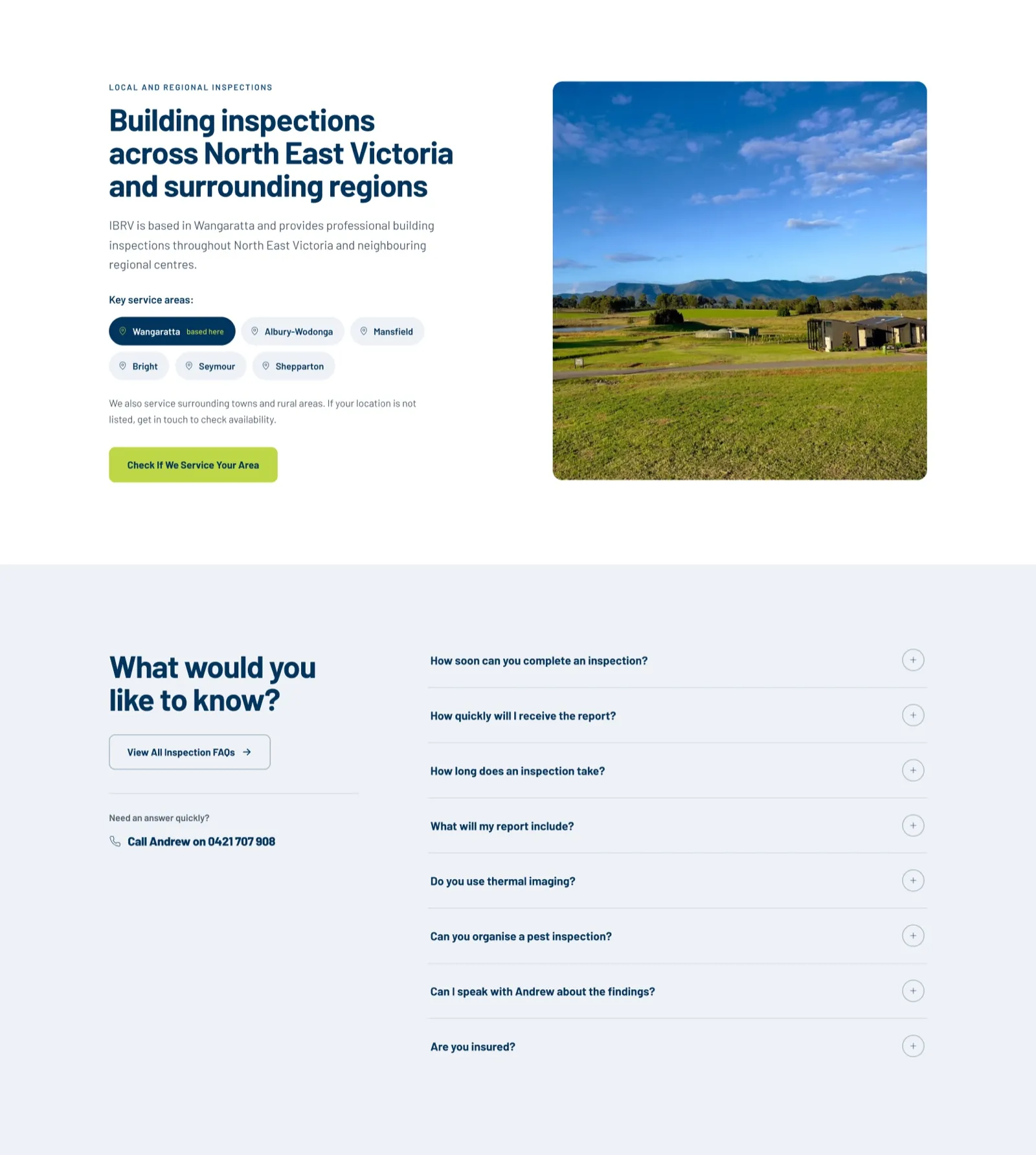
Two sections sit on dark navy, the process and the reviews, so the long page has a rhythm instead of five pale sections in a row. The service areas are a row of towns with Wangaratta marked as the base, and the FAQs come with a direct line to Andrew beside them.
Beyond the homepage
Four more pages were designed from the approved homepage: one each for pre-purchase and new home handover inspections, a location page for Wangaratta, and contact.
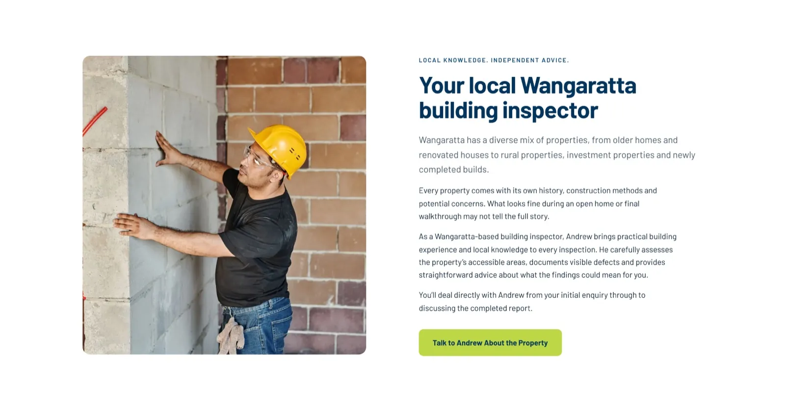
The Wangaratta page had a quiet search problem. Its job is to rank for building inspections in Wangaratta, but the homepage mentions Wangaratta too, and two pages chasing the same search usually means the homepage wins and the location page ranks for nothing. The fix was on the homepage: its Wangaratta chip links straight to the location page, which tells Google which page is the Wangaratta page. The location page itself is written about the town, Your local Wangaratta building inspector, and the mix of older homes, renovations, rural properties and new builds found there.
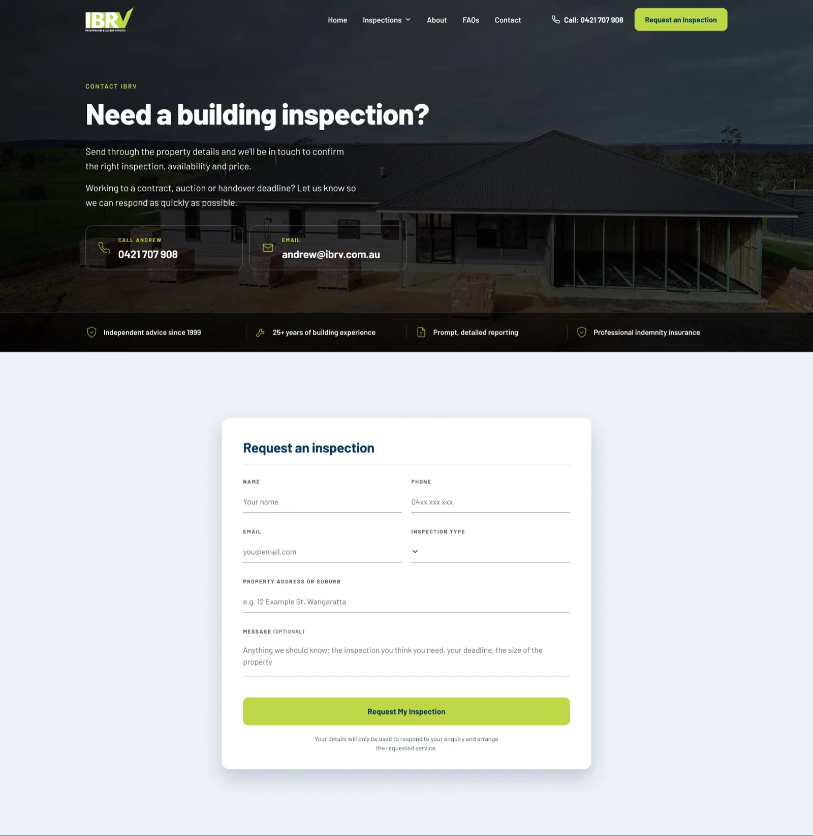
The contact page is deliberately different from the others. It has a short hero, Need a building inspection?, with Andrew's phone and email as two large tiles and a line for anyone working to a contract, auction or handover deadline. The form gets a section of its own, centred, with a short promise underneath about how the details will be used. A contact page built on the long homepage template would have read as a page with things missing.
Concept 2, taken further
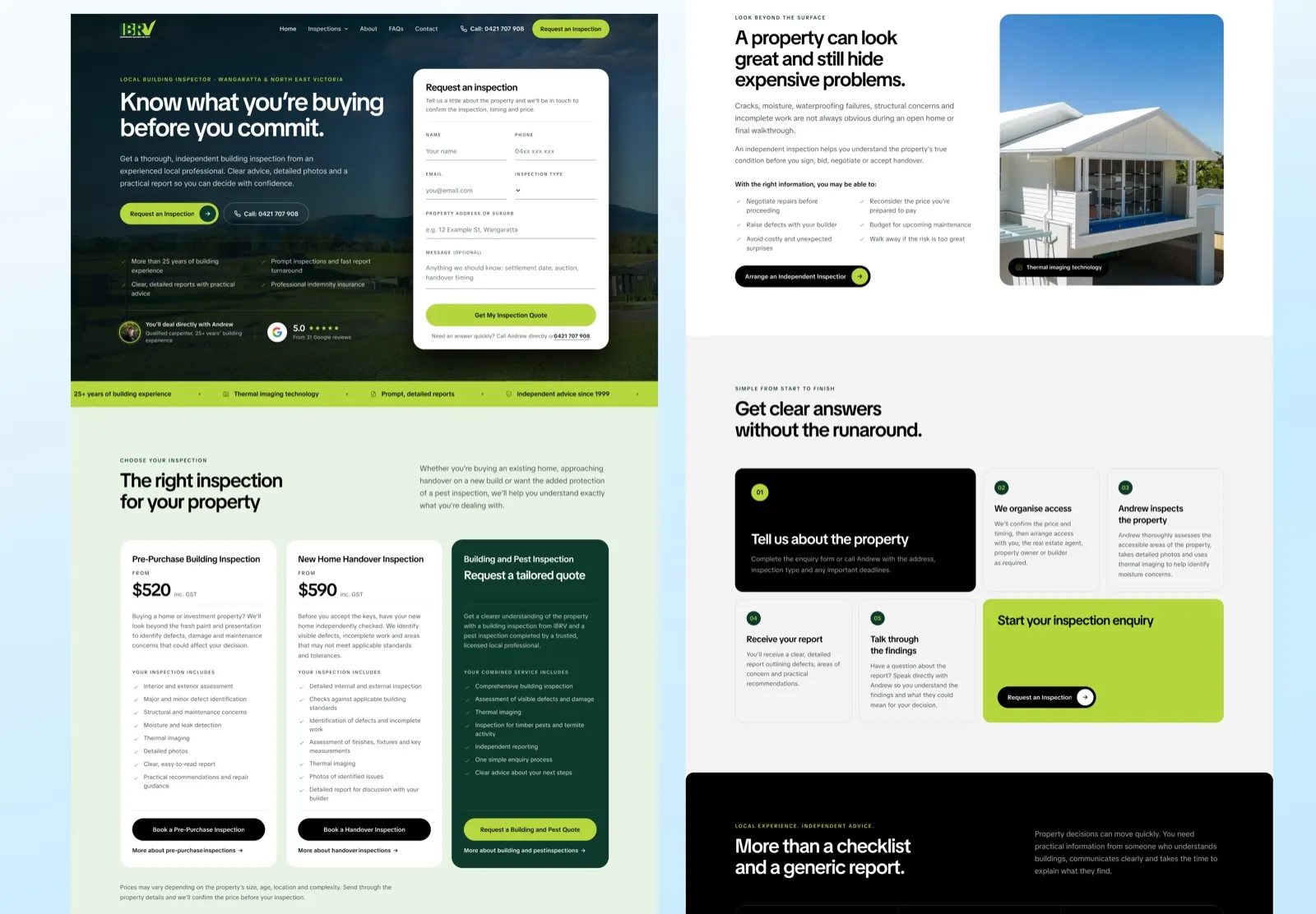
Concept 2 was not built, but it is worth showing, because the reasoning behind it applies to a lot of small business sites.
- Grounds are ink and paper. Solid black, solid white and one cool grey carry the page. The brand colour appears in five places only: the trust strip, the process section, one pricing card, the buttons and the small marks. Painting every section in the brand colour is what makes a site look like a template.
- A palette that can be read. IBRV's lime cannot be used as text on white at all; it measures about 1.3 to 1 for contrast. The shifted lime and deep green in Concept 2 work as text, as a button and as a full section background, so the accent can do three jobs instead of one.
- One typeface at one weight. Concept 2 swaps Barlow for a single newer family with headings at a medium weight and tight spacing. Restraint at large sizes is most of what makes type look expensive.
- Almost no new words. Four long sentences were shortened to fit the tighter layout, in the client's own voice. Nothing else was rewritten.
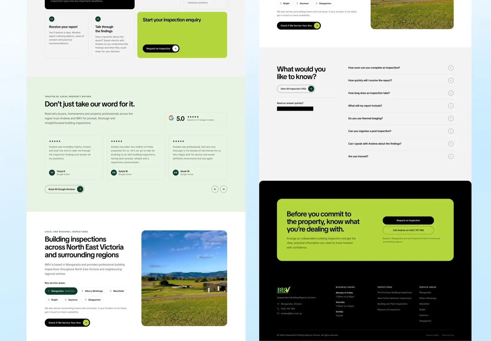
The reviews sit under a plain heading, Don't just take our word for it, with the 5.0 rating shown once beside the section and each card marked as a Google review under the reviewer's name. Showing the Google logo on every card would have been repetition, not extra trust. The page closes on a lime panel: Before you commit to the property, know what you're dealing with.
Small decisions that matter
- The photographs are honest about where they are. Some of the landscape photography is stock rather than North East Victoria, so the image descriptions say regional Victoria and never claim a specific place.
- Contrast was measured on the photograph. The hero text sits on an image, so it was checked against the rendered picture, not just the colour values. Both concepts passed WCAG AA at desktop and phone widths.
- Concept 2 was tested across 24 screen widths, from 280 to 2560 pixels, with no layout faults.
How it is built
Once the client chose Concept 1 and signed off a round of changes in Figma, the five pages were built in Webflow, replacing the Duda site. Each inner page was designed from the approved homepage, so the site reads as one piece, and the structure leaves room for more location pages. The live site has since grown to include pages for more of the towns IBRV covers and a pest inspection page.
Where it stands
Concept 1 is built and live at ibrv.com.au. Concept 2 was designed in full and reviewed by the client, but not built.
We have not published enquiry figures. We have not been given any, and a new site needs a few months of bookings before a comparison means anything.
Questions
What people ask about this project.
Which version is live?
Concept 1, in IBRV's own navy and lime. The client chose it, and it is live at ibrv.com.au.
Concept 2 was designed in full and reviewed by the client, but not built. Both are shown on this page, and every image says which one it is.
Why design two homepages?
To show the client the range before they committed. The first stayed close to the existing brand. The second took full control of palette and type, on the same content, to show how far the brief could go.
Seeing both makes the choice real. It also meant good ideas from the second could be carried into the first, and the tick marks were.
Why put a form in the hero?
Because people book a building inspection under a deadline: a contract, an auction or a handover date. The fewer steps between landing and asking, the better.
The form asks only what IBRV needs to confirm an inspection, and it offers the phone number underneath for anyone who would rather call.
How do you stop a location page competing with the homepage?
Tell Google which page is which. On IBRV the homepage mentions Wangaratta, so its Wangaratta link points straight at the location page, and the location page is written about the town itself rather than repeating the homepage.
Without that link, the homepage usually wins the search and the location page ranks for nothing.
Why move off Duda?
Webflow gave the site proper control over layout, type and speed, and a structure that more location or service pages can be added to later. We also build on WordPress, Shopify and Framer, and pick whatever suits the business.
Are there results?
Not yet, and we will not invent any. If IBRV shares enquiry figures later, we will publish them here with the period they cover.
Next case study