

Case study
A herbal tea shop that follows your day, one blend for every hour
Fennly sells loose-leaf herbal teas and bath soaks in tins you refill. We designed its shop homepage for Framer, light first with a dark version from the same source, and let the photos carry all the colour while the shop parts do the selling: a hero that moves through the day, a bundle builder, a steep timer and refills you can set up in one tap.
In short
- What it is
- The shop homepage for Fennly, a small brand of loose-leaf herbal teas and bath soaks sold online, designed for Framer in a light and a dark version.
- Who it is for
- Adults who want a calmer daily routine and buy their tea and bath products online, often on a phone.
- The hard part
- Wellness shops tend to sell with promises. We wanted a page that sells with taste, ingredients and the moment of the day each blend is made for, and makes no health claims at all.
- The idea
- A day in four blends. The hero moves from a 7:00 morning cup to a 21:30 bath, and every section after it is a working piece of the shop.
- The design
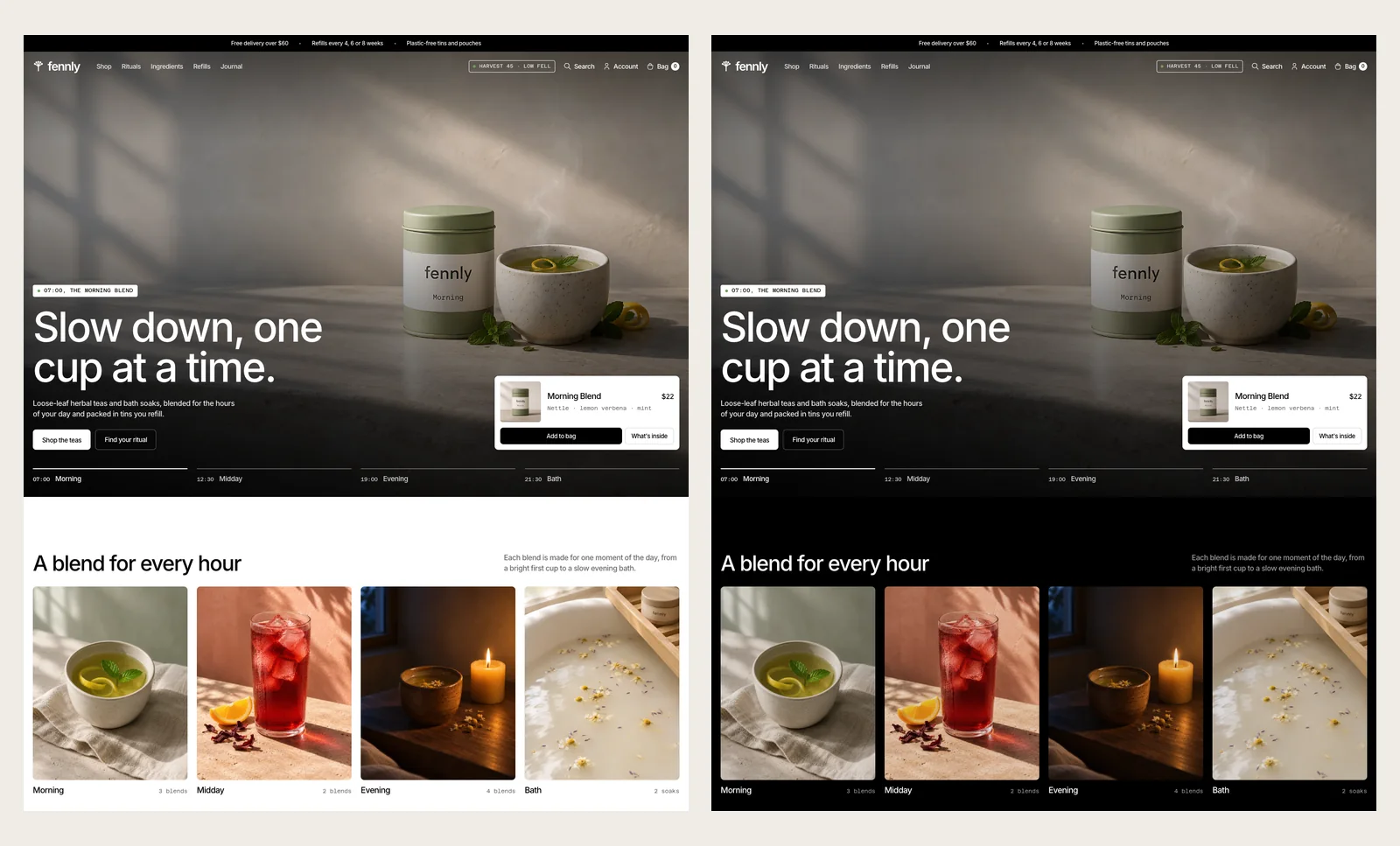
- A white page, black Inter with tight tracking, small mono labels, 8 pixel corners and a 20 pixel gutter that runs edge to edge. The only colour comes from warm close-up photos made for the brand.
- Good to know
- The farms, prices and products on the page are sample content written for the design, and the photos were made for it.
What Fennly is
Fennly blends herbal teas and bath soaks for the hours of an ordinary day: a Morning Blend with nettle and lemon verbena, a Midday Blend with hibiscus, an Evening Blend with chamomile and lemon balm, and an Oat Bath Soak for the end of it. Each comes in a plain tin you keep, and refills arrive in paper pouches every 4, 6 or 8 weeks.
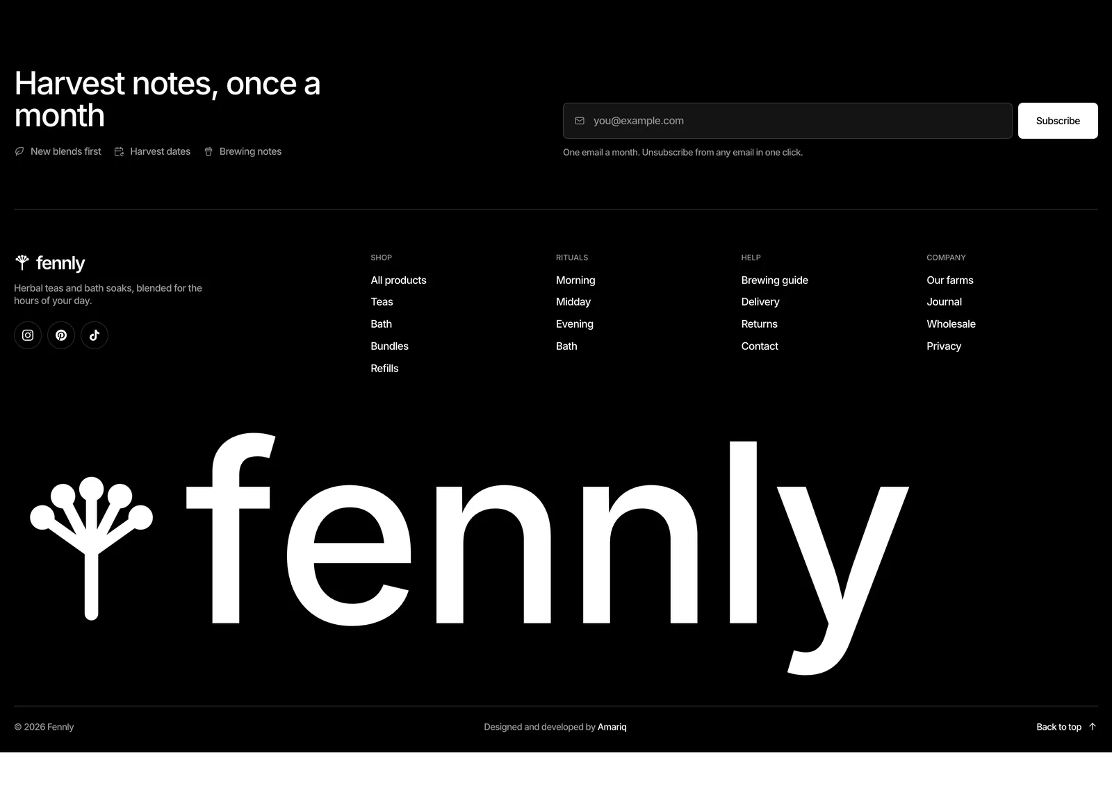
The name comes from fennel, and so does the mark: an umbel, the flower head of the plant, drawn as five rays from one stem. It sits in the navigation, the favicon and the giant wordmark that closes the footer.
The problem the site had to solve
- Sell without promising. No “better sleep”, no “detox”, no badges or review stars. Blends are described by taste, ingredients and the time of day they are made for.
- Make four products feel like more. A small range needs a reason to browse: moments, ingredients, a bundle and a ritual, each with its own way in.
- Feel calm and still shop well. Prices, sizes and the bag have to be clear and fast, without the page turning into a busy store.
- Make refills easy to choose. The tin is bought once. The page has to make the refill plan as simple as adding a product.
A day in four blends
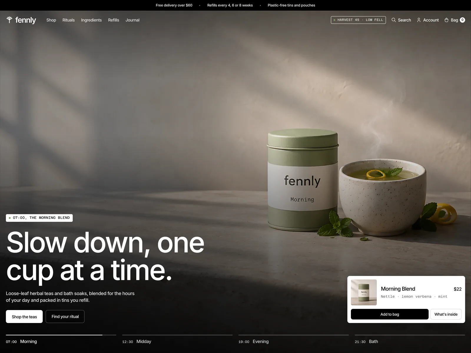
The first screen is one counter by one window, shot at four times of day: 07:00 in cool dawn light, 12:30 under hard sun and leaf shadows, 19:00 in low gold, and 21:30 by candlelight with the bath tin. A timeline along the bottom works as the clock. Each hour fills its bar for four and a half seconds and then hands over to the next, and you can tap any hour to jump to it.
A small product card in the corner follows the hour, so the photo you are looking at is always one tap away from the bag. The hero only pauses when it leaves the screen or the tab is hidden, never because a pointer is resting on it.
A shop grid with room to breathe
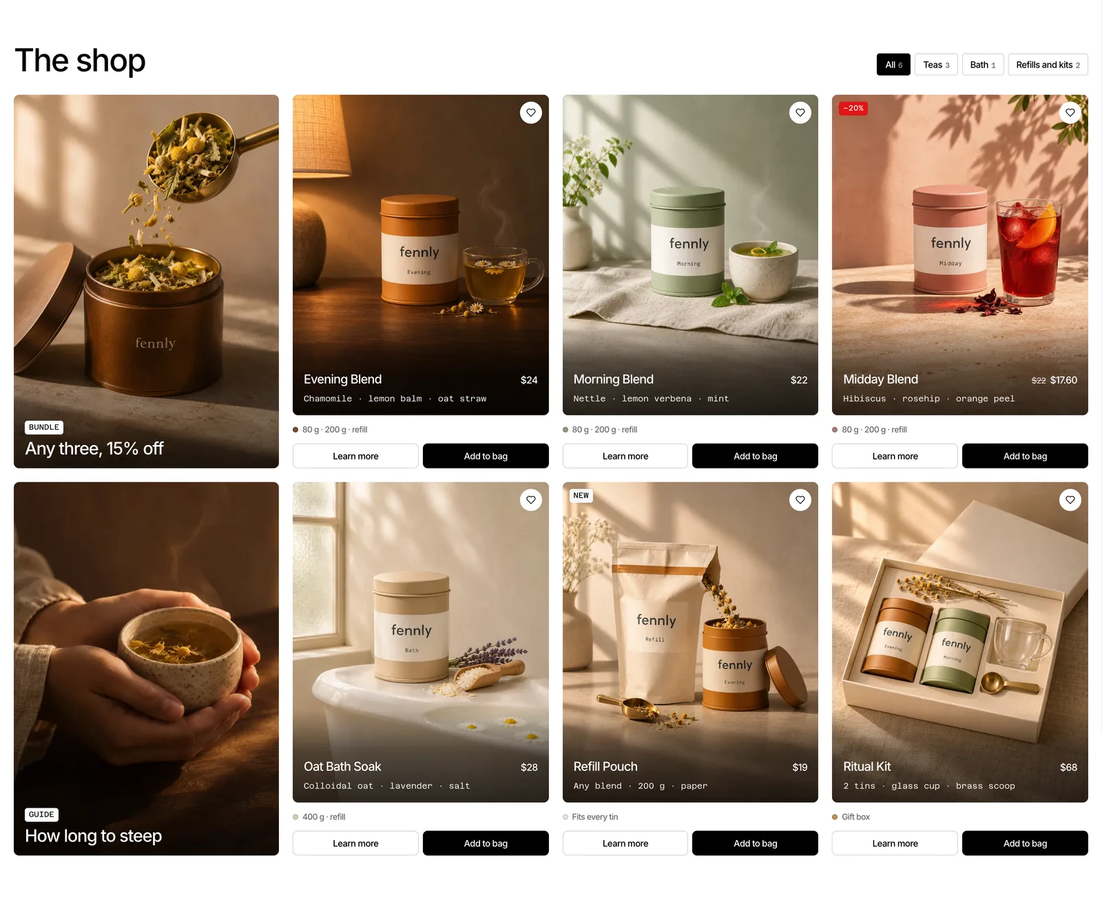
After a row of four moments, the shop mixes two large photo tiles with six product cards in one design. Every card is a lifestyle photo made for that blend, with its own set and light, and the name, price and ingredients sit in white on a soft shade at the bottom. Sizes and two equal buttons, Learn more and Add to bag, sit underneath.
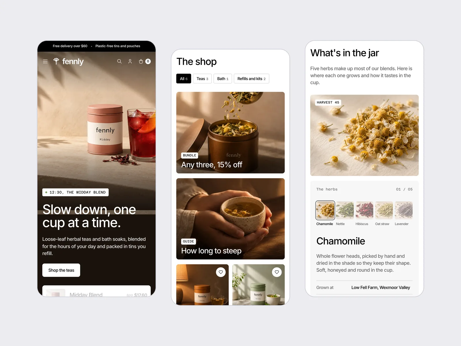
Tabs above the grid filter by Teas, Bath and Refills and kits, with a count beside each. One card carries the red sale tag, the only UI colour on the whole page.
Add to bag opens a side bag rather than a new page. Each line has its photo, size and a stepper for more or fewer, the subtotal updates as you go, and a thin bar counts down to free delivery at $60, so one more tin always has a clear reason. The bag icon in the nav keeps a live count and opens the same drawer from anywhere on the page.
What’s in the jar
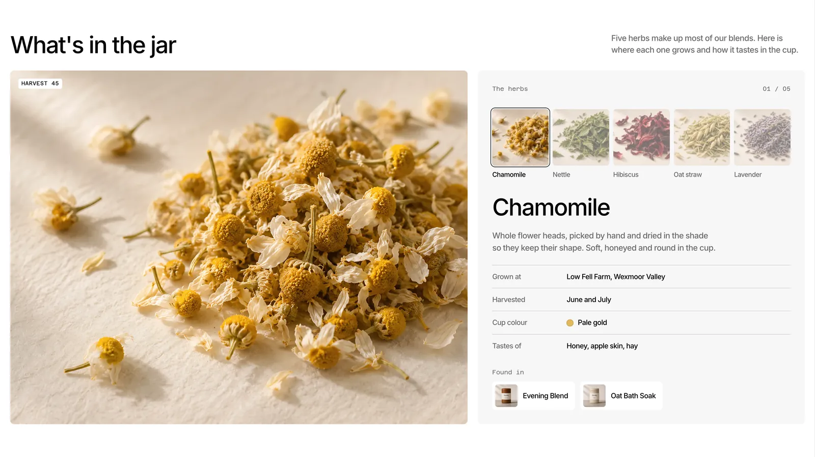
Five herbs make up most of the blends, and each one gets a sheet: a big close-up of the dried herb, where it grows, when it was harvested, the colour it gives the cup, how it tastes, and which blends use it. Small photo tabs switch between the five, with a 01 / 05 counter so you always know where you are.
Build your ritual
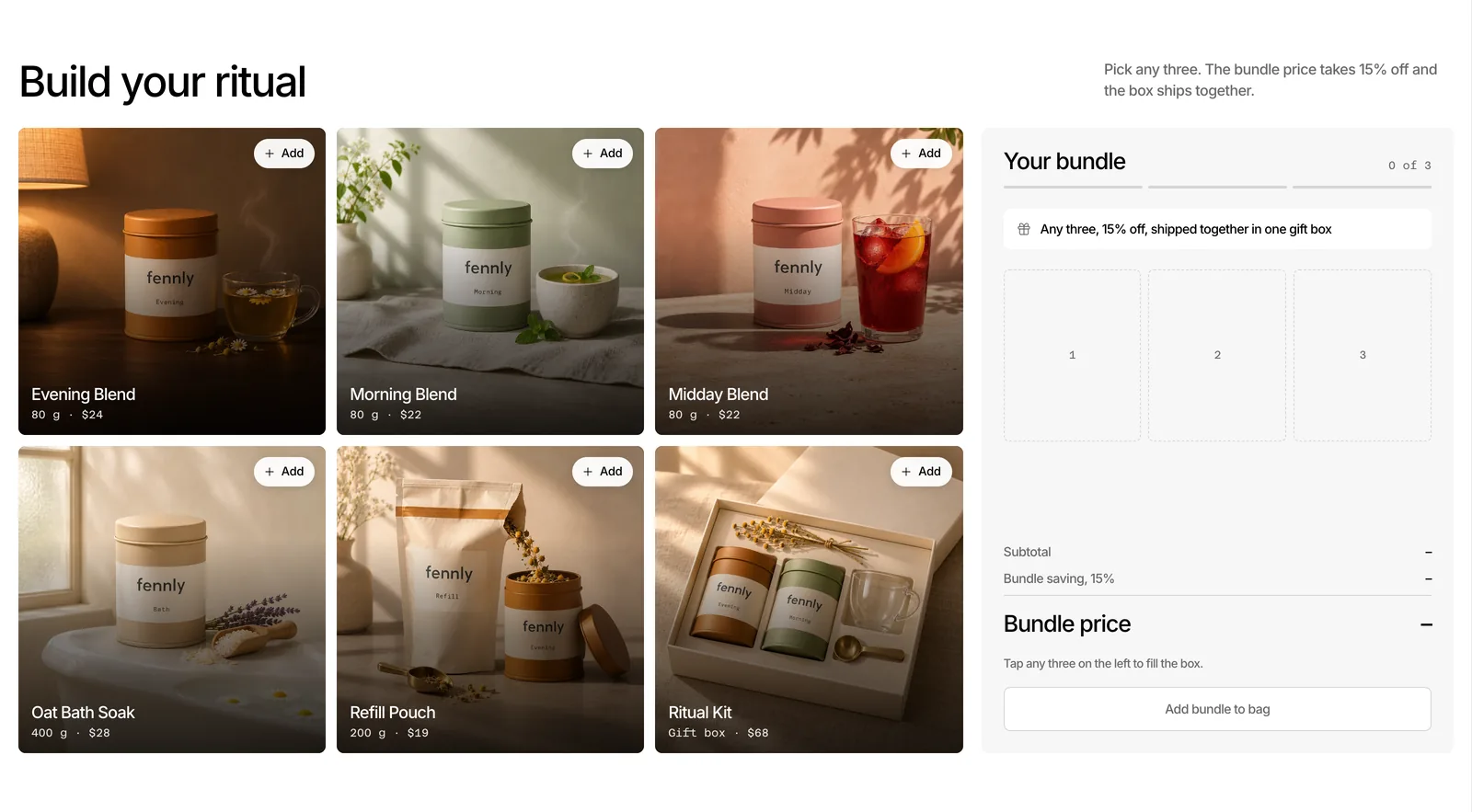
The bundle builder turns the range into a small game. Pick any three products and the summary panel fills one numbered slot at a time, a three step bar tracks your progress, and once the third is in, the subtotal is struck through and the bundle price appears with 15% off. Each pick shows its state on the tile itself: Add, Added, or Bundle full once three are chosen.
Brew it right
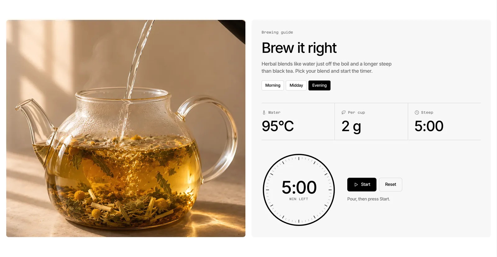
Herbal blends need hotter water and a longer steep than black tea, so the page shows how. Choose Morning, Midday or Evening and the water temperature, the amount per cup and the steep time change to match. Press Start and a ring of sixty ticks counts down the minutes. It is the one loop on the page, and it stops when the tea is ready.
Keep the tin, we send the tea
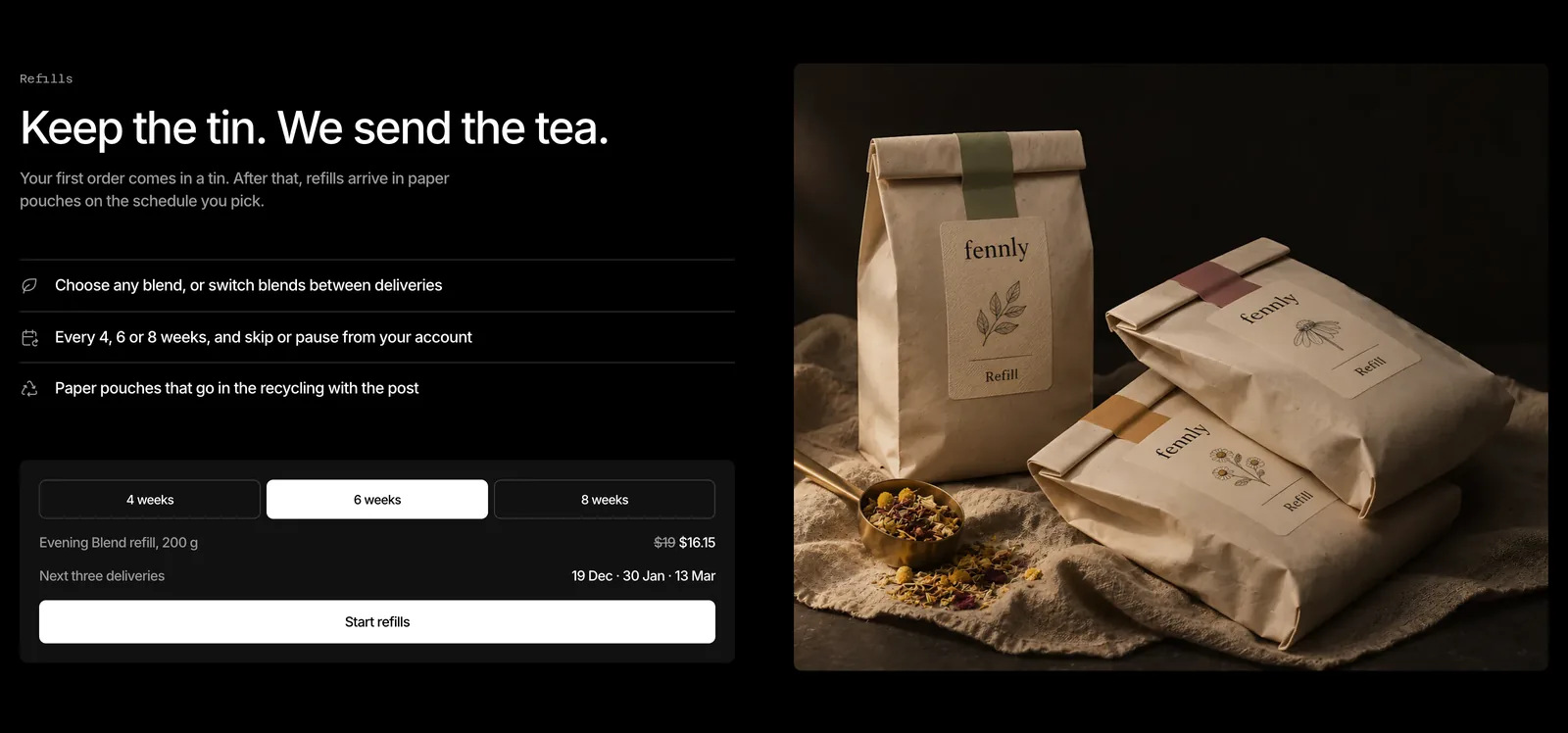
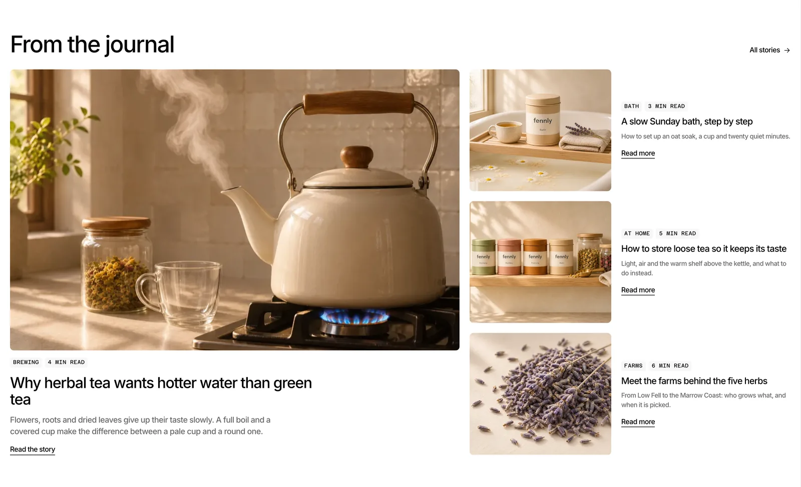
Refills get their own black band: a plain list of what the plan does, a switch for every 4, 6 or 8 weeks that updates the next three delivery dates, and one big photo of the paper pouches. After it, the journal leads with one story about water temperature, with three shorter stories beside it, and the range closes on a photo of the four tins with the line “Four blends, one tin you keep”.
The brand system
The UI has almost no colour: a white page, pure black text, a pale grey panel and a stone grey for lines, with red kept for the sale tag alone. The colour lives in the photos instead, amber tea, honey light and sage green, all made for Fennly with the surface, background and light written into every prompt, then upscaled and graded in the files so they read as one shoot.
Inter carries every word at weight 500 with tight negative tracking, and Azeret Mono sets the small labels: harvest notes, times, temperatures and weights. Corners come from a short scale, 4 pixels for tags, 7 for buttons and 8 for cards and photos. The only hover effect is a thin rim of light that follows the pointer around the photo frames.
Light first, dark from the same source
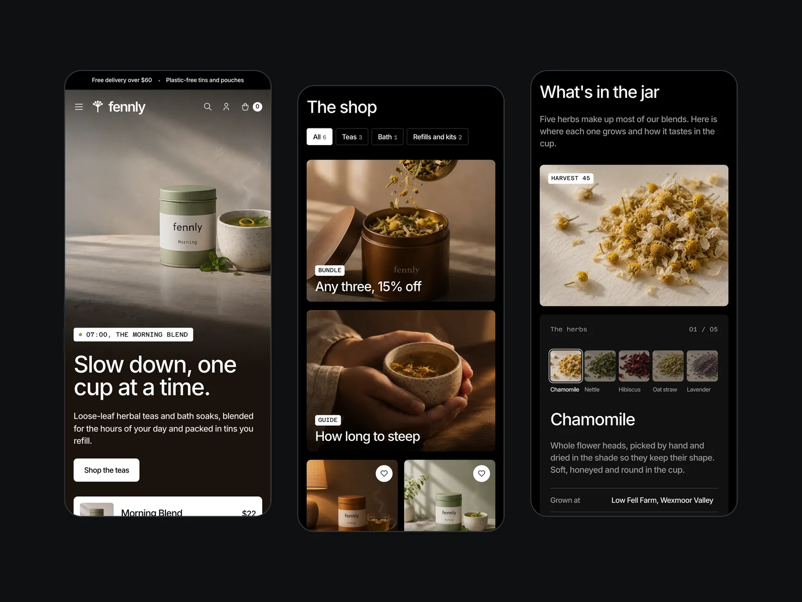
The light version is the main one, because a white shop page lets warm photos do the work. The dark version is generated from the same file, so a change reaches both themes at once. The page turns black and the type turns white, and every photo gets its own deeper grade, baked into a second set of files, so it sits quietly on black.
Motion with a job
- One clock. The hero timeline is the only thing that moves on its own, and each hour lasts four and a half seconds so the whole day plays in under twenty.
- Swaps, not slides. The hero card, the shop grid and the herb sheet fade out, change and fade back in, so nothing jumps halfway through.
- Smooth, quiet scroll. Each section rises once as it arrives, and scrolling is smoothed so the photos glide rather than jump.
- Calm by request. For visitors who ask their system for reduced motion, every animation is off and the page is complete without it.
Fast and easy to read
- Light to load. On a slow phone profile the page loads in 15 requests and about 530 KB, with the largest image on screen in about 2.3 seconds. Photos are WebP in two sizes, and the typefaces and animation code are served from the site itself.
- Steady while loading. The photo grade is built into the files instead of being calculated as you scroll, and nothing on the page shifts as it loads.
- Easy to read. Every line of text on the page passes the WCAG AA contrast standard in both themes, on desktop and on phones, including the white text on photos.
Built for phones
On a phone the hero photo sits on top with the headline and product card below it on a dark ground, so the text never covers the tins. The shop tiles stack, the product cards go two across, and the bundle panel and steep timer stay full width and easy to tap.
Ready for Framer
Fennly was designed for a Framer build from the first section. Each section stands on its own so it maps to one Framer component, the colours, type, corners and spacing sit in a small set of shared variables, and the two themes are a single variable swap. Products, herbs and journal stories are lists of the same card, ready to become Framer CMS collections.
Questions
What people ask about this project.
Can you design a shop like this for our tea, wellness or beauty brand?
Yes. We start from your range and how people buy it: which products sell together, what a first order looks like, and whether refills or subscriptions matter. The page is then built around those jobs, with your own photos or images made for your brand.
We design for Framer, Webflow or Shopify, depending on where your shop runs or should run.
Where do the photos come from?
Every photo on Fennly was made for the brand, with the surface, background and light written into each prompt so the set reads as one shoot, then upscaled and graded in the files. On a real project we work the same way with your product photos, or plan a shoot with you.
Do the bundle builder, steep timer and bag really work?
Yes, on the page itself: you can filter the shop, fill a bundle of three, start the timer and add products to the bag. On a live store the same parts connect to your checkout, through Shopify, Framer or Webflow Ecommerce.
How do you keep a wellness site free of health claims?
We describe products by taste, ingredients and the moment they are made for, and leave out badges, ratings and promises about how they make you feel. It reads calmer, and it keeps you on the right side of advertising rules.
Can it be built on a platform other than Framer?
Yes. We also build on Webflow, Shopify and WordPress. The sections, components and motion carry over to any of them.
Next case study