

Case study
Warm enough for families, serious enough for a referral
Alongside Support is a registered NDIS provider in Albury-Wodonga. Its one landing page has to calm a worried parent and satisfy a Support Coordinator placing a referral, for people aged from seven to over seventy. We designed it and built it in Webflow, replacing an old four-page site.
In short
- The business
- One-to-one NDIS support at home and in the community across Albury-Wodonga, for children, adults and older Australians.
- The problem
- The old homepage was a mission statement, four values and three photographs. It never said what the service does, where, or how to start, and the phone number sat in the footer.
- The hard part
- Warm without being childlike. An adult participant or a professional referrer leaves a page that looks like a children's service.
- Two audiences
- Families and referral partners use the same page. Reviews carry a relationship label, and the enquiry form's first question sorts who is asking.
- The design
- Registration and region above the headline, a call button in the hero, services with concrete lists, four clear next steps, and real photography throughout.
- The build
- Webflow on Client-First, no CMS, accessible to WCAG AA, with local business schema for Albury and Wodonga.
Who Alongside Support is
Alongside Support is a registered NDIS provider working across Albury-Wodonga and the towns around it. It gives one-to-one support, both in people's homes and out in the community, to participants living with physical, intellectual and psychosocial disabilities and autism. The youngest participant is seven. The oldest is past seventy.
The name is meant literally. The team does not do things for people. It works beside them, building confidence and independence. That idea had to be visible on the page, not only written on it.
What the old page did
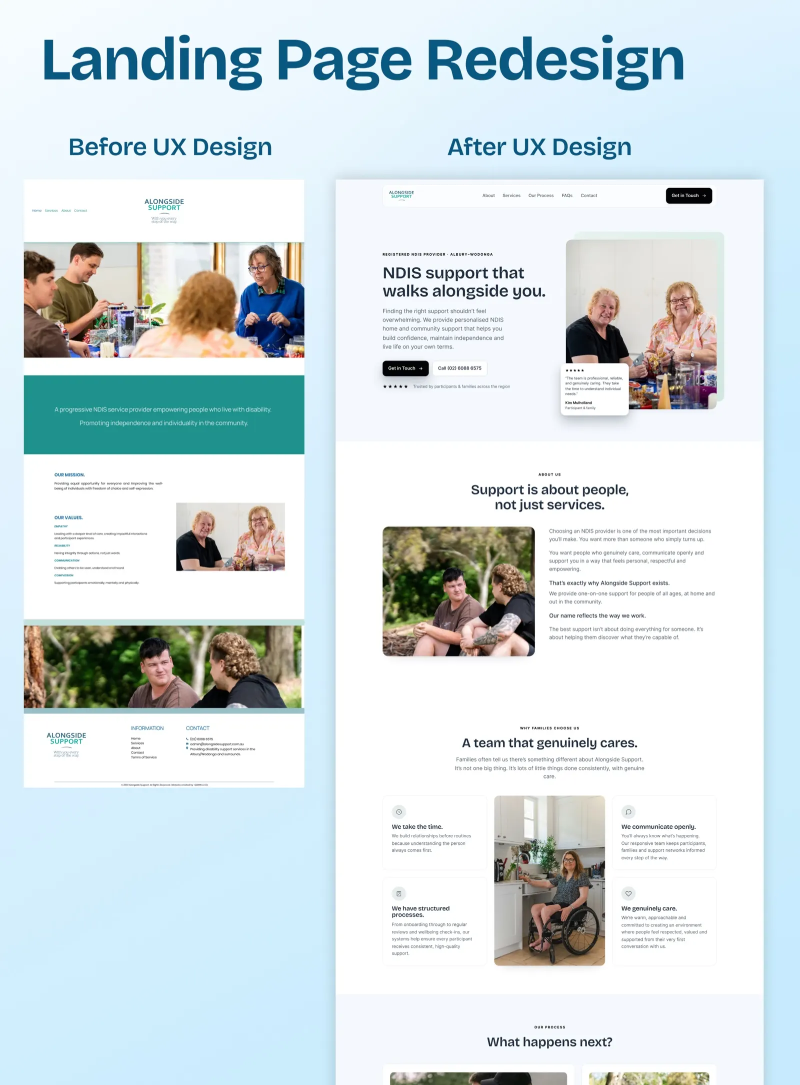
The old site had four pages and was built in 2023. The homepage was a centred logo, a wide photograph, a coloured band with a mission line, four values (empathy, reliability, communication, compassion), a second photograph and the footer.
All of it was true. None of it answered the questions a family arrives with.
- What do you actually do? The services lived on another page. The homepage never named them.
- Where do you work? The region appeared once, in small footer text.
- How do I start? There was no button to enquire. The phone number was in the footer, the last thing on the page.
- Can I trust you? No reviews, no people named, nothing for a professional who needs to check a provider before referring someone to it.
The constraint that shaped everything
The brief put the goal in one phrase: a visitor should feel a sigh of relief. The same brief carried a warning, repeated twice. Do not make it childlike.
This is the biggest risk in disability support design. Warmth slides easily into soft pastels, rounded shapes and cartoon drawings, and the result looks like a service for small children. A sixty-year-old participant would not feel spoken to. A Support Coordinator would not feel confident putting a client there.
So the warmth comes from somewhere else:
- Photography, not illustration. Real people, shown as adults getting on with their lives, never as objects of sympathy.
- Confident type and calm spacing. A clear, grown-up typeface and generous room around every section.
- One dark section. The approach section sits on near-black, which gives the page weight in the middle and keeps it from feeling sweet.
- Restrained corners and a quiet palette. Soft, never bubbly.
One page, two audiences
Families and carers are one audience. Referral partners are the other: Support Coordinators, Plan Managers and allied health workers who place participants with providers every week. They read the same page in different ways, and it has to work for both without splitting in two.
Three small decisions do most of that work. The line above the headline reads Registered NDIS provider, Albury-Wodonga, because registration and region are the first two things a professional checks. Every review carries a label, such as participant and family, parent and full-time carer, or referral partner, so a coordinator can find the voice of another coordinator. And the enquiry form opens by asking who is enquiring, so a referral and a worried parent reach the team already sorted.
Answering the first questions first
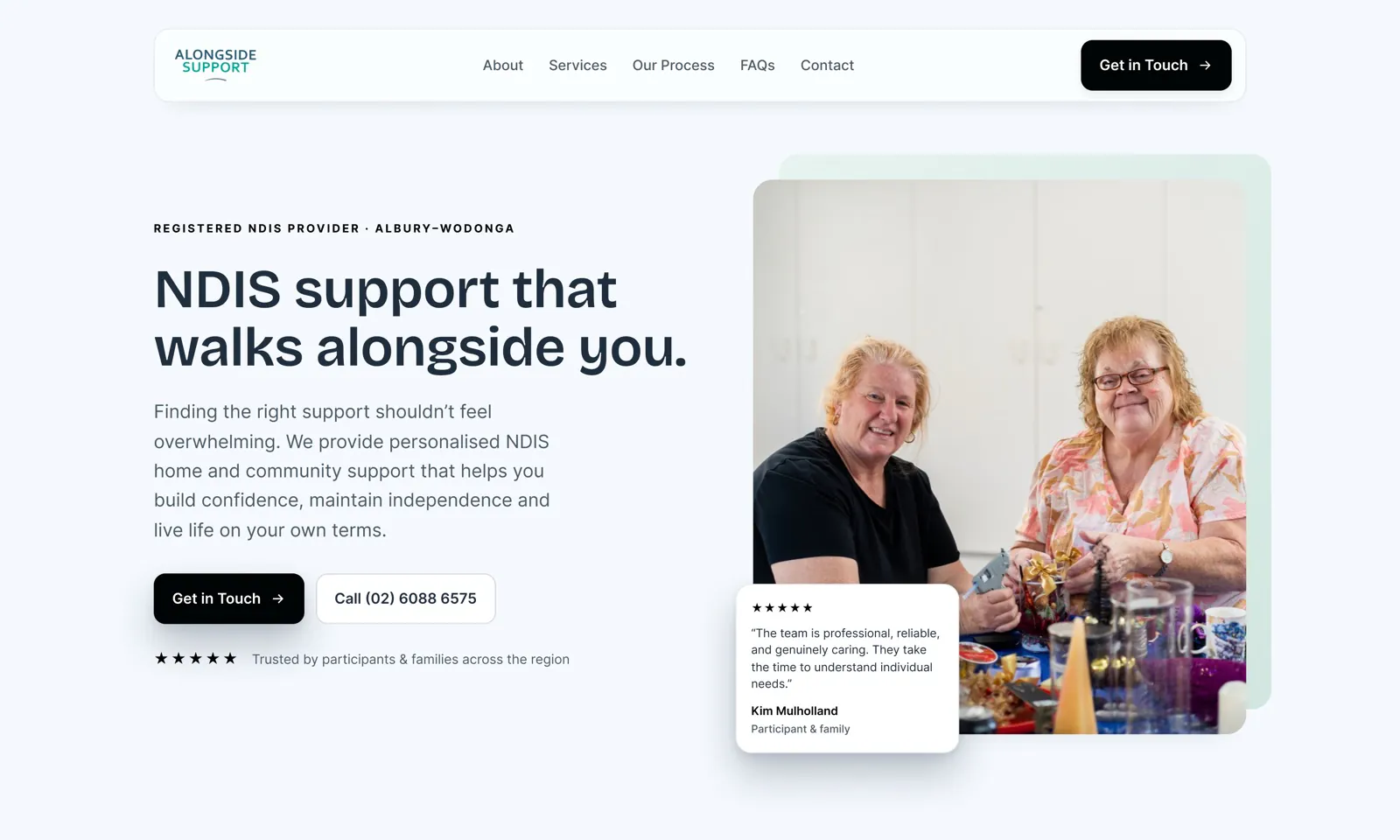
The hero says what the service is in the headline, NDIS support that walks alongside you, and gives two ways in: Get in Touch and a second button with the phone number on it. Many families would rather ring than fill in a form, so the number is a button in the most visible place on the page, and it dials on a phone.
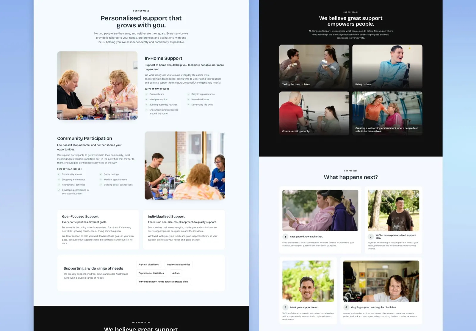
Below that, the page follows the order people actually think in. What the support is, split into in-home support and community participation, each with a short list of what it may include. Who it is for, as a row of plain labels. Why families choose this team. Then What happens next?, four numbered steps from the first conversation to regular check-ins, so nobody has to wonder what they are signing up for.
Proof, placed where doubt arrives
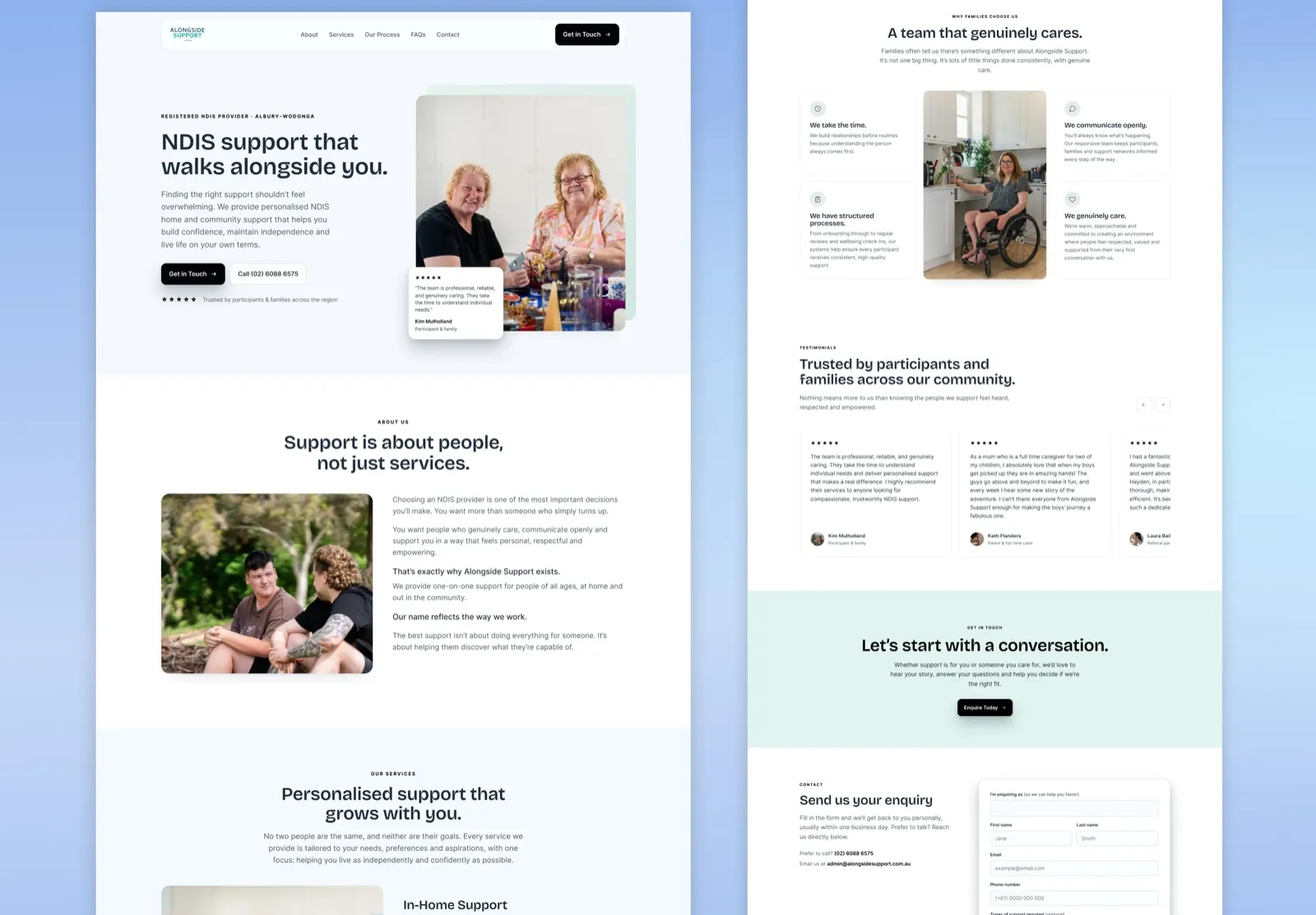
Five Google reviews sit in their own section with names and relationships, directly before the invitation to get in touch. One of them is from a support coordinator, who explains in a single sentence why they keep using the service. For a referrer, that sentence is worth more than any claim the provider makes about itself.
A review also sits on the hero photograph, so the very first screen has a real person vouching for the team. The close is gentle: Let's start with a conversation, then the form, with the phone number and email beside it for anyone who would rather not type.
The words, and search
Alongside Support wrote the copy, and we did not rewrite it. Our work on the words was the order they come in, and some tightening of longer sections, which the client approved.
For search, the page targets people looking for an NDIS provider in Albury-Wodonga, which is in its title. It carries a clean heading order, descriptive image text, and local business schema naming both Albury and Wodonga as areas served. The footer includes an Acknowledgement of Country, which referral partners in Australian care notice when it is missing.
How it is built
The design went through the client's review and was signed off before the build began. The page is built in Webflow on the Client-First system, without a CMS, and structured so more service pages can be added later without reworking this one.
Accessibility was treated as part of the job, not an extra. For a disability provider, a page that fails a keyboard user or a screen reader contradicts everything the page says. Contrast, focus states, keyboard navigation and screen reader labels were built to WCAG AA.
What the client said
Another sensational project from Amariq. They really are invested in creating the best possible outcome for you, always asking the hard questions that need to be asked.
Hayden McDiarmid, founder of Alongside Support.
Where it stands
Built and live at alongsidesupport.com.au.
We have not published enquiry figures. We have not been given any, and one of the page's goals, more enquiries from Google rather than only from referral networks, takes months to measure honestly. If Alongside Support shares numbers, they will go here with the period they cover.
Questions
What people ask about this project.
Who was this page for?
Two groups at once. Participants, parents and carers looking for support, and the professionals who refer them: Support Coordinators, Plan Managers and allied health workers.
They need the same facts in a different order. A family wants to know the people are kind. A referrer wants to know the provider is registered, reliable and easy to deal with. The page answers both without splitting into two.
How do you make a disability support site warm without it feeling childlike?
By getting warmth from photography and tone rather than from decoration. Participants here range from seven to over seventy, and an adult participant or a professional referrer will leave a page that looks like a children's service.
So there are no pastel palettes, cartoon illustrations or bubbly shapes. There is real photography of people as adults, confident type, calm spacing and one dark section to give the page weight.
Did you write the words on the page?
No. Alongside Support wrote the copy, and it was theirs to keep. Our job was the structure, the order the questions are answered in, and some tightening of longer sections, which the client approved.
We also wrote the search title and description, and made sure the heading order and image descriptions hold up.
Why Webflow?
It was the client's choice, and it suits a single page that one person will edit. There was no need for a CMS.
We built it on the Client-First system so a second service page can be added later without reworking the first. We also build on WordPress, Shopify and Framer, and pick whatever fits the business.
How was accessibility handled?
As a requirement, not a finishing touch. For a disability provider, a page that fails a screen reader or a keyboard user undermines the whole message.
Colour contrast, focus states, keyboard navigation and screen reader labels were part of the build from the start, aimed at WCAG AA.
Are there results for this page?
Not yet, and we will not invent any. One goal of the page is more enquiries from Google rather than only from referral networks, and that takes months to show.
If Alongside Support shares figures later, we will publish them here with the period they cover.
Next case study