

Case study
A running shop you browse by the weather
Kelvo sells running layers for autumn and winter. We designed its shop homepage for Shopify around one idea: pick the temperature you run in, and the page builds the kit for you, layer by layer, from a tee and shorts at 14°C to six pieces below zero.
In short
- What it is
- The shop homepage for Kelvo, a small running apparel label selling base layers, fleeces, shells, tights, gloves and beanies online, designed for Shopify.
- Who it is for
- Adults who run outside through autumn and winter, often before work, and want to know what to wear before they buy it.
- The hard part
- Most running shops sell with athletes, star ratings and claims about speed or warmth. We wanted a page that sells with something more useful, and makes no performance claims at all.
- The idea
- Shop by temperature. The weather runs through the whole page: the hero changes with it, the kit builder dresses you for it, every product shows the temperatures it is made for, and the footer remembers the reading you picked.
- The design
- Huge uppercase Inter, square corners everywhere, white and warm stone grounds, a cold night colour for the dark bands, and one signal red used like reflective trim. The Layers logo was drawn for it.
- Good to know
- The products, prices, fabric specs and stories on the page are sample content written for the design, and the photos were made for it.
What Kelvo is
Kelvo makes running layers for people who train outside when it gets cold: a Merino Base Long Sleeve, a Grid Fleece Half-Zip, a Wind Vest, a Storm Shell and a Trail Shell, Thermal Tights and shorts, Thermal Gloves and a Grid Beanie. Ten pieces that are meant to be worn together, in more or fewer layers depending on the morning.
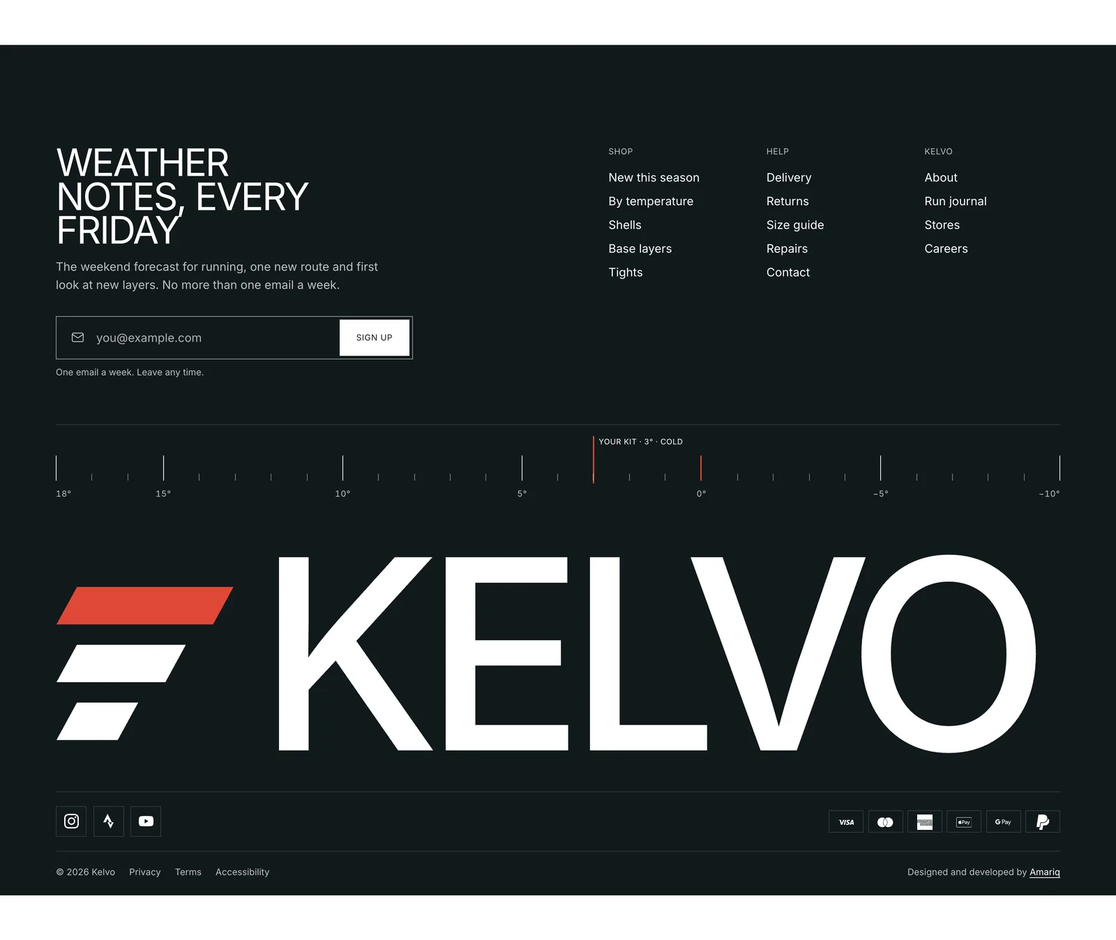
The name nods to the Kelvin scale. That gave the brand its one tool: a temperature rail, a thin scale from 18° down to −10° with a red marker. It appears in the hero, in the kit builder and across the footer, so the shop always knows how cold it is outside.
The problem the site had to solve
- Help people dress, not just buy. The real question a winter runner has is “what do I wear at 3°?”. A grid of jackets does not answer it. The page had to.
- Sell without promising. No “run faster”, no “warmest jacket ever”, no waterproof ratings that read like lab results, no athletes, stars or press logos. Garments are described by fabric, weight, fit, features and care.
- Make ten products feel like a system. A small range needs clear ways in: by temperature, by layer, by collection, by a look, and a close look at the fabric.
- Feel like a sports brand, not a template. People moving in real weather, big type and sharp edges, with the shop parts doing real work instead of slogans.
A hero that changes with the weather
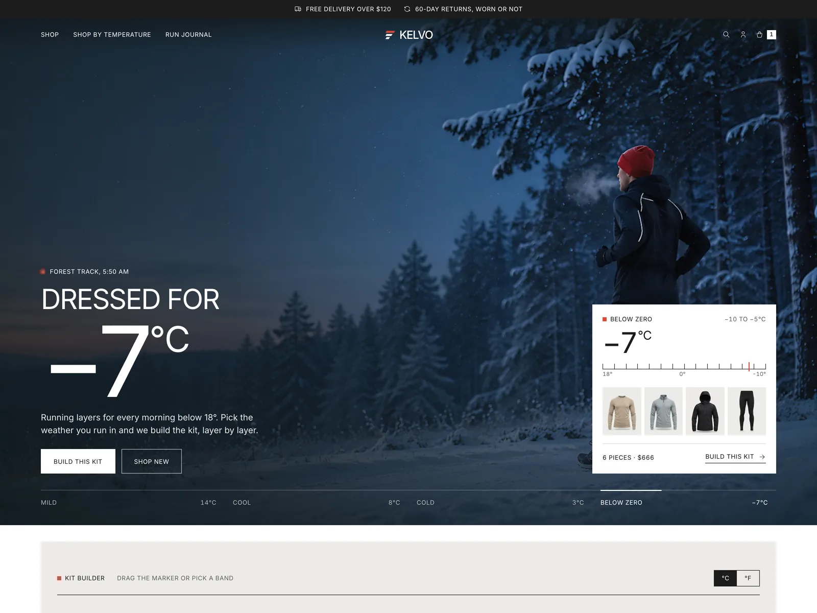
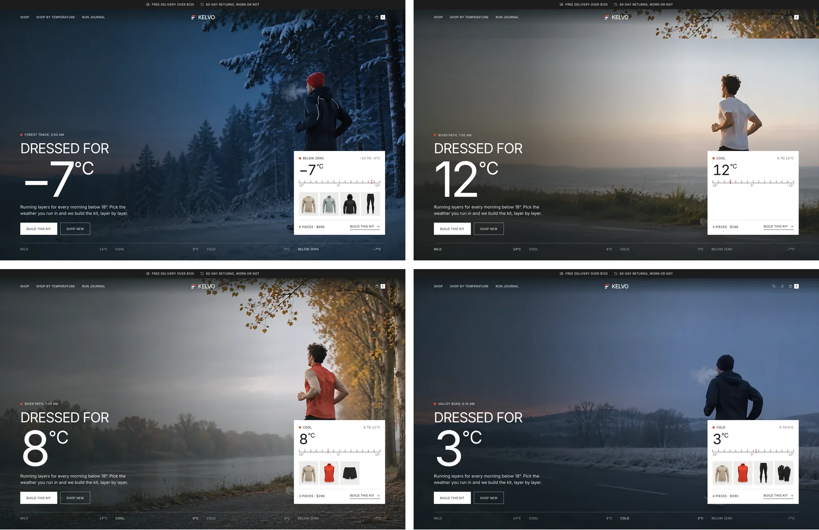
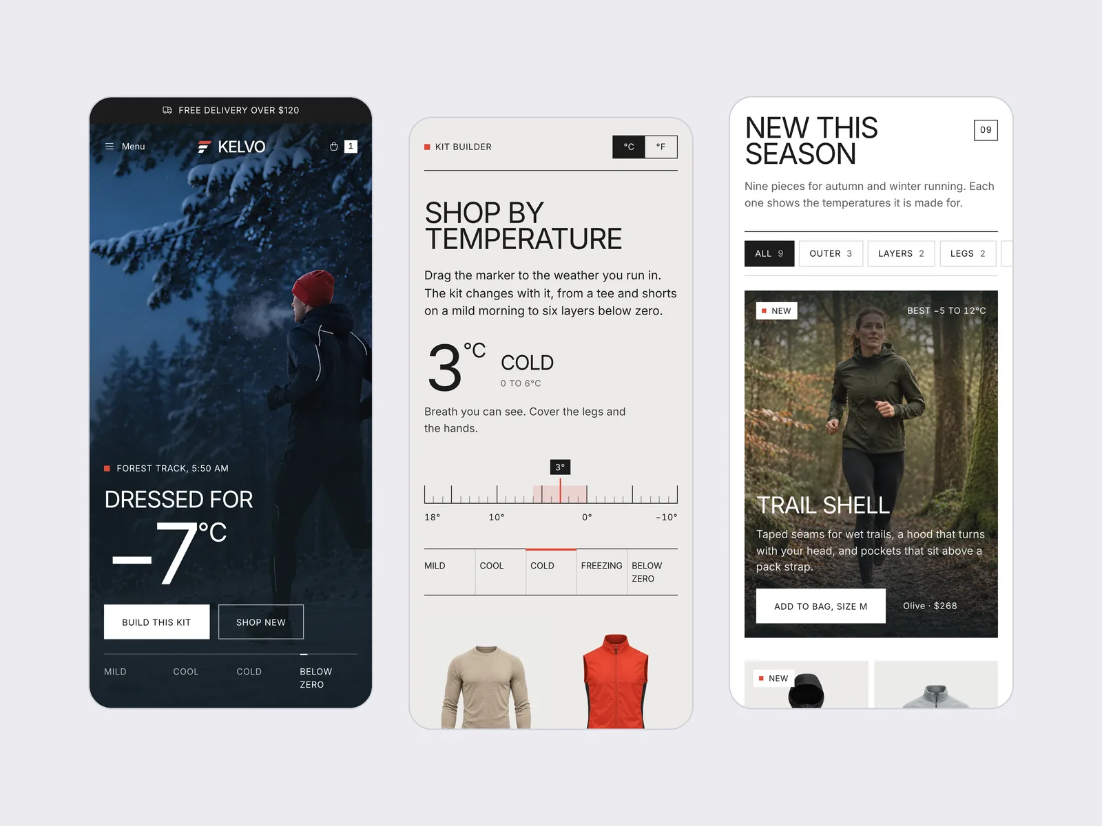
The first screen is a full-width photo of a runner on a forest track at 5:50 in the morning, snow on the trees, with “Dressed for −7°C” in giant type. Every few seconds a new scene wipes down from the top like a cold front moving in: a coast road at Mild, a river path at Cool, a valley road at Cold, then back to the snow. The number counts to the new temperature, the place and time roll over, and the marker on the rail slides along.
In the corner, a white card shows the kit for that weather, with its packshots, the piece count and the price. “Build this kit” scrolls down to the kit builder and sets it to the same temperature, so the hero is a working preview of the tool below, not a picture with a slogan on it.
Shop by temperature
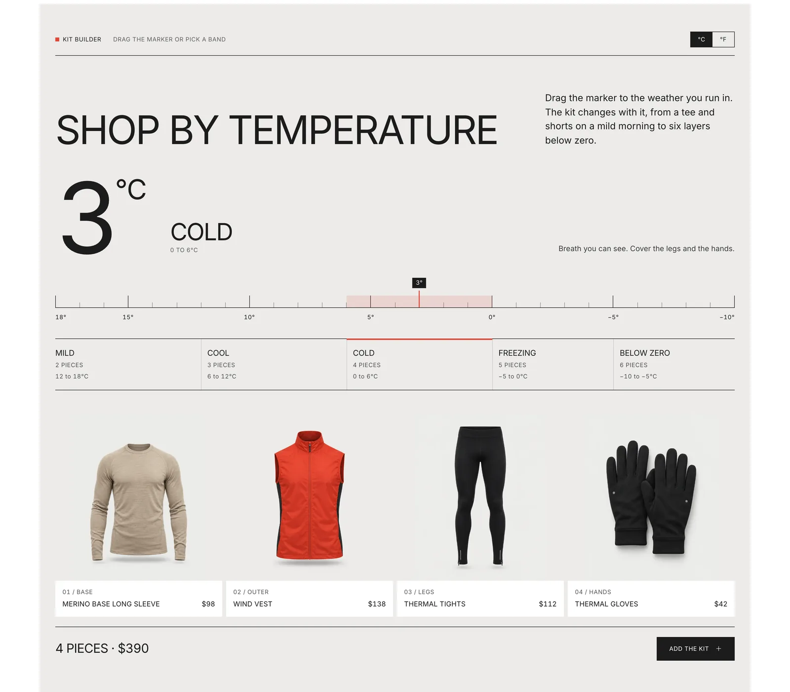
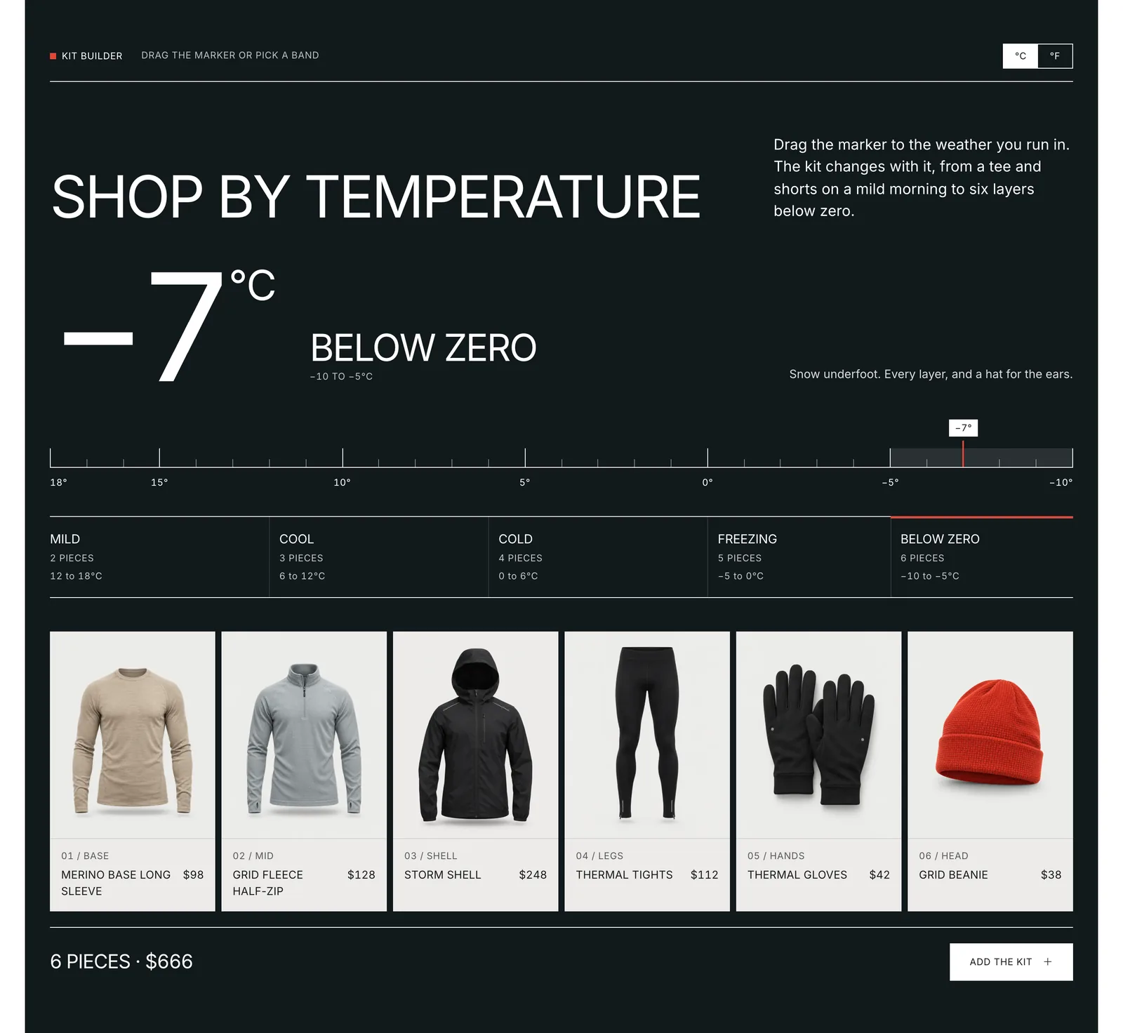
This is the section the whole shop is built around. A wide rail runs from 18° to −10°, with a tick for every degree. Drag the red marker, or tap one of five bands under it: Mild, Cool, Cold, Freezing and Below zero. The bands are drawn to scale, so each one sits under its own stretch of the rail and shows how many pieces it needs.
The kit changes as you go, from two pieces on a mild morning to six below zero, laid out as packshots with their layer, name and price. The total and an “Add the kit” button sit underneath, and one line of plain advice describes the weather: “Breath you can see. Cover the legs and the hands.” A small switch flips every reading between °C and °F.
The section gets colder as the temperature drops. Its ground moves from white to warm stone, to slate, to night, so the page itself tells you how cold it is before you read a number.
New this season
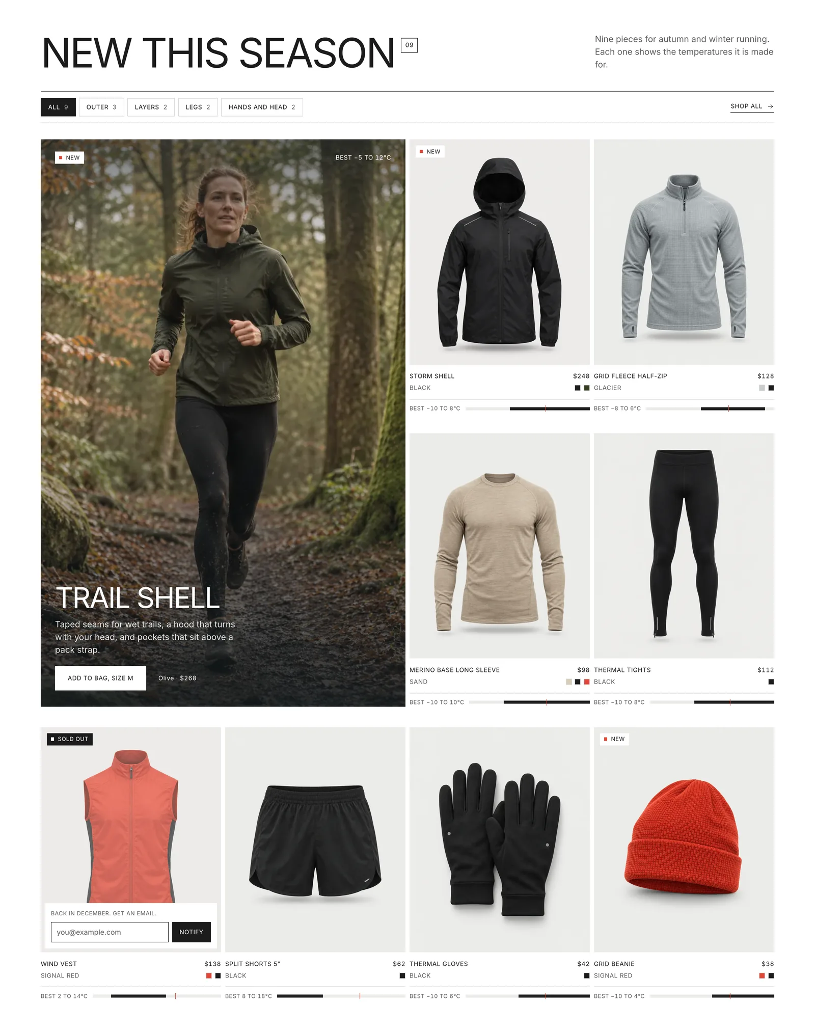
Nine pieces for autumn and winter, with filter chips that show their counts: All, Outer, Layers, Legs, and Hands and head. The Trail Shell leads as a large tile on its on-body photo, with its size and an add-to-bag button right on the picture.
The other eight share one card design: a packshot on the stone panel, name, colour and price, and colour swatches as small squares. Each card also carries a small track that reads “Best −10 to 8°C”, on the same scale as the kit builder, with a red line at zero, so you can see at a glance which pieces belong to which mornings. Hover a card and the packshot gives way to the garment on a runner, and a size row rises from the bottom. Picking a size puts it in the bag. The Wind Vest is sold out, and its card turns into an email box to hear when it is back.
Collections, as big as the type
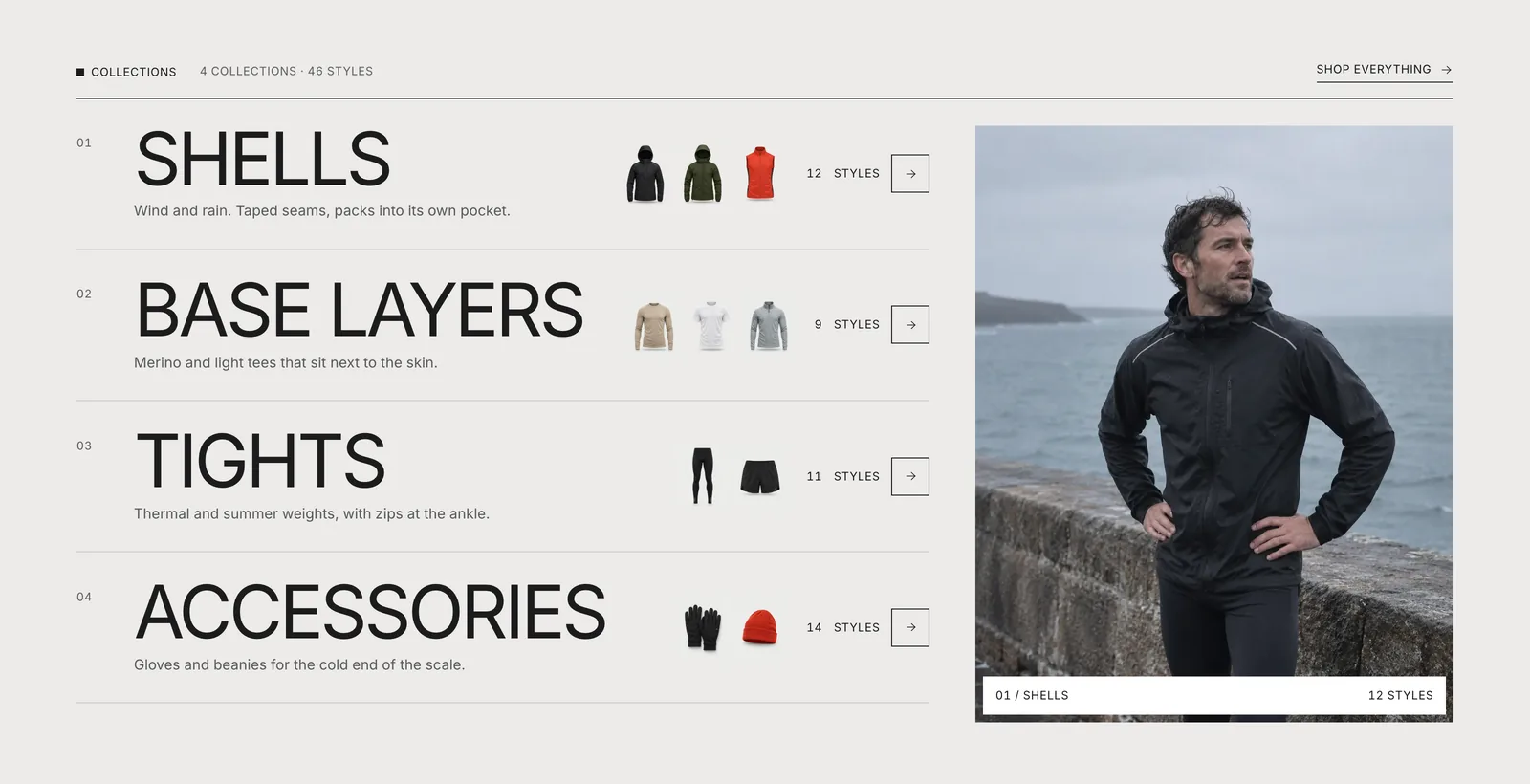
The collections are four huge uppercase lines on a stone band: Shells, Base layers, Tights and Accessories. Each line carries a short note, its own small packshots, a style count and a square arrow that fills black on hover. Beside the list, a photo of that collection settles into place, with a white bar naming it. It stays in its own column, so it never covers the words.
Shop the look
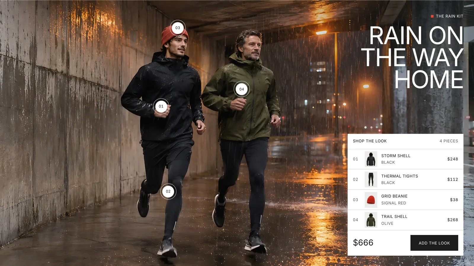
Halfway down, a full-width photo of two runners in a wet underpass under sodium light: “Rain on the way home.” Four numbered pins sit on the shell, the tights, the beanie and the second runner’s olive Trail Shell, and they match the numbered rows of a small “Shop the look” panel with thumbnails and prices. Hover or focus a row and its pin opens on the photo. One button adds all four pieces to the bag.
Built for the wet and the cold
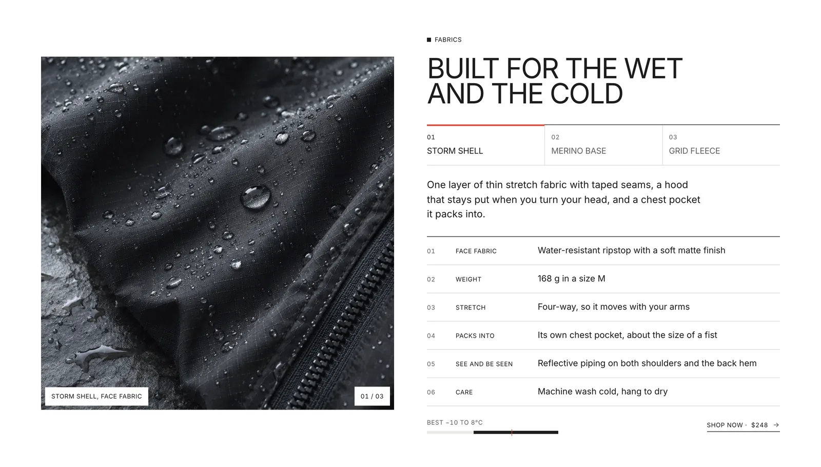
The fabric section borrows from the best running brands: let the material speak, in plain facts. Three tabs switch between the Storm Shell, the Merino Base and the Grid Fleece. Each change wipes a new macro photo down from the top, the same move as the hero, and swaps a short intro, six numbered specs, the temperature track and a “Shop now” link with the price.
The specs are what a runner would check on a label: face fabric, weight in a size M, stretch, what it packs into, where the reflective trim sits and how to wash it. There are no lab numbers and no certification badges, just what the garment is made of and how it is made.
Dark by five
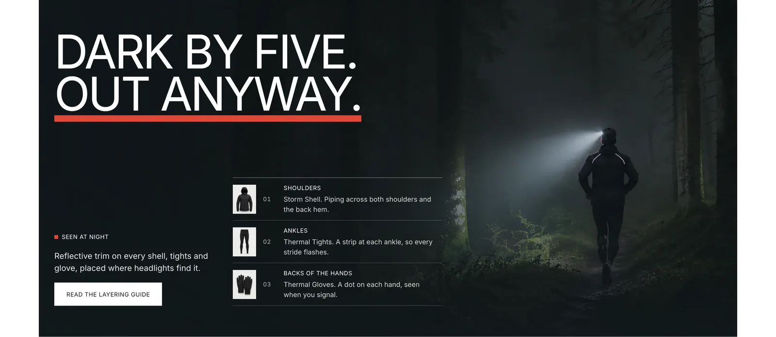
In winter most runs happen in the dark, so the page gives that its own band. On the night colour, a runner with a headlamp on a forest trail, and “Dark by five. Out anyway.” with a red bar under the second line. Beside it, a short list shows where the reflective trim sits on three pieces: the shoulders of the Storm Shell, the ankles of the Thermal Tights and the backs of the Thermal Gloves.
Notes from the road
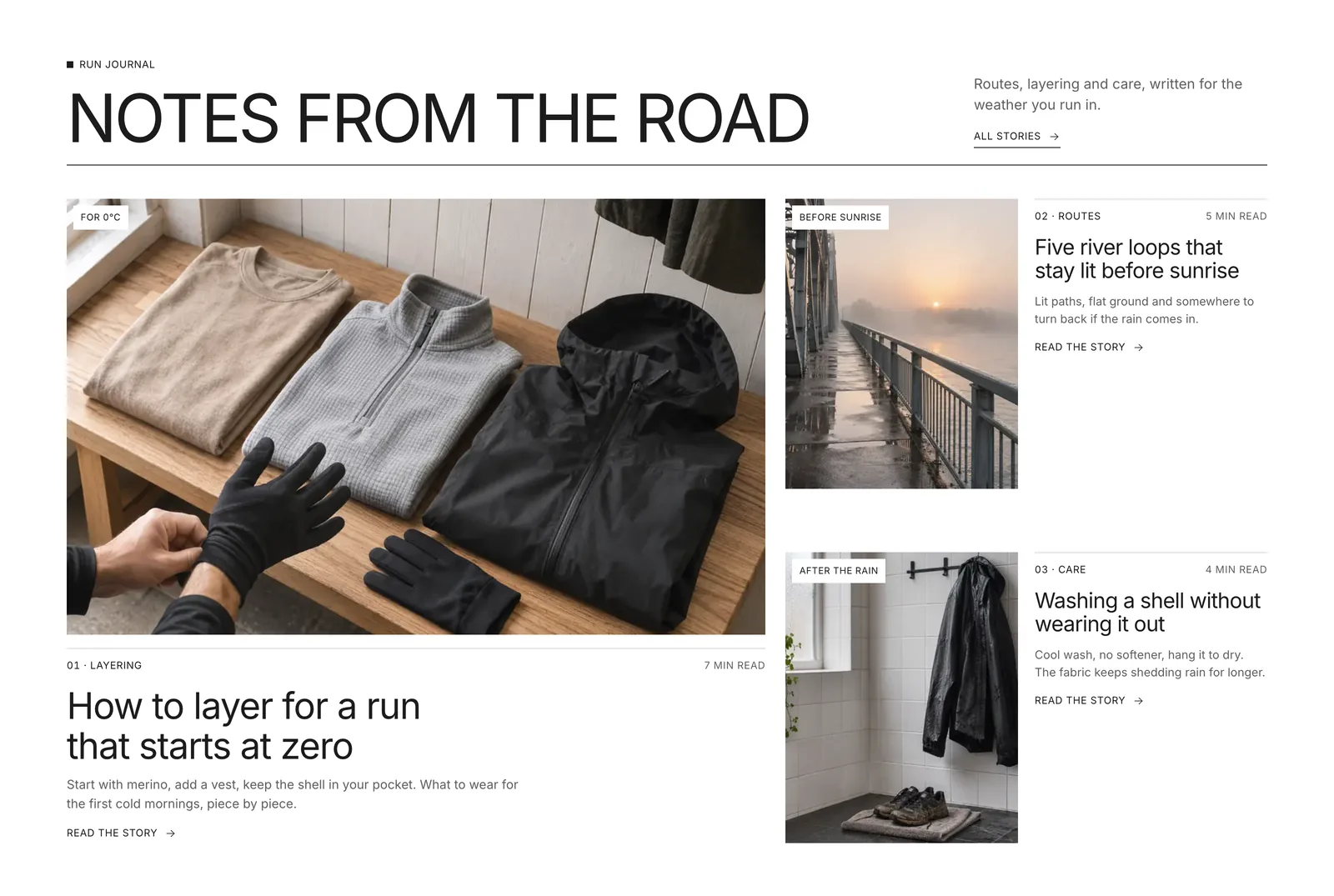
The journal is about running in weather, never about training or health: how to layer for a run that starts at zero, five river loops that stay lit before sunrise, and washing a shell without wearing it out. The layering guide leads large, with the other two stacked beside it, and each story carries a weather tag on its photo, like “For 0°C” or “After the rain”.
The brand system
The type is Inter, in uppercase at the big sizes, set tight with lines nearly touching, and in sentence case for anything longer than a few words so it stays easy to read. Prices and temperatures use tabular figures, so numbers do not jump as they count. Every corner is square, on buttons, cards, inputs and badges.
The grounds are white, a warm stone for the product panels, slate, and a cold blue-black night for the dark bands and the footer. One signal red, #E04837, is used the way reflective trim is used on a jacket: the rail marker, the zero line, the small square beside each label, the logo’s top bar and the underline in the night band. It never sits behind small text, because at that size it does not pass contrast.
The logo came from three options: a K with a red degree ring at its shoulder, the weather-map sign for a cold front, and the one chosen, Layers. Three bars lean forward like a runner, one for each layer of a kit, base, mid and a red shell on top. It works at the size of a browser tab and across the full width of the footer, where the wordmark spans the page.
A bag that knows the delivery line
Every add, from a single size to a whole kit or look, opens the same drawer from the right. Each line has its packshot, colour, size and a stepper, the subtotal updates as you go, and a thin bar counts down to free delivery at $120. The empty bag is designed too: it points you back to the kit builder with “Start with the weather you run in.”
Motion with a job
- One opening. On load the hero photo wipes in and the temperature counts down to −7. It happens once.
- One loop. The weather scenes are the only thing that moves on its own. They pause when the hero leaves the screen or the tab is hidden.
- Moves that mean something. The cold-front wipe, the ground turning colder in the kit builder and the fabric photo wiping in all show a change in weather or material, not decoration.
- Calm by request. For visitors who ask their system for reduced motion, the hero holds on one scene and every transition is off. The page is complete without them.
Fast and easy to read
- Light to load. On a slow phone profile the page loads in 16 requests and about 510 KB, with the largest image on screen in about 2.4 seconds. Only the first hero scene loads with the page. The other three follow once it has finished, and the typeface and animation code are served from the site itself.
- Steady while loading. Nothing on the page shifts as it loads, and the photo grade is built into the image files instead of being calculated as you scroll.
- Easy to read. Every line of text on a solid colour passes the WCAG AA contrast standard. The white text over the hero was measured against the pixels behind it on all four weather scenes, on desktop and on a phone.
Built for phones
On a phone the hero stays full-screen, with the headline and the weather tabs over the lower part of the photo. The kit builder keeps the rail and the five bands in one row and the kit goes two across. Product cards go two across, the lookbook panel moves under the photo, and the menu opens with the sections in large uppercase type. The bag slides in from the right, one tap away from anywhere.
Ready for Shopify
Kelvo was designed for a Shopify theme from the first section. Each section maps to one Online Store 2.0 section with its own blocks, so the store owner can reorder or hide them in the theme editor. The product cards come from one design, ready to read from Shopify products, colours, sizes and stock, and the sold-out state follows the stock. Each product’s temperature range is a single pair of numbers, made to live in a product metafield, so the kit builder, the card tracks and the hero kits can all be filled from the products themselves.
Questions
What people ask about this project.
Can you design a shop like this for our sportswear or outdoor brand?
Yes. We start from the moment your customer decides what to buy, for a running brand that is the weather, for others it might be the activity, the fit or the season, and build the homepage around that one way in. Photos can be your own packshots and campaign images, or images made for your brand.
We design for Shopify, Webflow or Framer, depending on where your shop runs or should run.
Does the kit builder really work?
Yes, on the page itself: drag the marker or pick a band and the kit, the piece count, the total and the background change, the unit switch flips between Celsius and Fahrenheit, and Add the kit puts every piece in the bag. On a live Shopify store the same tool reads from your products and connects to your checkout.
How would the temperature ranges work on Shopify?
Each product gets its temperature range as two numbers in a product metafield, and the kit for each band is a short list of products. The kit builder, the tracks on the product cards and the hero kits all read from those, so the store owner changes them in the Shopify admin, not in code.
Where do the photos come from?
Every photo on Kelvo was made for the brand, with its own place, weather and light written for each image, from a snowy forest track to a wet underpass, then upscaled and graded in the files. The packshots sit on a backdrop matched exactly to the stone colour of the product panels. On a real project we work the same way with your photos, or plan a shoot with you.
Did you design the logo too?
Yes. We drew three options for Kelvo and Layers was chosen: three bars leaning forward, one for each layer of a kit, with the shell in red. We can do the same for a new brand, or work with the logo you already have.
Next case study