

Case study
A government contractor's website, built the way a tender is read
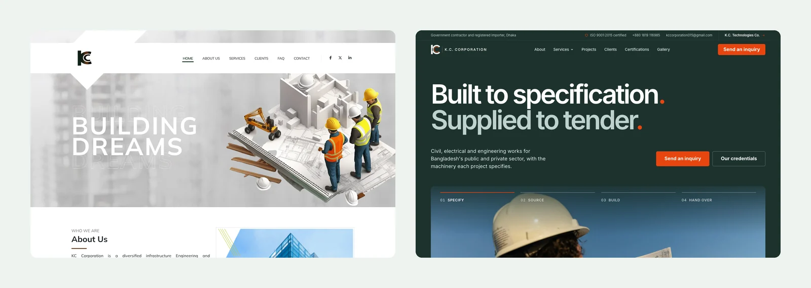
K.C. Corporation is a licensed government contractor and registered importer in Dhaka. We redesigned its website from the ground up: 28 pages that put its licences, clients and services where a tender evaluator looks first.
In short
- Who it is
- K.C. Corporation, a Dhaka company that delivers civil, electrical and engineering works for public institutions and imports the equipment those projects need.
- Who reads the site
- Government departments checking a tenderer, private companies looking for a contractor, and suppliers and partners abroad.
- The hard part
- The old site said "Building dreams" over a 3D illustration. A procurement officer wants licences, numbers and past clients, and could not find them.
- The idea
- Treat the site like a tender file: every licence with its issuer, number and expiry date, every client named, every service on its own page.
- The design
- Deep green, white and one orange, a single typeface, square structure and quiet motion. Serious enough for a ministry, modern enough for a foreign partner.
- Good to know
- The photographs are representative stock images until the company's own project photos arrive, and the site says so in its footer.
The client
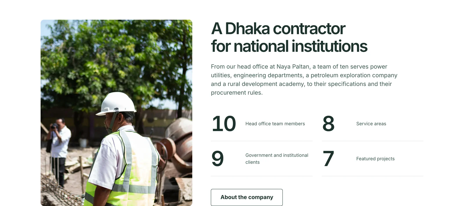
K.C. Corporation is a government contractor and importer based at Naya Paltan in Dhaka, with a head office team of ten. It works in eight areas, from civil construction and electrical installation to steel structures, power, agriculture and automation, and has delivered work for nine national institutions, including BPDB, BREB, DESCO, DPDC, PWD, LGED, BAPEX, the Rural Development Academy and the Bangladesh Shooting Federation.
The company also has a sister concern, K.C. Technologies Co., which supplies substation machinery, power and solar products, and agricultural spraying drones.
Where it started
The old website had seven pages, a stock 3D illustration in the hero and a general paragraph about the company. It listed six services by name with no detail, and none of the company's licences, certificates or enlistments appeared anywhere. For a business that wins work through tenders, the site was hiding the very things an evaluator checks.
A brief built from the client's own documents
We started with 24 questions, sent in Bangla on WhatsApp, about the business, the services, the clients, the documents and the people the site is for. The answers came back from a meeting with the company, and the documents came with them: the ISO certificate, the electrical contractor licence, the Bangladesh Railway enlistment, the import registration and the trade licence.
Those answers became a written brief with one rule: if a fact is not in the client's answers or documents, it does not go on the site. No invented years, project values, countries or awards. Where something was still open, such as the year the company was founded, the site leaves it out rather than guessing.
Research before any design
The client gave no reference sites and asked for an international standard. So we studied six international engineering and infrastructure companies, Bechtel, Arup, Mott MacDonald, Larsen & Toubro, Hitachi Energy and Jacobs, and asked of each one what makes it feel credible and what a ten-person Dhaka contractor can honestly borrow.
The answer was consistent. The strongest sites use one typeface with discipline, one accent colour with one job, a visible grid, quiet motion, and proof shown as facts rather than adjectives. We then chose a premium construction template as the reference for colour and type, and planned every section ourselves.
The credentials, set out like a register
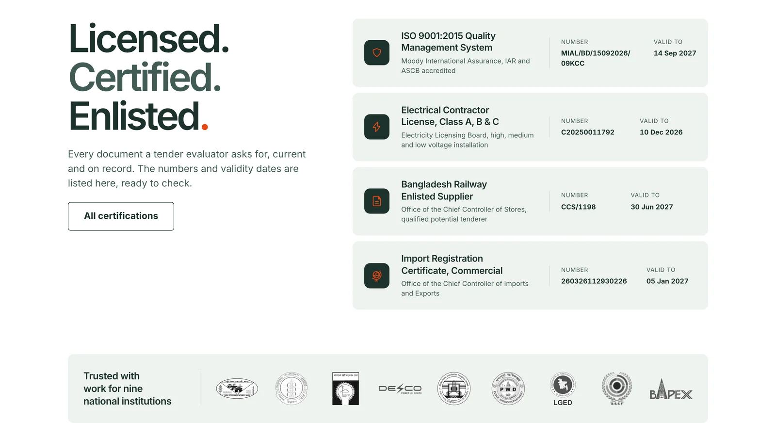
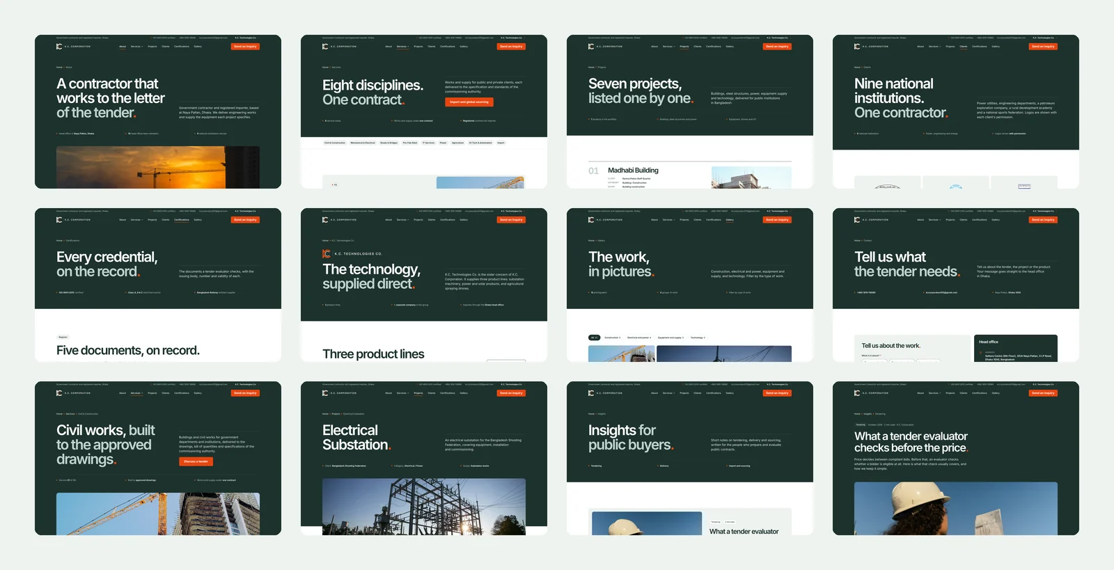
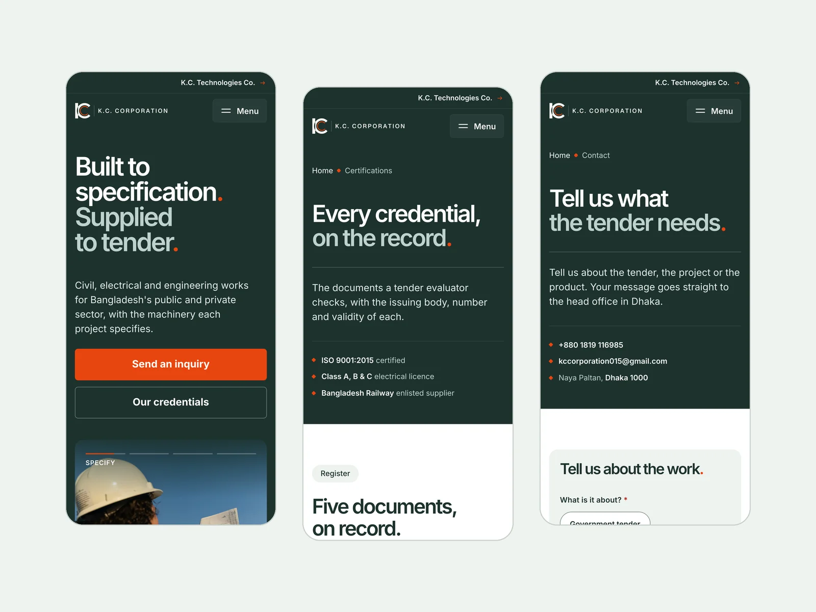
The biggest change is how proof is shown. Right under the hero, four documents sit in a register: the name of each one, the body that issued it, its number and the date it is valid to. A dedicated Certifications page lists all five, laid out as they appear on the certificates.
The point is simple: an evaluator can check every line against the original, so the page earns trust instead of asking for it. Next to the register, the logos of the nine institutions K.C. Corporation has worked for, used with the client's permission.
Eight services, each with a page of its own
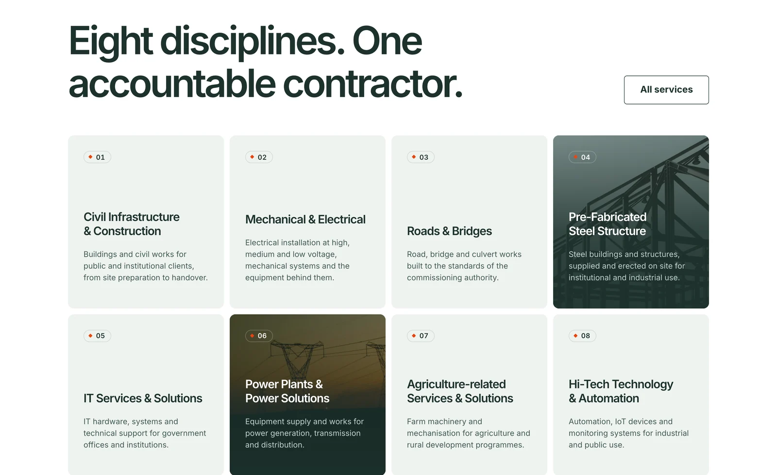
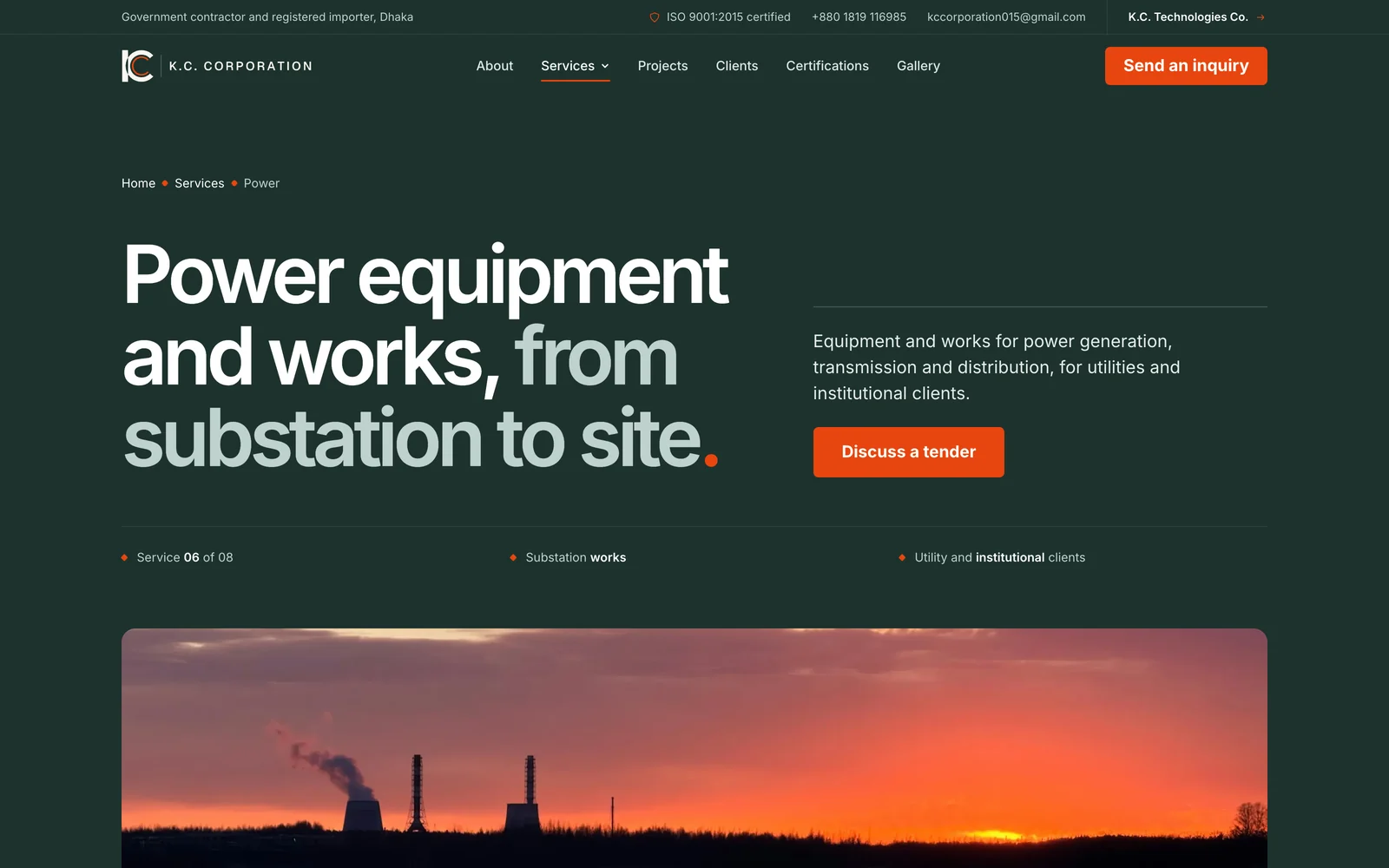
On the home page the eight services sit in one grid, numbered 01 to 08, with photo cards where a picture helps. Each one opens a full page: what the service covers, four scope items, the four steps every contract follows, related projects, the questions buyers ask and the other seven services.
Below the grid, three routes split the visitors the site serves: government departments, private companies, and suppliers and partners abroad. Each one gets a single line on what matters to them and a direct path in.
Projects, clients and the sister concern
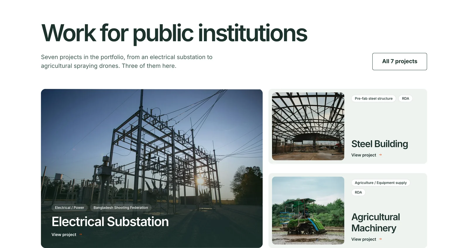
Seven completed projects each get a page with the client, the category and the scope, from an electrical substation for the Bangladesh Shooting Federation to a steel building and agricultural spraying drones for the Rural Development Academy. A Clients page sets out what was delivered and for whom, and K.C. Technologies Co. has its own page, kept separate from the contracting services, as the client asked.
There is also a filterable photo gallery, an Insights section with three articles written for public buyers, and a contact page where the visitor first chooses what the inquiry is about.
The brand system
The old logo was a monogram: a K bar beside a C ring. We drew three logo concepts that all keep that shape. The site carries the first of them, retouched rather than redrawn, with the wordmark set in a clean geometric face.
Around it, the palette is small on purpose. Deep green is the colour of authority, white is the page and a soft sage holds the cards. One orange does one job: the main buttons, small markers and the orange full stop that closes every headline. Inter carries every word, from the 108 pixel hero line down to the smallest label.
Photographs follow one grade, so images from different sources read as one family. The CEO portrait on the About page is the client's own photo, cut out and set on the brand green.
Motion with a purpose
The motion is short and calm, the way a serious company should move. The headline rises on load and the hero photo settles into place. Below it, a four-step slider walks through how a contract runs, Specify, Source, Build and Hand over, with an orange bar as the timer and a pause button.
- A real menu. Services opens a mega menu with all eight areas, and on a phone the menu unrolls from the header with the services as a sub-list.
- Quiet reveals. Sections fade up once as they arrive, the company figures count up, and two large photos drift slightly as they cross the screen.
- Smooth page changes. Moving between pages uses view transitions, so the site feels like one piece.
- Calm by request. Visitors who ask for reduced motion get the complete page, still.
A contact form with every state designed
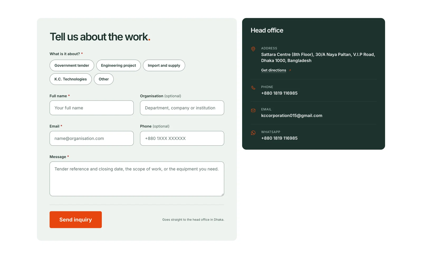
The contact form asks one question first: what is the inquiry about? A government tender, an engineering project, import and supply, K.C. Technologies, or something else. Then name, email and a short message. Every state is designed: missing fields, sending, a thank-you panel that confirms what was sent, and a clear message with the phone number and email if sending fails.
Ready for search and for sharing
Every page has its own title, description and canonical address, a share image made for it with the page's headline on brand green, and structured data that tells search engines what it is: the company as a contractor, each service, each article and the breadcrumb trail.
Built for phones, not squeezed onto them
On a phone, every section is recomposed for one column rather than shrunk: the headline, the register, the services and the contact form all stay readable row by row.
Questions
What people ask about this project.
What services does Amariq offer?
Design and development, handled end to end.
- Strategy and UX/UI design
- Webflow development
- WordPress development
- Shopify development
- Framer development
- Ecommerce builds
- Brand identity
- Ongoing maintenance
One team from first call to launch, so you never juggle multiple vendors.
How long does a typical project take?
Most projects land in one of these ranges.
- Landing pages2–3 weeks
- Marketing websites3–6 weeks
- CMS-driven sites and platforms6–8 weeks
Milestones and a delivery date are agreed before work starts, so expectations stay aligned.
Do you handle both design and development?
Yes. Design and development both happen in-house.
- No handoff between a design studio and a separate dev team
- What you approve in design is exactly what gets built
- Fewer delays, because nothing gets lost in translation
Can you work with an existing website or design?
Yes. We often improve or rebuild existing websites.
- Redesigns on Webflow, WordPress, Shopify or Framer
- A move to a better-fit platform when the current one holds you back
- Better structure, usability, speed and scalability, not just new visuals
How does your pricing work?
Project-based, set by scope, complexity and timeline. No fixed packages and no hourly billing.
- A short discovery call about your goals and constraints
- We recommend the right scope and way of working
- You get a tailored proposal before any work starts
Will our team be able to manage the site after launch?
Yes. Sites are built so your team can run them after handoff.
- CMS collections for content that changes often
- Reusable components and a consistent style system
- A short handover so your team can work independently
- Ongoing maintenance available if you would rather hand it off
What makes Amariq different from other agencies?
We stay intentionally small, focused and hands-on.
- You work directly with senior designers and developers
- No account managers or outsourced teams in between
- Built for structure, performance and long-term use, not just looks
Next case study