How to Design a High-Converting Landing Page (Step-by-Step Framework)
Quick Summary
- A high-converting landing page follows a clear structure from first impression to final action
- Strong messaging and hierarchy help users quickly understand your offer
- Trust and clarity matter more than visual design
- Each section should guide users toward a decision
- Conversion comes from structure, not just design
.avif)
Most landing pages don’t fail because they look bad.
They fail because they don’t guide people toward a decision.
You can have a clean design, modern UI, and smooth animations…
but if your page does not clearly lead someone from interest to action, it will not convert.
This is why many websites get traffic but struggle to generate leads or sales.
In this guide, you’ll learn a complete landing page framework that focuses on clarity, structure, and conversion.
Not design trends.
Not guesswork.
A system that helps turn visitors into customers.
Watch the full breakdown video:
Before You Start: 3 Things You Must Know
Before designing your landing page, you need clarity.
First, who is this page for?
Not everyone. It should be one specific type of person.
Second, what problem are they facing?
What is frustrating them right now?
Third, what action do you want them to take?
Do you want them to book a call, sign up, or make a purchase?
If these are not clear, your landing page will feel random.
And even a good design will not convert.
The Structure of a High-Converting Landing Page
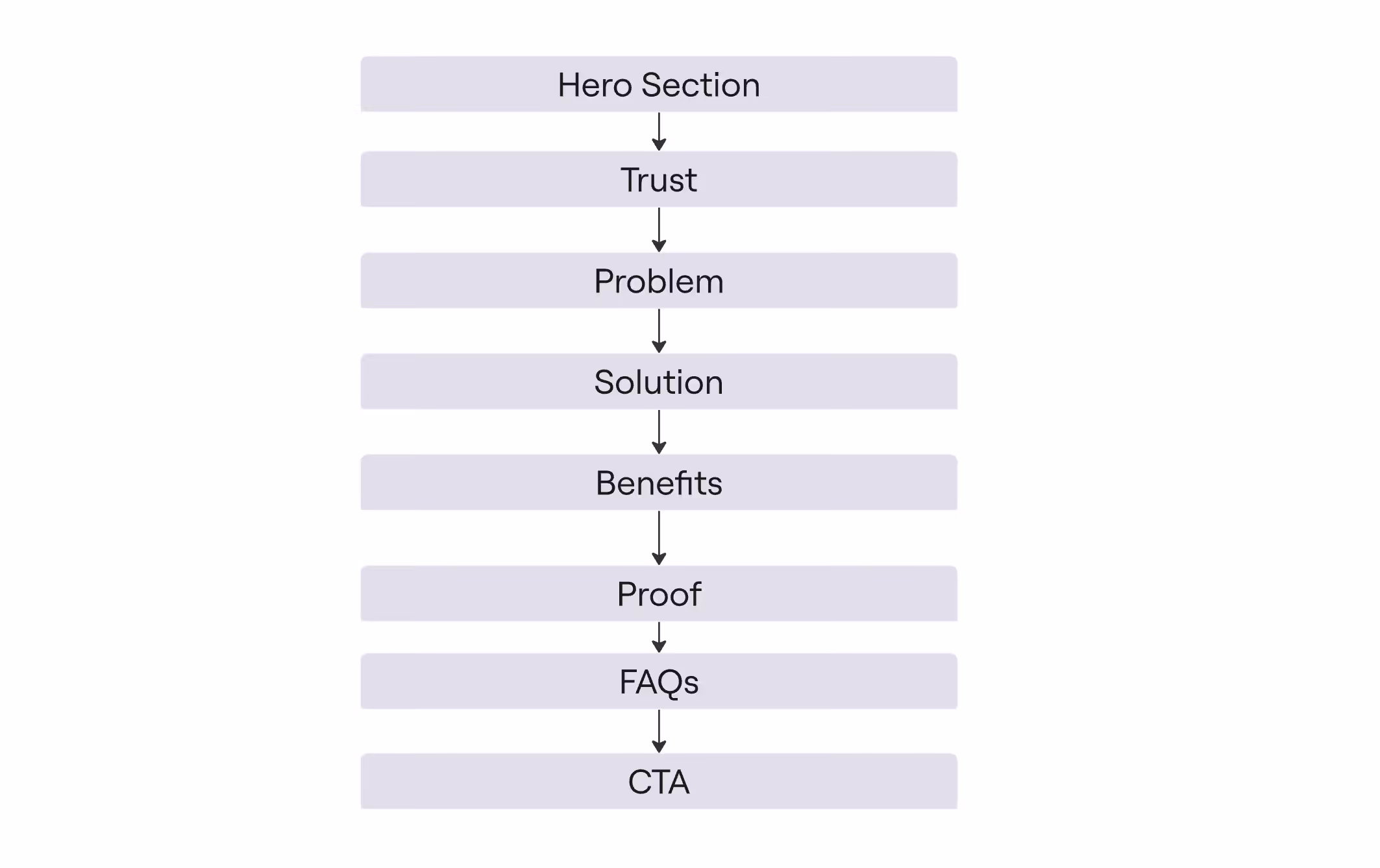
A high-performing landing page follows a clear flow:
- Hero section
- Trust
- Problem
- Solution
- Benefits
- Social proof
- Differentiation
- How it works
- FAQ
- Final CTA
This structure matches how people make decisions.
First they understand.
Then they evaluate.
Then they trust.
Then they act.
1. Hero Section: The First Impression
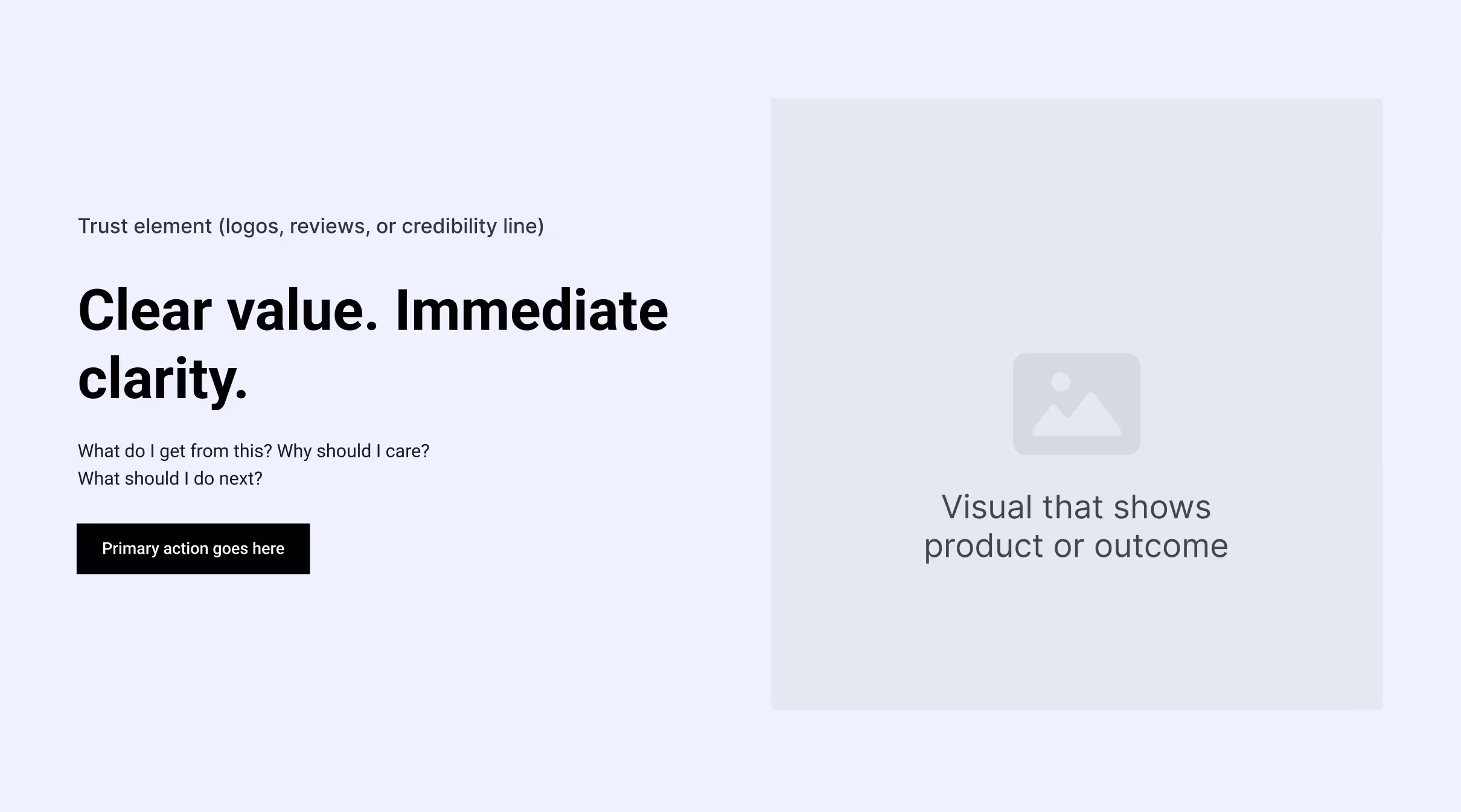
The hero section is the most important part of your landing page.
It answers one key question immediately:
👉 What do I get from this?
A strong hero includes:
- A clear, benefit-driven headline
- Short supporting text
- One primary call to action
- A relevant visual
- Trust elements near the top
If users don’t understand your value in a few seconds, they will leave.
2. Build Trust Early

Most websites wait too long to build trust.
But users decide quickly whether they trust your page.
Add trust elements at the top:
- Client logos
- Reviews or ratings
- Key metrics
- “Trusted by” statements
Trust helps users stay longer and explore your page.
3. The Problem Section
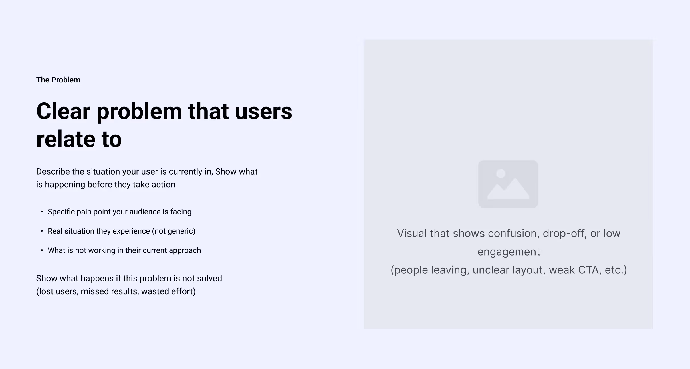
Once users understand what you do, they want to feel understood.
Clearly describe their problem:
- They get traffic but no conversions
- They spend money but see no results
- Their message is unclear
Make it specific and relatable.
Also show the cost of not solving it:
Lost leads.
Wasted budget.
Missed opportunities.
4. The Solution Section
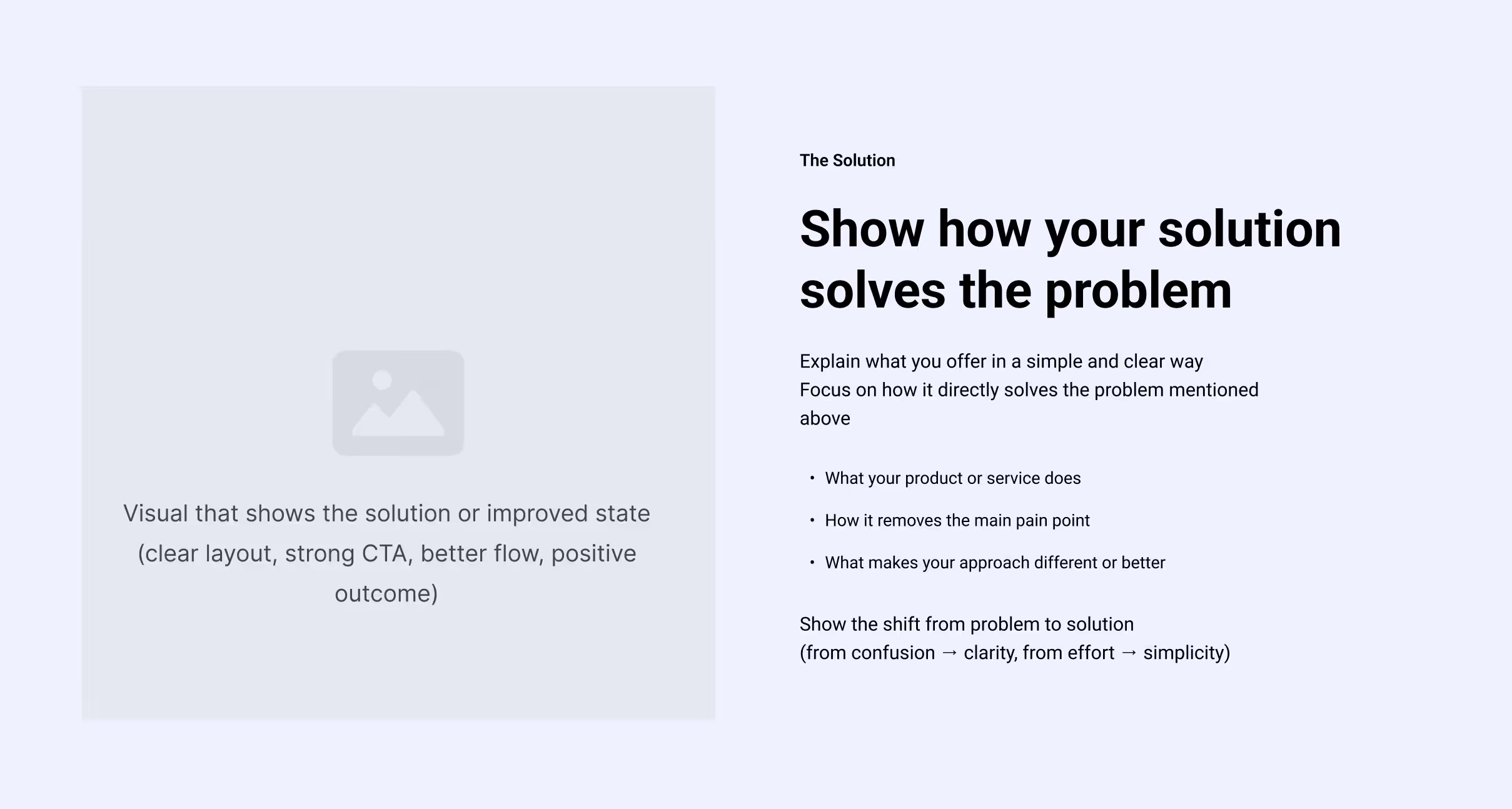
Now introduce your solution.
Explain clearly:
- What you offer
- How it solves the problem
- Why it works
Keep it simple and focused on the outcome.
This section should feel like a shift from confusion to clarity.
5. Benefits Over Features

Most landing pages fail here.
They list features instead of benefits.
A feature explains what something does.
A benefit explains what it does for the user.
Example:
Feature: Real-time analytics
Benefit: Make better decisions faster with clear insights
Always translate features into outcomes.
6. Social Proof (Stack Trust)

Don’t show trust once.
Repeat it throughout the page.
Use:
- Testimonials
- Case studies
- Results
- Customer quotes
- Media mentions
The more people trust you, the more likely they are to convert.
7. Differentiation: Why You?
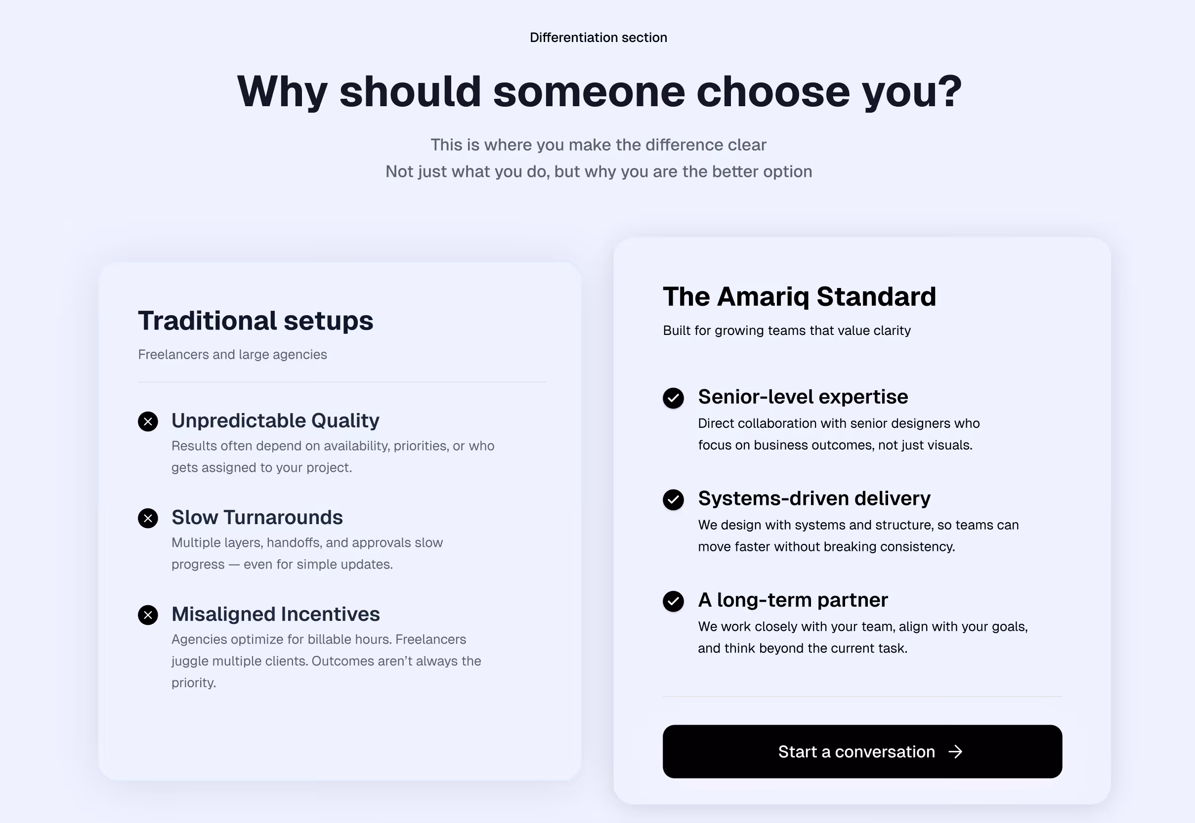
Users always ask:
👉 Why should I choose you?
Make your difference clear:
- Faster results
- Simpler process
- Better outcomes
- Clear system
Avoid being generic.
Clear differentiation makes decisions easier.
8. How It Works

Reduce effort by showing a simple process.
Break it into steps:
- Step 1: What the user does
- Step 2: What happens next
- Step 3: How results are delivered
The simpler it feels, the more people take action.
9. FAQ Section (Remove Doubt)

Even interested users hesitate.
Answer common questions:
- Pricing
- Timeline
- Process
- Fit
This removes uncertainty and increases conversions.
10. Final CTA: Close the Decision
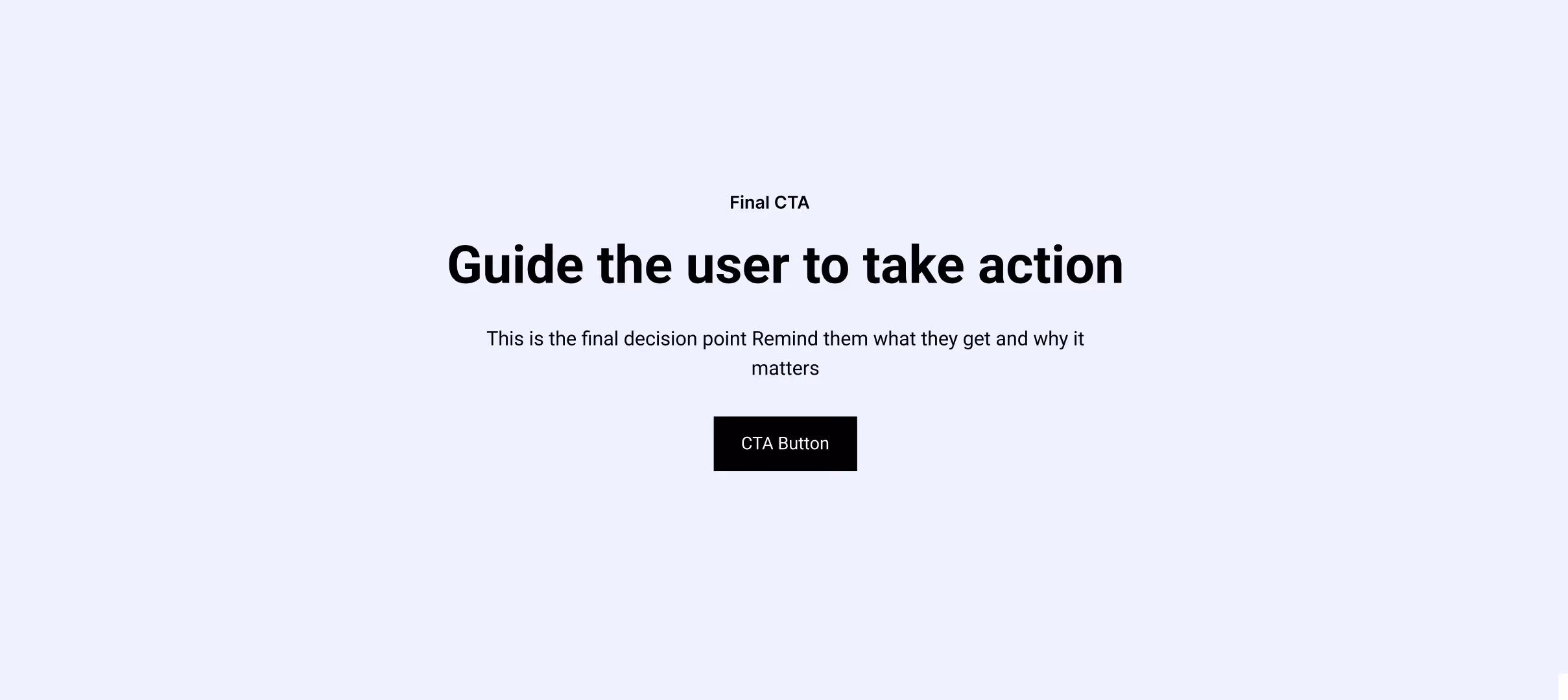
The bottom of your page is your final opportunity.
Don’t just repeat a button.
Instead:
- Recap the value
- Reinforce trust
- Reduce friction
- Make the next step clear
Clarity at this stage drives conversion.
The Real Secret: Testing
No landing page is perfect on the first version.
What drives results is testing.
- Headlines
- CTAs
- Layout
- Messaging
Small improvements can double or even triple conversions.
Final Takeaway
A great landing page is not just a nice-looking page.
It is a structured decision-making experience.
From the first section to the last, everything should guide users toward action.
What is a high-converting landing page?
A landing page designed with clear structure, strong messaging, and trust elements to turn visitors into leads or customers.
Why do most landing pages fail?
Because they focus on design instead of clarity, structure, and user decision flow.
What is the most important part of a landing page?
The hero section, because it determines whether users stay or leave.
How can I improve my website conversion rate?
By improving structure, messaging clarity, trust, and reducing friction throughout the page.
Work With Us
If you want a website that actually converts, not just looks good:
👉 https://www.amariq.com/contact
We design high-converting websites using the exact structure explained in this guide.